

When Ugly is a Good Thing in Book Cover Design
Hair, Flesh, and "Bad" Typography

Click here to read this in your browser.

Last year, I published a newsletter about “ugly” yet well-designed book covers called Cover Your Book with Beautiful Garbage.
I found a cover that makes the ones in that newsletter look positively cute. As far as I am concerned, this cover is the pinnacle of this genre of design.
I’m talking about Big Money Porno Mommy by Catherine Weiss.
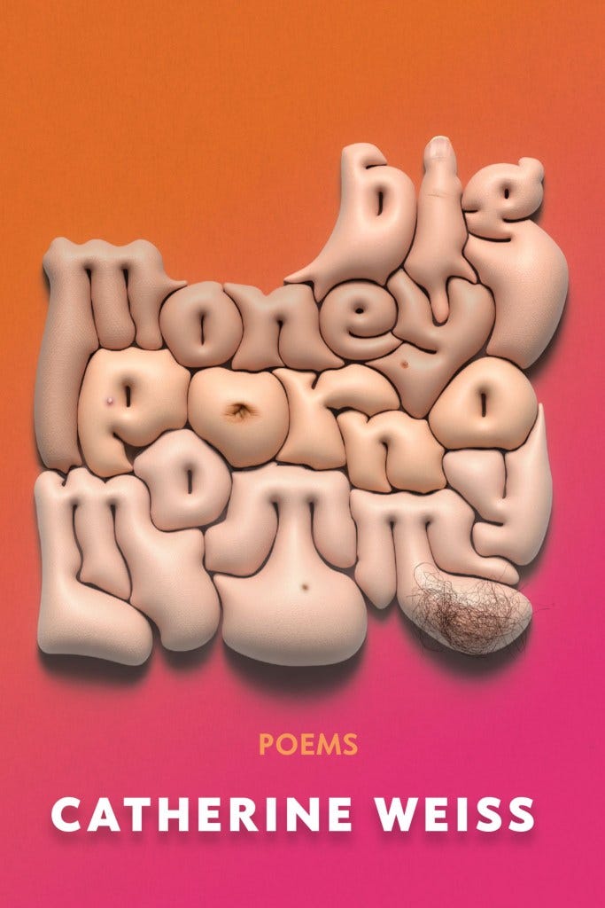
After I shared this cover via Notes a while ago, I got an email from Catherine Weiss’s publicist asking if I’d like to ask the author and designer some questions about their cover for my newsletter. This Q&A is one of my favorite things I’ve published so far. You can read it here:

I don’t think they can compare to Big Money Porno Mommy, but ever since publishing that last newsletter on the subject, I have been on the lookout for more “ugly,” well-designed book covers. Here are some more.
The links to bookshop.org in this newsletter are affiliate links that earn me a small commission. If you’d like to support the newsletter, this is a great way to do so.
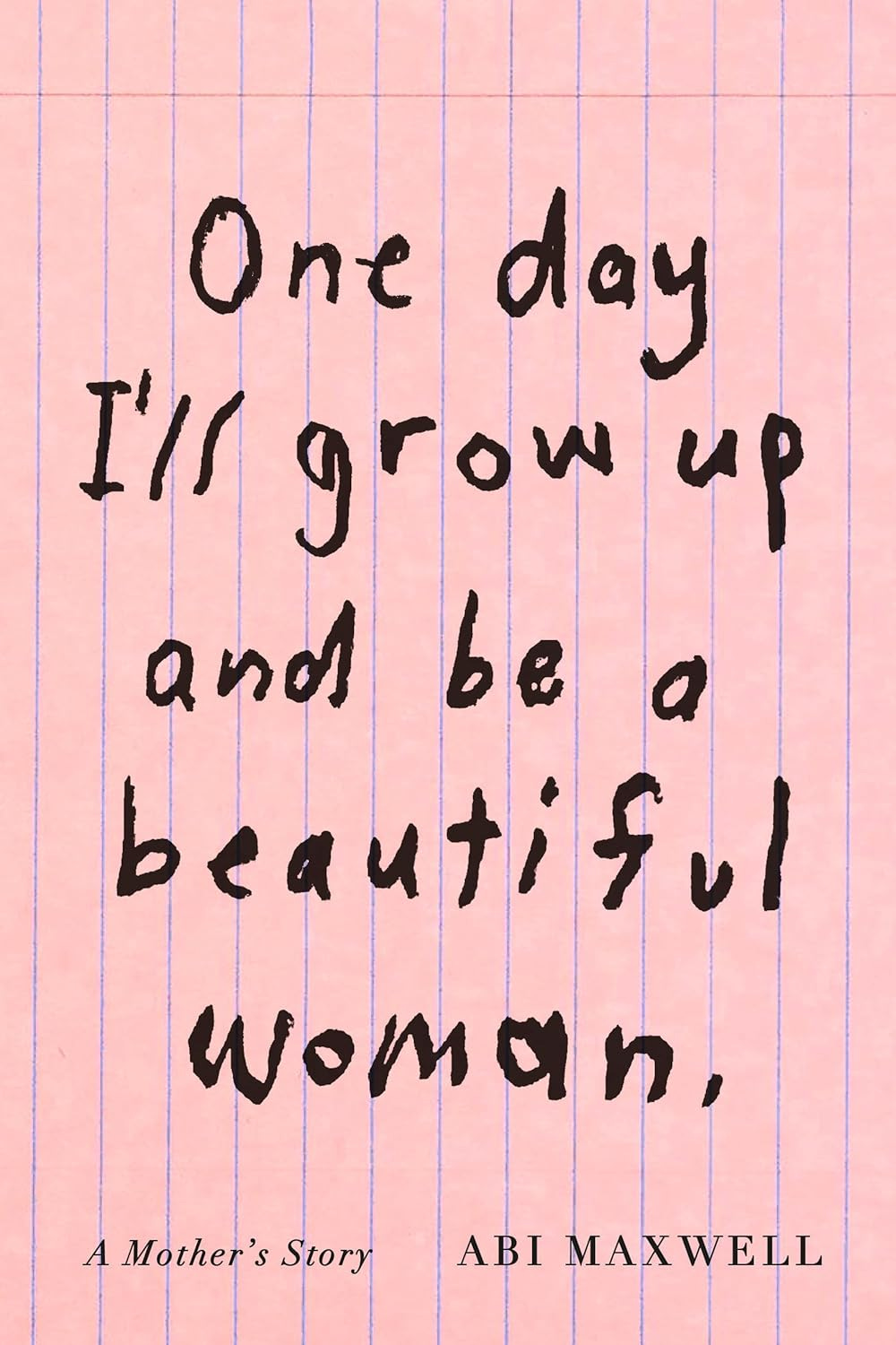
One Day I’ll Grow Up and Be A Beautiful Woman: A Mother’s Story by Abi Maxwell
This is another strong entry in the “bad handwriting” category of cover designed by Janet Hansen. The handwritten type, paired with the lined paper background, communicates a juvenile sensibility that is emphasized by the book’s subtitle. There is hope in the title and fragility in its type treatment.
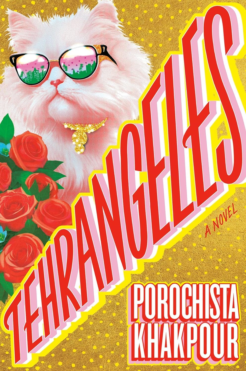
Tehrangeles by Porochista Khakpour
This cover, designed by Philip Pascuzzo, joins Girls That Never Die by Safia Elhillo in the bold and garish group of covers. The angled title feels like it might leave the page and is the first in a one-two punch followed by a sunglasses-wearing cat. Like Jenny Carrow wrote of this cover in Lit Hub’s 2024 cover round up: “A little bonkers and completely original.”
Berlin Atomized by Julia Kornberg
To get this green in print, you need a spot color. These colors—that red, that magenta—are perfectly calibrated by designer Erik Carter to vibrate and maybe just hurt your eyes. The effect is completed by the sharp spikes emanating from the type. Is this what being atomized feels like?
Bonus: See some of Carter’s unused versions of this cover over on his Instagram.
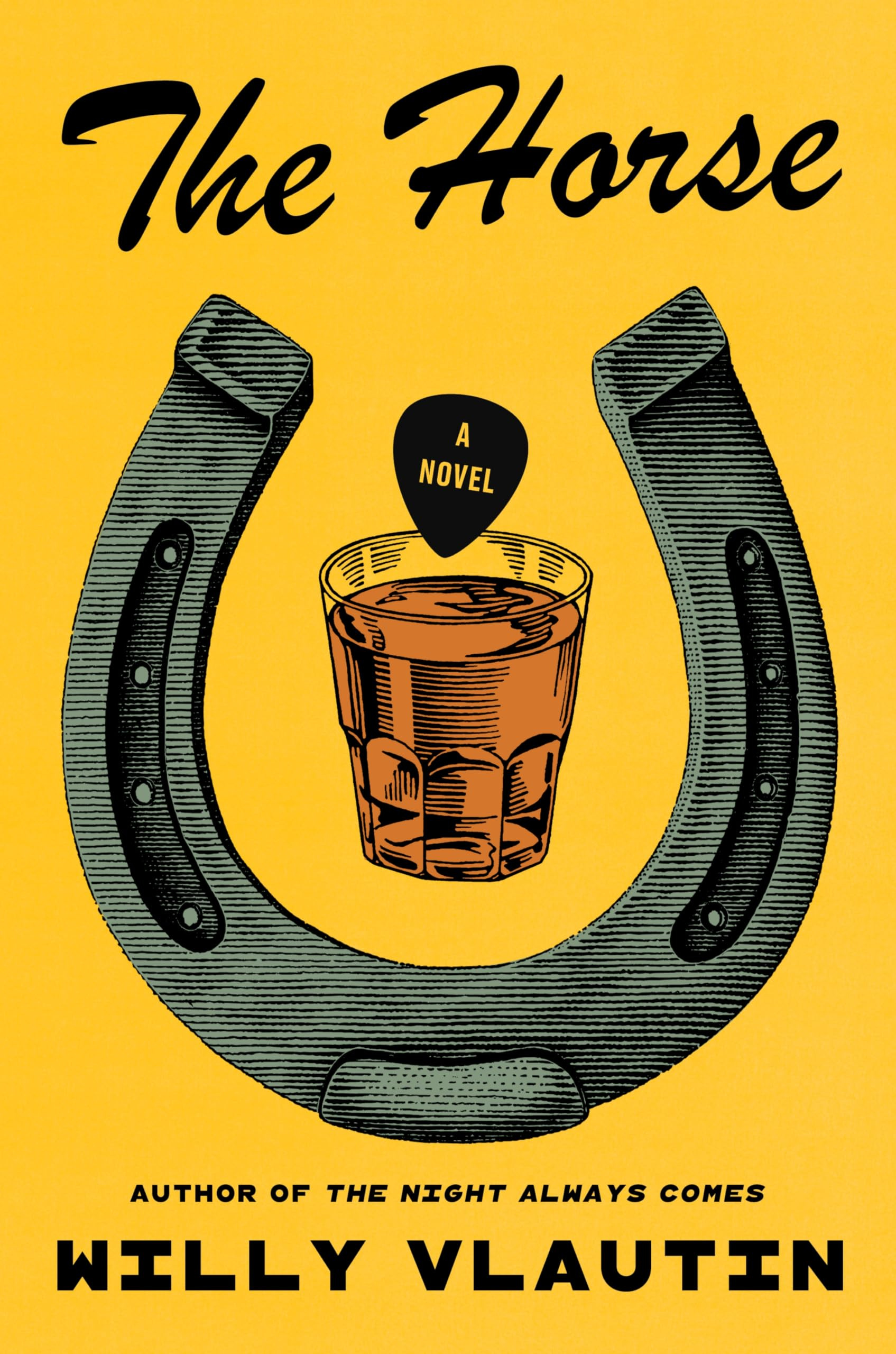
The Horse by Willy Vlautin
This cover by Milan Bozic joins Ben Denzer’s jacket for A Guide for Murdered Children in the perfect use of a typeface, in this case Brush Script, that is usually an indication of poor design. Here, along with the other cover elements, it perfectly illustrates the world you are about to enter.
We have Comic Sans, and now we have Brush Script, but I have yet to see a cover use Papyrus effectively.
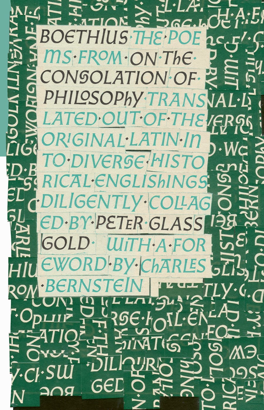
Poems from On the Consolation of Philosophy by Boethius
How many times have you heard “it’s too busy” as criticism? Cover designer Andrew Bourne expertly employs this busyness via a collage that represents what is happening with the book’s translation. This cover rewards a slow attention.
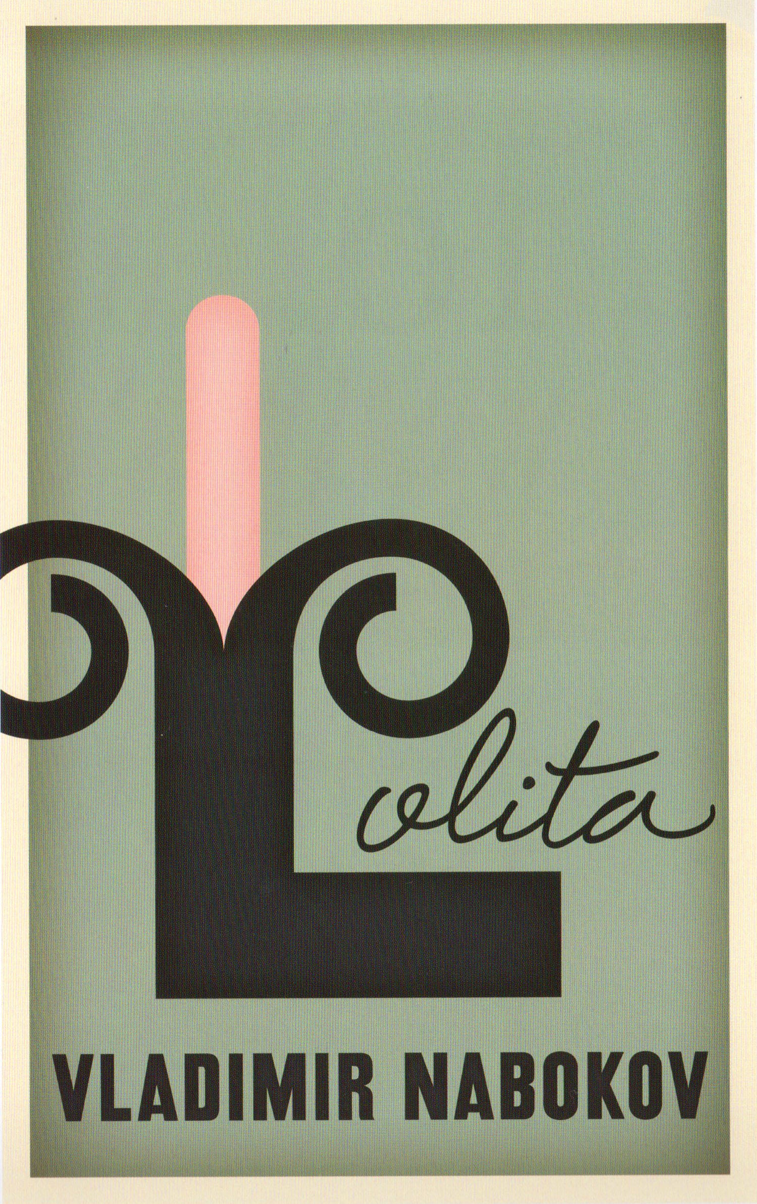
Lolita by Vladimir Nabokov
Sometimes “ugly” is in the concept, not necessarily aesthetics. This cover represents Lolita’s abuse in a phallic, literal way. It’s an unpublished cover by Mark Melnick as part of a project in which 80 graphic designers were given the task to reinterpret the cover of this classic, challenging book.

Global Civil War: Capitalism Post-Pandemic by William I. Robinson
Is there anything uglier in graphic design than the QR code? This is the perfect symbol for post-pandemic capitalism. I only wish the code actually led somewhere.
Notes of a Dirty Old Man by Charles Bukowski
Designed in 1976 by Pierre Mendell, a German designer, with photography by Klaus Oberer, this is the oldest “ugly” cover I have found so far in my internet wandering. It’s not clear if this cover was actually ever published. I haven’t read any Bukowski, but this feels like the perfect, in-your-face cover for his work. More butts on book covers!
Here’s a review of the jacket by designer Javier Jaén.

The World Goes On by László Krasznahorkai
The first commandment of graphic design is “thou shalt not stretch type.” The second: “know the rules to break the rules.” Contemporary legend Paul Sahre does so here with authority.

More Like This:


News
Somehow, I’m in the Washington Post! Thanks to this newsletter, I was interviewed about trends in romance book cover design.
Of course, the first time I am quoted in a national newspaper I mention “milking” something. Sigh.
Read it here: “Why do romance covers all look like this now?”

In Case You Missed It
Just Because You Can Doesn’t Mean You Should: On AI and the Creative Process

The Latest for Paid Subscribers
How to Design A Book Cover: Law, Justice, and Society in the Medieval World

What I’m Reading (books)
Harry Potter and the Sorcerer’s Stone by J.K. Rowling (book club with mom)
What I’m Reading (links)
Letters to a Young Graphic Designer by Beth Mathews
Should AI be able to steal books? Are they stealing them? by Anne Trubek
The Daily Heller: A Novel With a Typographic Plot (Print Mag)
30 of the Best Book Covers for April 2025 (Print Mag)
Thanks for reading!
Thanks for reading! If you love this newsletter and want to support it, you can do so by buying me a coffee or becoming a paid subscriber.
Paid subscribers get access to How to Design a Book Cover, a bonus bi-weekly series in which I break down my book cover designs from creative brief to final cover. You can read the first post in the series for free here:

That's really awesome that you got interviewed by the Washington Post. Congrats!
Better ugly than boring! At least ugly is memorable.