

13 Quotes About Book Covers
From 'The Look of the Book' by Peter Mendelsund and David J. Alworth

There are many, many, many reasons to read and love The Look of the Book by Peter Mendelsund and David J. Alworth.
For one, the book is beautifully designed and absolutely stuffed with illustrations. For another, it is a terrific blend of design and literary criticism. Both of these aspects would and might just warrant their own newsletters about this book.1 But as a cover designer myself, and a bit of an industry fanboy, one of my favorite parts of this book are the quotes from designers, about their work, sprinkled throughout its pages.
The Corrections by Jonathan Franzen
![The Corrections [Book]](https://substackcdn.com/image/fetch/$s_!DmoO!,f_auto,q_auto:good,fl_progressive:steep/https%3A%2F%2Fsubstack-post-media.s3.amazonaws.com%2Fpublic%2Fimages%2F96c9972f-2d3c-44bd-8ce5-c3a4aa54e161_1650x2475.jpeg "The Corrections [Book]")
“In my experience, designing covers for ‘big books’ by ‘big authors’ is a similar process to designing any other book jacket—only more so. By which I mean: more people are involved, with more opinions and higher expectations. Adding to the pressure, everyone usually wants something that is different and ‘fresh’ (but not too different! No one wants to take a chance when so much is on the line). Usually we’re asked for ‘big type’ and something that ‘really pops.’ In any case, it’s still a book, and I love books. And a ‘big author’ is often a big author because their books are great. So that is a big plus. If things get painful, I usually try to go back to the book itself. And the roller-coaster ride of a ‘big book’ can be a kind of rush, I guess—usually in retrospect, though. As far as The Corrections, in particular, I came across the cover image in a postcard being sold in Union Square. I skipped back to my computer, came up with the design rather fast, and got an approval quickly, as I remember.”
—Lynn Buckley, cover designer of The Corrections by Jonathan Franzen
Grand Union by Zadie Smith
![Grand Union: Stories [Book]](https://substackcdn.com/image/fetch/$s_!cWVK!,f_auto,q_auto:good,fl_progressive:steep/https%3A%2F%2Fsubstack-post-media.s3.amazonaws.com%2Fpublic%2Fimages%2Fb4ba0a98-4e48-489e-b817-95f59f159371_1684x2560.jpeg "Grand Union: Stories [Book]")
“Designing these covers is a joy. My brief is generally: This is the new book by Zadie Smith. The cover needs to convey: ‘This is the new book by Zadie Smith.’ Zadie is great at sharing her own ideas and thoughts for the cover but in a totally non-constrictive way. She will send things she likes, and I will be told the mood and setting and then left to get on with it. She is also very good at choosing titles. all of which balances perfectly. Detail and image are stripped away, and you try to give a sense of the content purely through text and color.”
—Jonathan Gray, cover designer of Grand Union by Zadie Smith
The Year of Magical Thinking by Joan Didion

“There may be something to magical thinking. As I begin to design this jacket, still under the spell of Joan’s manuscript, I began to arrange the lettering and the name ‘John’ simply appeared to me. I hoped it would be a subtle way to honor him.”
—Carol Devine Carson, cover designer of The Year of Magical Thinking by Joan Didion
Jurassic Park by Michael Crichton

“The objective on the Jurassic Park cover was not so much to make it look like a ‘big book’ (though, of course, that would be a by-product) as it was to make it look like a book about dinosaurs that hopefully didn’t look like any book about dinosaurs you had ever seen. Since we were kids, we had all enjoyed ‘artists’ conceptions’ of what these animals might have looked like, but they inevitably came off as fake, because so much had to be built from the imagination. I decided to start with what was real, what we knew actually existed, and fill in just enough of the blanks to make it plausible yet unique. It didn’t hurt (so to speak) that the result has so many sharp edges. In terms of the typography, the title is meant to evoke park signage. I will admit that, to this day, I can’t remember why I put a black drop shadow behind his name. It looks needless and dumb. Who knows, maybe someone in sales said it needed to ‘pop more.’”
—Chip Kidd, cover designer of Jurassic Park
A Clockwork Orange by Anthony Burgess
 - Fonts In Use")
“I had to create this image in one night. When Stanley Kubrick unaccountably refused to supply us with promotional press shots, I immediately commissioned a well-known illustrator to help out. The result was not only unacceptable but it was also inexcusably late, so we were horribly out of time … I had a very clear image in my mind’s eye as to how the cover should look, and so, collecting up a few supplies from the art department, I sped home to my Highgate flat to create the cover myself. I remember a motorcycle messenger arriving at 4:30 a.m. to deliver the ‘repro.’ Another messenger arrived at 7 a.m. to whisk the artwork off to the printer. Consequently, I had not had time to make the small adjustments and refinements that I still believe it needed. So now, every time I see that image, all I see are the mistakes. But then, maybe it’s those unfinished rough edges that contribute to its appeal. Who knows?”
—David Pelham, on his cover for A Clockwork Orange by Anthony Burgess
The Stories of John Cheever

“You can’t believe the amount of requests for a jacket like The Collected Stories of John Cheever.”
—Paul Bacon, book cover designer
“Sometimes a jacket—like Robert Scudellari’s inviting, bright-red wrapper for the very successful ‘Stories of John Cheever’ (1978), with its huge silver ‘C’—does cheer on searchers for a Christmas present to bestow.”
—John Updike, New Yorker
RELATED READING: What Your Favorite Book Cover Says About You
1984 by George Orwell
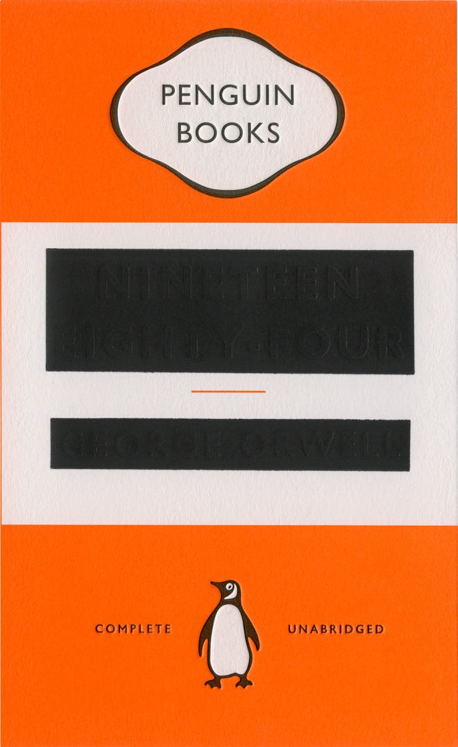
“My first move was to do a stock take on what has already been done. Countless Nineteen Eighty-Four covers exist, and a good number of recent editions sit together in bookshops, so this quickly became a process concerned with what I couldn’t and shouldn’t do rather than what I could and should.
I knew the idea wouldn’t work if the Penguin livery wasn’t in place. There would be no ‘way in’: nothing familiar or comforting to play against the starkness of the redaction. The book also needed to be well known to get away with this level of subversion: if potential buyers hadn’t read it, there would be a good chance they would still understand the messaging. (I liked how the ‘complete’ and ‘unabridged’ line made Penguin look somehow complicit in the spread of misinformation. I have to be grateful to them for allowing such brand abuse.)
And one last thing to mention is that Penguin understands the power of collective effect: If key content is hidden on this edition, then it can be found on another sitting close by. For a client to make this kind of leap of faith is no small thing.”
—David Pearson on designing George Orwell’s Nineteen Eighty-Four
The New Testament translated by Richard Lattimore

“The Richard Lattimore jacket was a freelance job for Little, Brown, and as such, it was pitched to me as ‘How would you like to design the Bible, and make it look like a novel?’ Of course, I couldn’t resist, but when I suddenly arrived at the solution (I chanced upon the image in an issue of COLORS Magazine), I knew it was right, but that it likely had no chance of getting approved. Besides being horrific, the photo was by Andres Serrano, he of the ‘Piss Christ’ notoriety. I submitted it anyway, because it just was the right thing to do, and I was ready to submit a kill fee when I got the call that they were going to take a chance and go with it. I was pleasantly amazed—and ultimately sorry for them, because the ensuing controversy in the press did nothing to help sales of the book. The subsequent paperback used an entirely different cover (not by me, and I don’t blame them), which had a far more soothing effect and is still in print.”
—Chip Kidd
Lolita by Vladimir Nabokov

“I’ve always said, my favorite thing about this cover is that anything risqué is totally in the eye of the beholder. When I show it to students, initially about a third of them can’t see anything other than the corner of a room. They’re the ones with sound minds. Book covers are quite small, and they’re not animated, so if you can get oe image to suddenly become two, you’ve doubled the size of your cover, and you’ve involved the viewer in some way—they’ve become coconspirators in the whole thing. And facts and figures are great, but it’s even more interesting when things get confusing or ambiguous.”
—Jamie Keenan, cover designer of Lolita by Vladimir Nabokov
More Quotes on Covers, in General
“Wendell Minor . . . says when they ask him for a gothic jacket, which traditionally shows an old mansion, a landscape, and a girl in flight, ‘I tell them you can have the landscape and the house or you can have the girl. You can’t have both. That way at least there’s 50 percent chance that I can do something original.”
—Victor S. Navasky, 1974, New York Times
“Book covers, to me, serve all kinds of functions, though probably the reason I like them most is just for pleasure’s sake. If it’s a book I don’t know, the cover gives me a sense of what the atmosphere of the book might be like, almost like a little tone poem. For books I’ve already read and loved, the cover becomes part of my experience of the book, like my emotional attachment to a familiar cover from childhood. I’ve always been jealous of artists and their tools, their paintbrushes and cameras and drawing pens., Writers don’t get to use anything fun: they have to work with words, the most basic of all tools, the same tools that constitute the nonsense that arrives in your spam box all day. Book covers give me that little pressure release from the ubiquity of words. Theyh link writing to the visual, and, when they’re good, covers also elevate the words inside to the level of art, or at least indicate to the reader that this is a different reading experience than reading your emails.”
—Emma Cline, author of The Girls
“In the end, nobody buys a book jacket.”
—John Updike, New Yorker

In Case You Missed It:

“At the risk of sounding morally deficient, I was excited to put a swastika on a book cover. More specifically, I was excited by the prospect of subverting the swastika on a book cover. I would never just slap a swastika on a book cover for the sake of it, but I thought a modified one might work conceptually.”
The Latest for Paid Subscribers

“I want this cover to be clever, but not cynical. The title is a little antagonistic, so I don’t want the book to look totally mean-spirited because I like to think there’s a lot of kindness here.”
What I’m Reading (books)
Gilead by Marilynne Robinson
Cathedral by Raymond Carver (falling apart as I read it)
What I’m Reading (links)
Jane Austen Gets a Makeover by Josh Frederick
How I got my book deal (and how it is going so far) by Jared Henderson
Human/Parents Interview: Mills Baker and Suicide Grief by Mills Baker and Katrina Donham

Thanks for Reading!
Thank you for reading! I mean it.
If you’d like to keep this newsletter going and help me say no to designing soul-sucking books about corporate events, email marketing, and raising capital, consider becoming a paid subscriber or buying me a coffee.
Paid subscribers get access to How to Design a Book Cover, a bonus series illuminating my book design process, and diary updates on the process of turning this newsletter into a book.
Until next time,
—Nathaniel
I’ve wanted to write about this book—one of my favorites—for a while, but I wasn’t sure what angle to take with it.
Long long ago I got a MA in theology. I saw Chip Kidd’s cover of Lattimore’s New Testament when it was first published. It was the most theologically profound image I’d ever seen. Of course people hated it, for the reasons Kidd describes. It is still my single favorite book cover because it is bold, horrifying and — if you can abstract — visually stunning. At the core of the New Testament is the brutal murder of a human being.