

Swastikas on Book Covers
And the Limits of Cleverness in Design


Confession: If there was one word with which I’d like my work to be described, it would be “clever.”
I still blush at “smart;” I smile at “beautiful,” but what I really want is to make something clever: a book cover with a knowing wink toward meaning. I want my design to be smart and funny and I want you to know about it.
But putting cleverness on a pedestal can be a dangerous game for a book designer to play.
Cleverness in graphic design requires a recipe containing both the familiar and the unexpected. Too much of the unexpected, and you’re making the audience work too hard to understand. Too much of the familiar, and you have baked a cliché. There is some wiggle room with these measurements, but less than you might think—there is a thin line between a perfectly moist cake and one with a soggy bottom.1 True cleverness in design requires the illusion of effortlessness in both a design’s execution and its ability to be understood. A delicious twist on what grandma used to make.
I’ll set aside the baking metaphor soon—because let’s be honest, I think I’m trying too hard to be clever here—but there is one more question to ask before breaking out the measuring cups: should a book cover be clever in the first place?
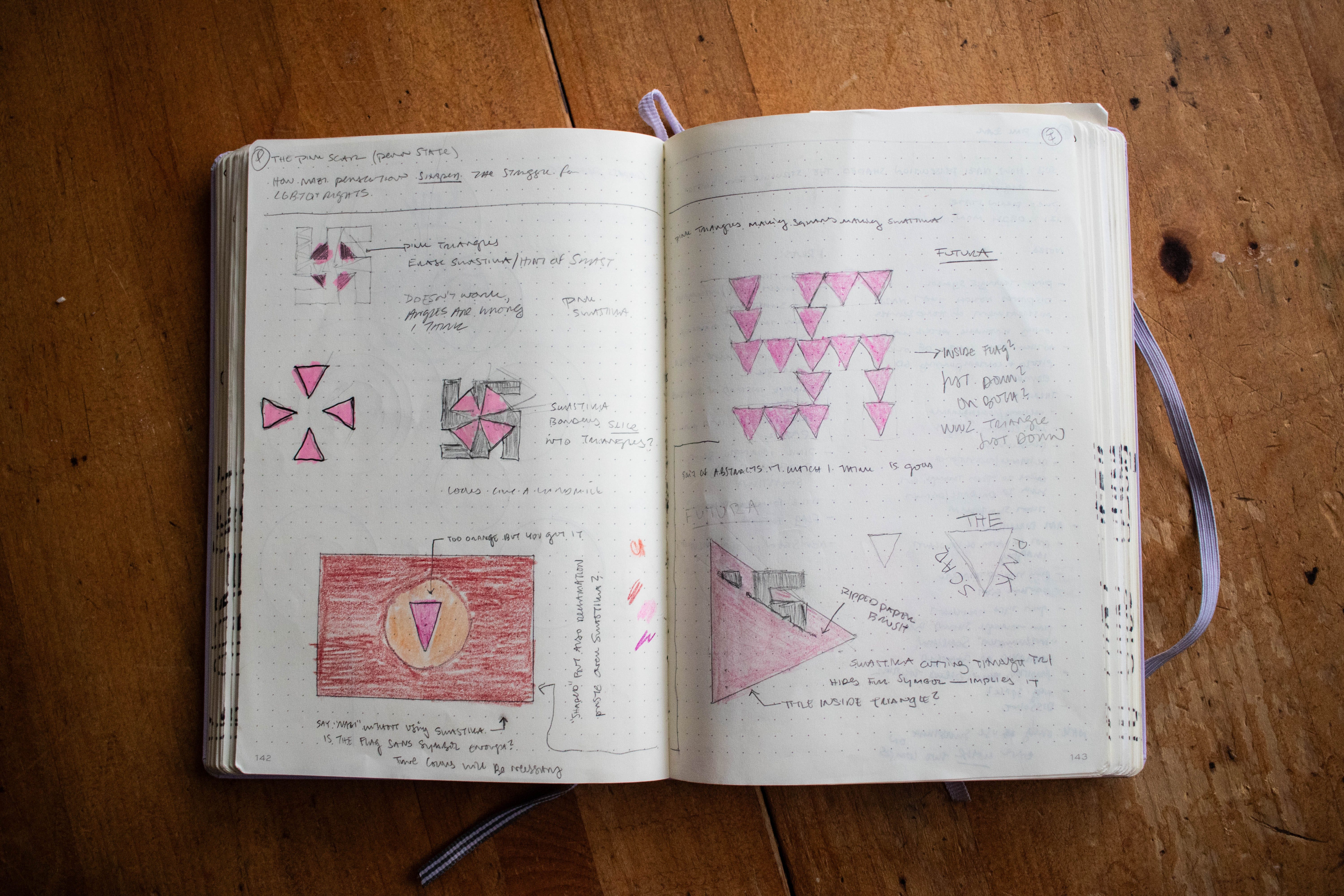
At the risk of sounding morally deficient, I was excited to put a swastika on a book cover. More specifically, I was excited by the prospect of subverting the swastika on a book cover. I would never just slap a swastika on a book cover for the sake of it, but I thought a modified one might work conceptually.
To be abundantly clear, I do not like the swastika, nor what it represents. It’s a hateful symbol. But it is a recognizable hateful symbol. Besides maybe the Christian cross, or the Nike swoosh, there might not be a more recognizable piece of iconography. And when there is such a familiar element in play, the opportunity to do something unexpected arises.
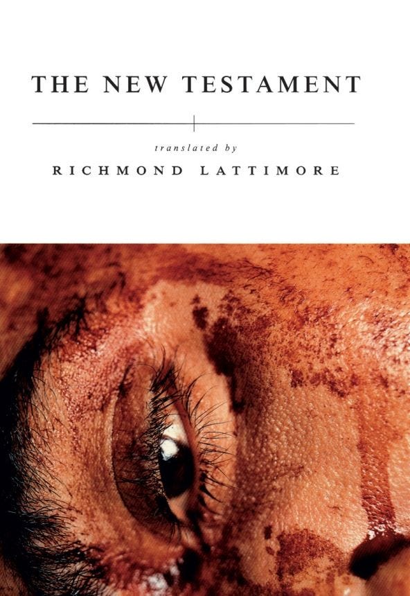
Basically, I wanted to do my own version of Chip Kidd’s original cover for Richard Lattimore’s translation of The New Testament.
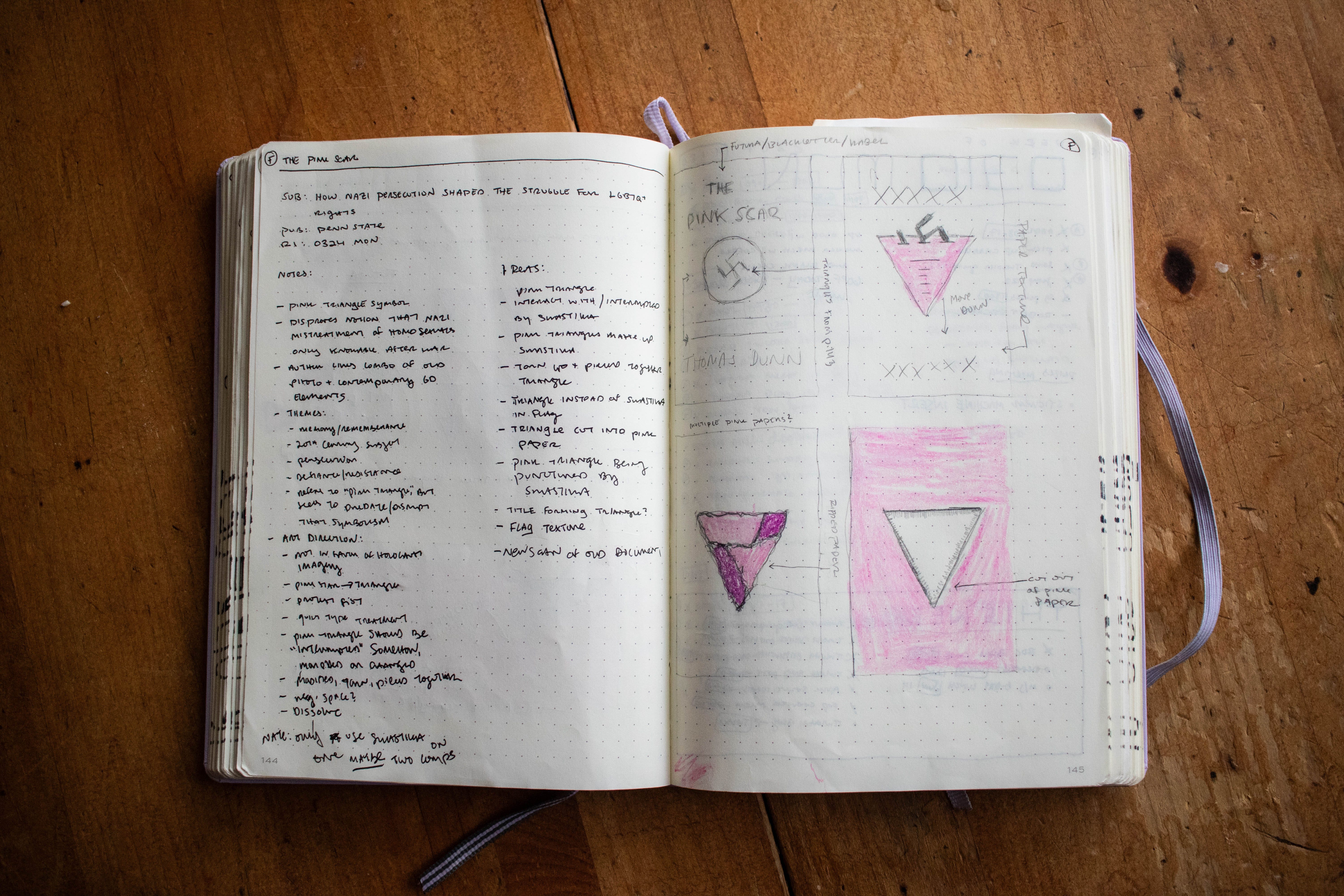
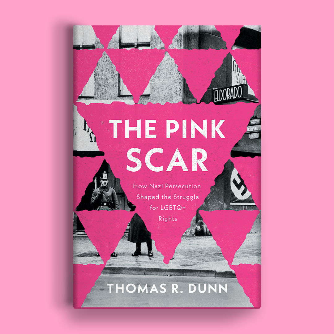
The book I was commissioned to design the cover for is called The Pink Scar, and is about the ways in which Nazi persecution “shaped the struggle for LGBTQ+ rights.” The design brief suggested a take using a pink triangle, the symbol the Nazis affixed to homosexual’s uniforms during the Holocaust and that has since been reclaimed by the LGBTQ+ community.

Before I even accepted the project, my mind was firing with ideas and excitement about clever ways in which I could combine and manipulate the swastika, representative of Nazi persecution, and the pink triangle, representative of the LGBTQ+ movement. One icon literally shaping another: an exercise in semiotics.
I felt a devilish glee at the notion of doing something clever or subversive with one of the most charged symbols known to humankind. I am a younger brother, and, while not an out-and-out rebel, I do have a mild antagonistic streak. This project definitely fed it. I’m not proud of that glee. It probably should have been a warming sign. But handed something so iconic, it felt like an opportunity to both play and say something with meaning. Such a symbol should not be used frivolously—if at all—so I wanted to make it count.
If you ever want to feel like a disgusting human being, try drawing some swastikas in your sketchbook. I started sketching on a blank page, but quickly labeled it with the book’s title and subtitle lest anyone saw the drawing out of context. When I moved to the computer, I briefly wondered if the police might burst through my door as I dragged rectangles along a grid to create the hateful vector.
The covers progressed, and the excitement about my ideas remained, but I also felt weird.
Here is a diary entry, two days after submitting the first round of covers to the publisher, and after sharing the covers with some of my book design peers:
March 19, 2025
Interesting, if brief, discussion on the book design Slack today regarding a few of my covers for The Pink Scar.
Of those who chimed in, there was almost universal preference for the ripped paper triangle over the comps employing the modified swastikas with much mention of how hateful the symbol is … which is fine, and true, though I myself consider the comps equally strong and the hatefulness of the Nazi symbol part of the point.
I wasn’t criticized for those covers—at least not directly—and their points are well taken. But I feel a certain defensiveness that I want to explore here.
Knowing myself, it is because I view the options with modified swastikas as the clever, or smart, options. And I always want my work to be considered smart. Not that the ripped paper isn’t, but it was originally [the Art Director]’s idea. I’d still be pleased if one of those is chosen—I’m not that egotistical—but I love having the idea. I get high on that shit.
The swastika comps also have the nature of being subversive. They play with fire a little bit. The way they are presented I don’t believe anyone could mistake these covers as endorsements for Nazi ideology. But it feels rebellious.
But we do live in politically fraught times in which a literal Nazi salute is in the news—does that make using the symbol more or less relevant? Powerful? Irresponsible? It might help sales, but should it? As a designer it is extremely tempting to use it—especially in a clever way—because it is one of if not the most iconic piece of graphic design, for better or worse, in the western world. To use and subvert such a widely recognized piece of iconography feels like a kid running onto a playground. That’s probably a fucked up thing to say about such a hateful symbol, but I’d feel the same way about the cross or the Nike logo.
Am I prioritizing my cleverness and designer ego over accurately representing the book? Maybe. But I do genuinely believe everything I designed met the brief. I haven’t read the book and I don't make the final call on the cover. It’s not like I will push for one of these options if they aren’t chosen. But was even including them an ethical misfire?
Ultimately, I don’t think so. They weren’t used frivolously and those comps have something to say that is in line with the book—or at least its title and subtitle. I provided several other options with just as much thought and effort put into them. But, I do think I need to continue to think about cleverness and ego and whether or not the cover serves the book or my portfolio more.
“You’re not the star of the show. The author took three-and-a-half years to write the goddamn thing, and the publisher is spending a fortune on it, so just back off.” —Paul Bacon
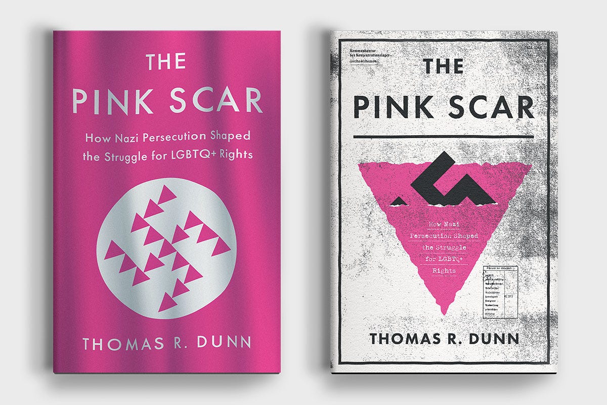
So here I am, still thinking about cleverness and ego and swastikas on book covers. In the end, neither of the options with modified swastikas were chosen.2 I still think those unused covers are good, but if I am being honest here, I am relieved they weren’t picked. I’m not sure how confidently I could stand behind that choice. I’m not sure I want to be clever that badly.
I’m relieved because even if done cleverly, I’m not sure if, how, or when a swastika should be used on a book cover or in graphic design in general. In a 21st Century in which real Nazis still exist—even on this very newsletter platform—is using the mark justified, even in critique? I’ve read Steven Heller’s The Swastika and Symbols of Hate and seen how people still use Nazi iconography. Does privileging the icon offer further desensitization to hatred, or does using it in conjunction with the book’s content shock the viewer into thinking critically? I don’t feel qualified to answer. I’m smart enough to know how dumb I am.
But what I do know is that there are limits to cleverness. Cleverness runs the risk of making the cover more about itself, and its designer, than the book itself. It is worth examining if cleverness comes at anyone else’s expense.
To be clear, I still want to be clever. I want you to think I’m clever and I want you to be right. If another opportunity arises to use the swastika, cross, or Nike swoosh on a book cover, I might just take it. But if I do, it will be in service of the book on which the cover sits, and I will do so knowing that cleverness isn’t the most important thing in book cover design.
If you’re interested, you can preorder The Pink Scar here.

Some great recommendations here if you’re in the market for short stories ⬇️
News
I am 31 now.
ICYMI


What I’m Reading (books)
Gilead by Marilynne Robinson
Cathedral by Raymond Carver

Thanks for Reading!
Thank you for reading! I mean it.
If you’d like to keep this newsletter going and help me say no to designing soul-sucking books about corporate events, email marketing, and raising capital, consider becoming a paid subscriber or buying me a coffee.
Paid subscribers get access to How to Design a Book Cover, a bonus series illuminating my book design process and diary updates on the process of turning this newsletter into a book.
I’m afraid this metaphor has a soggy bottom.
The final cover does have a swastika on it, but the mark is partially covered and is from a historical photograph and so feels less pointed.
Honestly, I think your original covers were better and that there isn’t anything offensive about them. You did a good job with a tough task. Taking a swastika and doing a subversion of it on a cover seems to me a very different thing than say, someone writing a Holocaust book and then a designer just lazily slapping a conventional swastika flag on it.
I must say the rejected covers were better than the final one. It communicated to me what the book was about immediately. I had no idea about the relationship between LGBTQ and Nazism. The sunken swastika was evocative because the pink triangle subsumes and triumphs over it. It gives me an idea that this book will tell me how it all happened!