

What Your Favorite Book Cover Says About You
Some Personal and Book Design History


When it comes to books, my adolescent years were, at least to some extent, defined by ones I never read.
I am the youngest in my family by seven and ten years. My mother takes credit for my conception, saying, “Bill, I want another kid,” or so the story goes.1 I am waiting for a late-in-life admission to the contrary—and fueled by a little too much Fireball—but at any rate, when you are the youngest sibling, you receive hand-me-downs.
Mine were mostly from my sister Rachael, and took the form of a Game Boy Color, her class of 2005 T-shirt bearing the Vitruvian Man and the phrase “Veni, Vidi, Vici,” and several books she read in English class she thought I might also need.
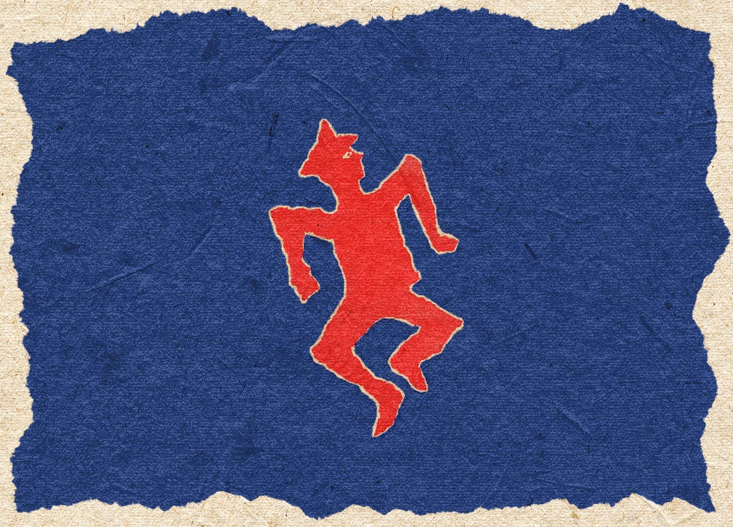
Curriculum can change quite a bit in seven years. I think I only read one or two of the books she handed down, but even so they became fixtures of my bed’s headboard bookshelf.2 A Passage to India rubbed shoulders with Redwall, Angela’s Ashes with my Star Wars prequel novelizations and Mike Lupica books, and Catch-22, my favorite book cover of all-time, rested nearby yet stood out from them all.
Why Catch-22? The angry-looking boy on my mass market copy of Angela’s Ashes—what I now realize was the film tie-in edition—still takes up precious mental real estate, but I wouldn’t call it my favorite. Maybe even then I knew that movie tie-ins were bummers. But I like to think that in Catch-22, the earliest seed of my design taste was planted. I didn’t know it at the time, but I was enthralled with a cover designed by one of the masters of twentieth century book design.
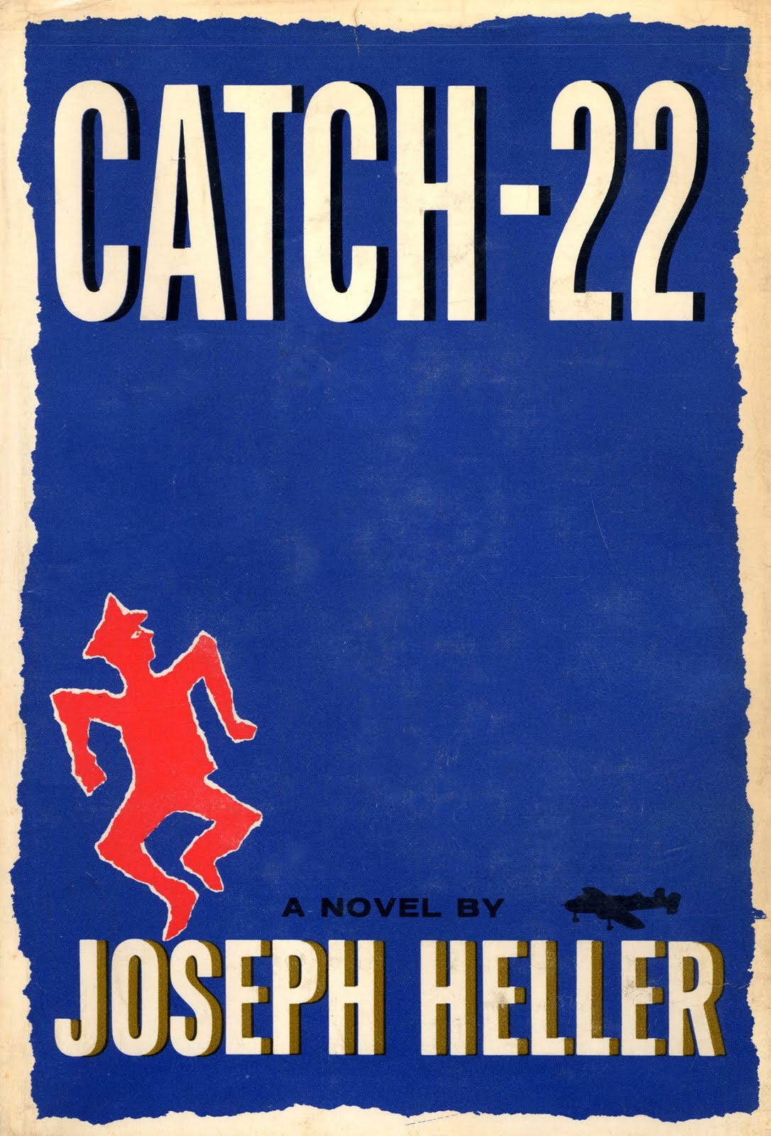
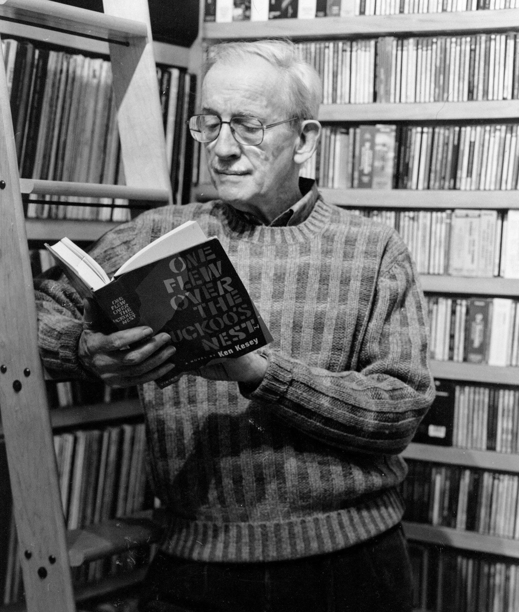
Paul Bacon (1923–2015), to borrow a phrase, might be your favorite book designer’s favorite book designer. Bacon is responsible for some of the most iconic covers of the twentieth century and what has become known as “The Big Book Look”—a bold, minimalist design with large type and a small, conceptual image. In addition to Catch-22, he designed the original jackets for books such as Slaughterhouse-Five, One Flew Over the Cuckoos Nest, Jaws, The Power Broker, Sophie’s Choice, and Zen and the Art of Motorcycle Maintenance.
“The ‘Look,’” Steven Heller wrote in a 2002 article for Print, “had its inception in 1956 when Bacon was commissioned by Simon & Schuster’s art director, Tom Bevans, to design the jacket for Meyer Levin’s Compulsion, a roman à clef about two young men who systematically plan and carry out the cold-blooded murder of a younger boy to see if they can get away with the crime.”
Click here to read “Paul Bacon, Bestseller” by Steven Heller (Print, 2002)
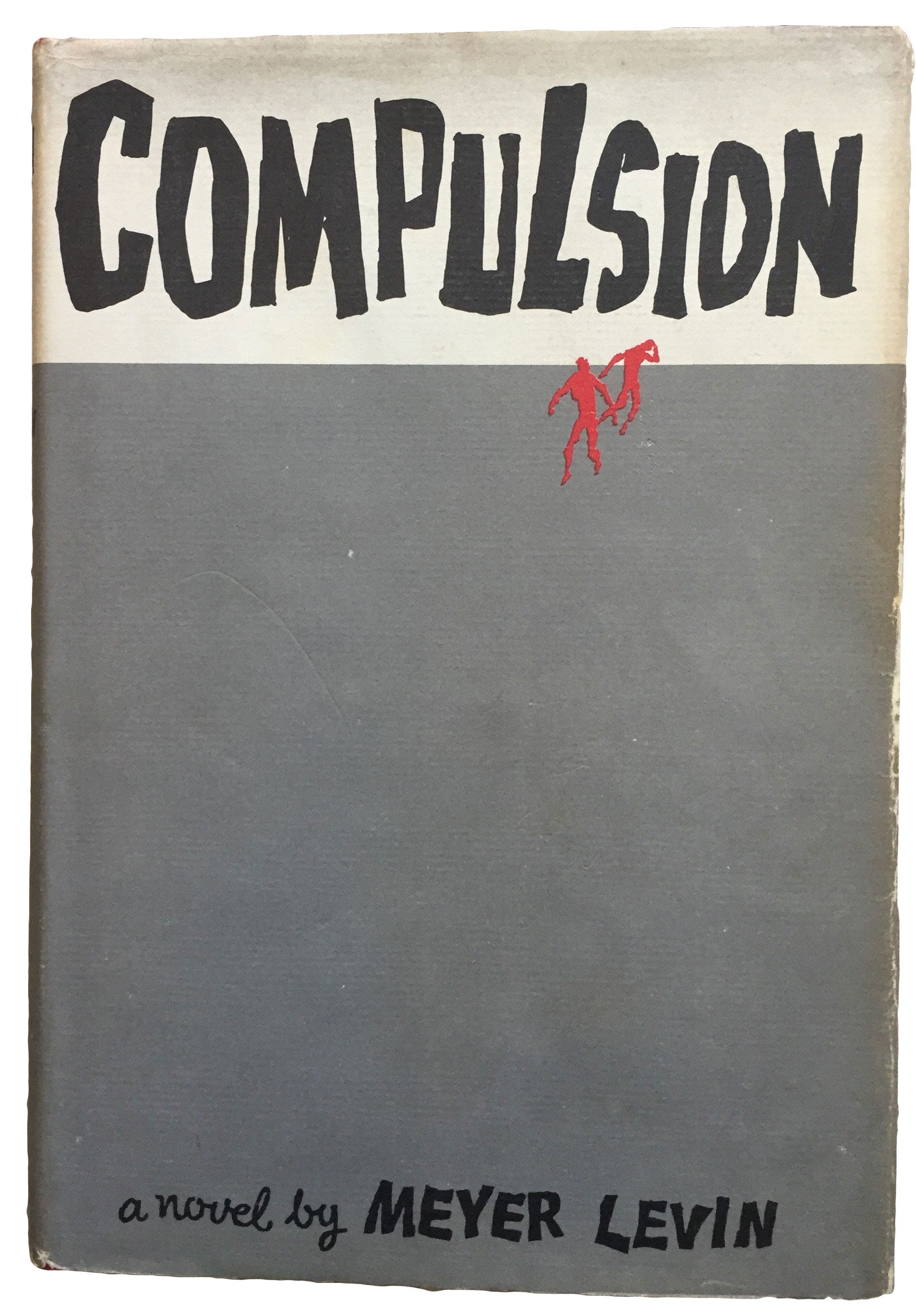
The publisher knew that the highly-publicized real-life killing of Bobby Franks by Nathan and Richard Leopold would popularize the novel, but was uncertain how to devise a jacket that would be suggestive without being lewd and evoke a sense of mystery without resorting to clichés. Bacon sketched out a number of ideas until he came up with the rough, hand-scrawled word “Compulsion,” which he positioned at the top of the jacket, taking up a fourth of the space, while below it, an empty taupe rectangle bled off the field, and below that, at the bottom, was scrawled “a novel by Meyer Levin.” Sparse and dramatic—yet Bacon felt something was missing.
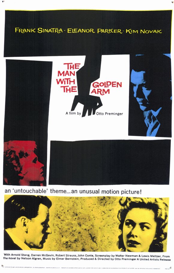
That “something” became two small, nervously drawn figures in red, running on the vacant expanse upward toward the title. Although the cover calls to mind Saul Bass’ 1955 expressionistic film poster for The Man With the Golden Arm, it was more likely influenced by the jazz albums Bacon had designed starting in the late 1940s. Whatever the influences, the book became a huge bestseller and the jacket, displayed everywhere, caught the publishing industry’s attention.
Compulsion and Catch-22 look related to me, like cousins. Or, maybe brother and sister. Perhaps Catch-22 is a stylistic knockoff—a publisher asking a designer to copy himself—but it stands out more to me. Maybe it’s the color. Maybe it’s the nostalgia.
Now in my thirties,3 the blue field and dancing figure of Catch-22’s cover remind me of a home that is gone, that only exists in my mind; like lyrics in First Defeat by Noah Gundersen: home is “not a person or place, but a feeling you can’t get back.”
My parents still live in the same house I grew up in, but it was renovated after the kitchen flooded. With walls repainted and a sliding barn door installed, my room is now my sister’s—she moved home six years ago4 to receive medical care—and my old bed was moved to the basement. I wonder, do the drawers still hold my long-too-small Cub Scout gear? There are no longer books on the headboard. More importantly, I am no longer that kid.
Nostalgia is a dangerous drug, especially when you are tired, seasonally depressed,5 and perpetually worried about money. What I wouldn’t give to trade my anxiety about the world my children will inherit for the anxiety about my parents seeing the pictures of Sports Illustrated swimsuit models I accidentally left up on the shared desktop computer.6
I don’t have that copy of Catch-22 anymore. I think I lent it to my friend Josh, about a decade ago in college. I wonder if the book made it to Louisiana with him.


I eventually read Catch-22 on my own. I loved it. This is probably incorrect, but my flawed memory tells me it was the first book to genuinely make me laugh out loud.
Was I drawn to simple, conceptual design before Catch-22, or is the book subconsciously the Rosetta Stone for my taste in graphic design? My own work usually gravitates toward the simple, and by and large the covers that make me wish I designed them are ones driven by strong concept and restrained execution. The lone red figure, apparently doing a jig in his military dress, perfectly encapsulates the absurdity that lies within the book. Yet the type still yells “buy me!” with its large, condensed sans-serif style that is right at home amongst the thumbnail-optimized covers littering Amazon today. Percival Everett’s James, published in 2024, looks like it could have been designed by the late Paul Bacon.
According to Bacon in Print, he did as many as 11 versions of Joseph Heller’s classic satire.
I did a jacket that just said ‘Catch 22’ in very large lettering, and underneath, I can almost remember how the subtitle I wrote goes: ‘A novel, wildly funny, and dead serious, about a Macedonian [changed by Heller from Assyrian] malignerer who recognized the odds.’ Gottlieb liked it but didn’t do it. Then I did one that had [the protagonist] Yossarian bull’s-ass naked but with his back to you, saluting as a flight of planes went over. I liked that one. Then I did a couple of modifications of those. Then at some point I came up with the little guy that I tore out of a piece of paper, representing Yossarian in full flight from everything.7
I love that penultimate idea. But would Catch-22 have had such a hold on me with ass cheeks facing out? Would it have been assigned to my sister in high school with that cover? Would I be a book designer today? Quick, pull me up—I’m headed down the rabbit hole.
Paul Bacon was not only influential, but prolific.
Bacon estimates he designed about 6,500 jackets from the late 1940s through the early 2000s for all the major houses—but most consistently for Simon & Schuster for over 40 years. The Bacon-esque approach became pervasive throughout the trade book world, yet his signature style was not always instantly recognizable because Bacon characteristically subordinated ego to function.
“I’d always tell myself, ‘You’re not the star of the show,’” Bacon said. “‘The author took three-and-a-half years to write the goddamn thing, and the publisher is spending a fortune on it, so just back off.’”
But he was not completely subservient to author whims and seemingly recognized the balancing act required for successful book cover design: “According to Bacon, writers make literal suggestions that could result in dumb illustrations.”
In addition to book cover design, Bacon designed many jazz album covers and, according to his obituary in The New York Times, “he also performed in a New Orleans-style jazz band called Stanley’s Washboard Kings, which for many years had a regular gig at the Cajun, a restaurant in the Chelsea neighborhood of Manhattan.” His instrument was “a tortoiseshell comb covered with a cellophane wrapper from a cigarette box, which he blew into to make a kazoolike sound.”
Paul Bacon died in 2015, the year I turned 21. I’m not sure I knew who he was when he died.

Catch-22 also, inevitably, makes me think of my sister, the source of this literary hand-me-down. She now sleeps in the room that used to house the book.
If the universe was fair though, she wouldn’t. More than six years ago—two years after winning a gold medal at the 2016 Paralympics in Rio—she became weak and started having trouble breathing. At the time, she was living in Spokane, Washington. She spent six months of that year inside three hospitals in two states, many days of which I spent beside her. This saga ended, a week or so before Christmas, with Rachael arriving home to the house in which we grew up in a powered wheelchair and with a tube in her neck.
How do you write effectively about ironic tragedy? That’s some catch, that Catch-22.
The book, admittedly, has nothing to do with this part of our story. I didn’t reread it then, and I don’t even know what my sister thinks about the book. But its cover reminds me of her—and it reminds me of before. And before is markedly different than now. Now is hard. Now is exhausting. Now is a sister on a ventilator and a mother with breast cancer and tax payments and a doughy belly and my heart running around outside my chest in the form of two small children.
Catch-22 was published 33 years before I was born. Who knew a piece of graphic design produced so long before you existed could become so entwined with your life?
I often wonder if book covers really matter. Like most things in book design, I think it depends. But for its qualities, both formal and personal, and things that have nothing to do with it, Paul Bacon’s Catch-22 cover matters a great deal.
What does that say about me?

News
I probably don’t have time for it with my other obligations, but I just started work on a new book cover for one of my favorite clients about Disney, fairy tales, and appropriation. I couldn’t say no.
New Work
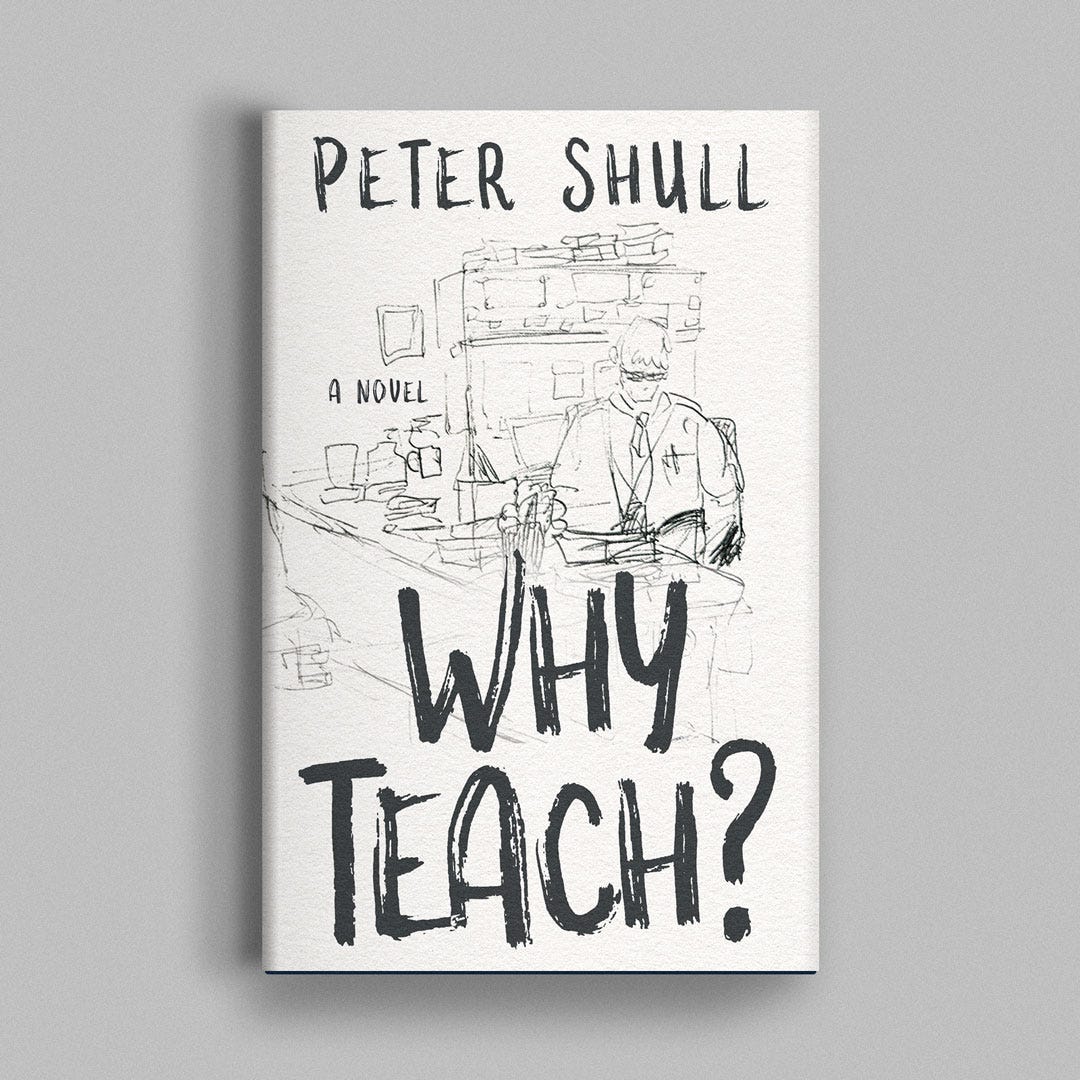
I designed the cover for Peter Shull’s novel Why Teach? He’s currently serializing the book over on his newsletter. You should check it out.

On the “Blog”

The Latest for Paid Subscribers
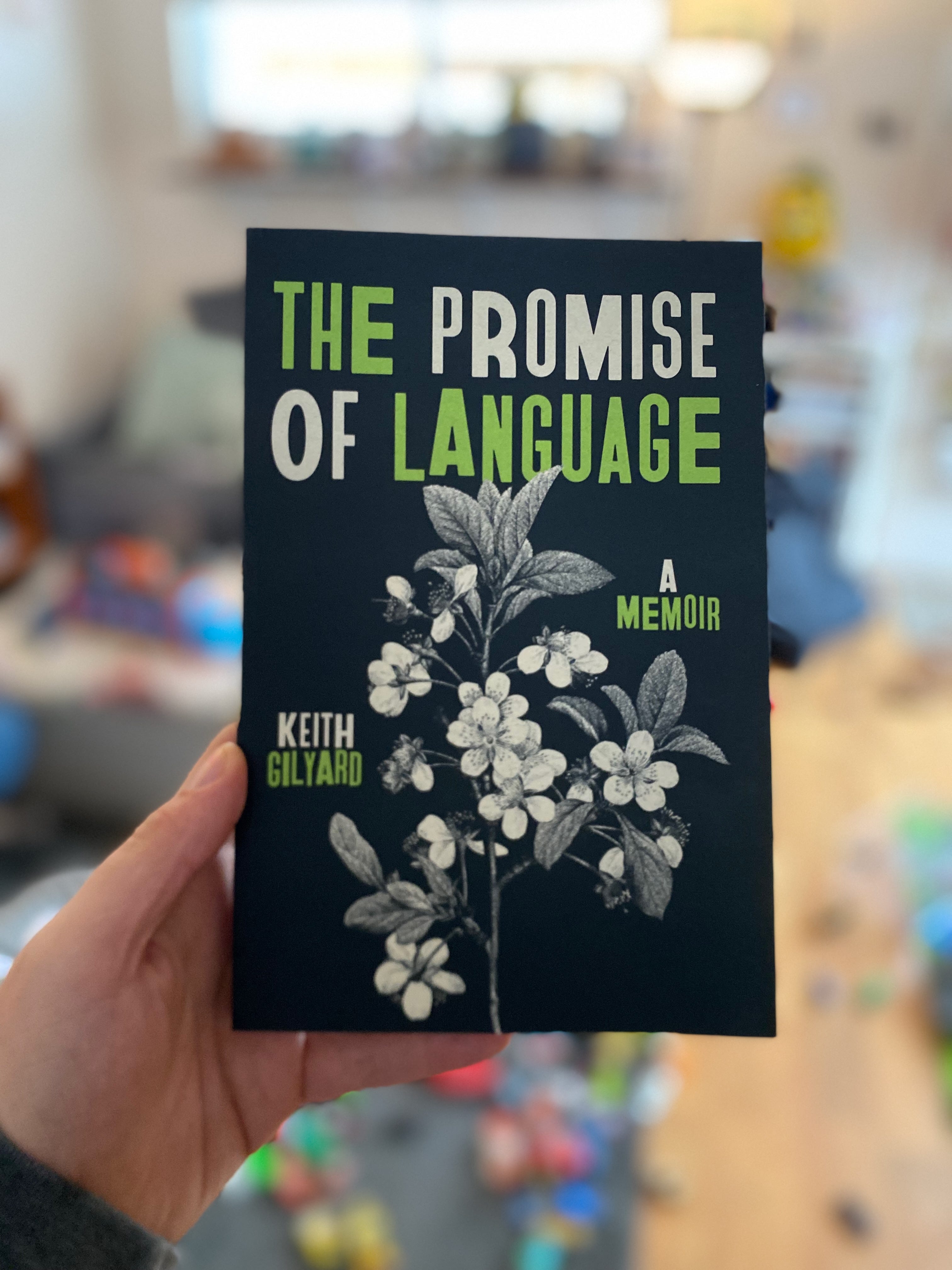
A breakdown of how I designed the cover for The Promise of Language by Keith Gilyard.

What I’m Reading (links)
The Hardest Working Font in Manhattan by Marcin Wichary (thank you to John Ward for sharing this with me!)
What Trump Taught Me About Executive Orders by The Maven Dispatch
Thanks for reading!
Thank you for reading. I’ve written a couple personal-essay-like things in this newsletter, but not really since pivoting to focus in exclusively on book design and creative practice. I wanted to challenge myself to do both, and it’s something I’d like to try and do more of.
If you liked this, please let me know. If you didn’t, well, just be kind. My writing skin is not as thick as my design skin.
If you find this newsletter valuable, you can let me know by buying me a coffee or becoming a paid subscriber. You can also buy Catch-22 using the button below—it’ll put a couple bucks in my pocket.
Paid subscribers gain access to How to Design a Book Cover, my bi-weekly bonus series that breaks down my process from sketch to final cover. You can read the first post in that series for free here:


Related Reads


Poor guy did not know what to do with a boy after raising two girls. I am not handy and I don’t like cars as much as he might like, but I think he did a great job.
I vaguely remember that when my parents bought this particular bed, there was a choice between bookshelf and CD rack. I’m not sure I can wholly take credit for the bookshelf choice, but I am grateful regardless.
30? Time, slow down.
Six? Time, slow down.
And sometimes not so seasonally.
True story. I had a Sports Illustrated screensaver application in which you could toggle “swimsuit” on and off. One day, I forgot to turn it off.
Did this book cover also predict my love of collage? Holy shit.
Loved your newsletter Nathaniel so interesting and I appreciate hearing about the human being behind the work. Lots of love to you and your family and sister. She sounds like an amazing woman. 🌷
As dated as they are, I think the one-two hit of Goosebumps and Animorphs designs never really left my taste. Extremely brightly colored, often textured, and usually layered with several faming devices, it's really no surprise I turned into a glitch artist and react to strong patterns and basic digital shapes.