

My First Book Design Wasn’t Very Good
We all start somewhere.


I designed my first book when I was in college. I didn’t know it then, but it wasn’t very good.
I studied graphic design at Central Michigan University, where at the time one of the classes in the program was, essentially, a portfolio class. Geared toward juniors and seniors, the class consisted of nothing but four deadlines. Students decided upon and created the assignments ourselves.
A quick recounting of the projects I chose reveals an earnest self-portrait of who I was at twenty years old:1
A branding project for a made-up company called “Tea for Two” in which I created posters, packaging, and a mug.
A booklet/publication of sorts called “Banned Books” that presented the opening lines from several, well, banned books.
A poster series for the film 500 Days of Summer.2
A cover-to-cover redesign of Fahrenheit 451 by Ray Bradbury.
Back then, Fahrenheit was my favorite book. It’s still one of my favorites. I was obsessed, and still am, with this quote from Faber to Montag toward the end of the book (emphasis mine):
The books are to remind us what asses and fool we are. They’re Caesar’s praetorian guard, whispering as the parade roars down the avenue, “Remember, Caeser, thou art mortal.” Most of us can’t rush around, talking to everyone, know all the cities of the world, we haven’t time, money or that many friends. The things you’re looking for, Montag, are in the world, but the only way the average chap will ever see ninety-nine per cent of them is in a book. Don’t ask for guarantees. And don’t look to be saved in any one thing, person, machine, or library. Do your own bit of saving, and if you drown, at least die knowing you were headed for shore.
I incorporated the bolded part of this quote into several projects in several mediums across multiple classes.3 Earlier that year, my mother had purchased me a copy of Cover by Peter Mendelsund and for the first time I considered book design as a career path. So it was only natural I would choose to design the whole book.
You’ve been so patient! Here I am, like a recipe on the internet, telling a story before getting to the good stuff. Here are some photos of the book:

I don’t think this is good, but it’s also not the worst thing I’ve ever seen (or designed). I know several of my readers are interested in publishing their own books—I’m not sure if you will think this is bad or curse me for thinking it is bad. Here are a few grains of salt that hopefully offer some perspective:
This is below my skill and taste today, 11 years later and now six years into designing books professionally. This is early work, but also:
This was a couple of years into a graphic design degree, and several years after I first starting messing around with my dad’s copy of Photoshop Elements4 in high school. This was an intensive period of improvement where my job was basically art and design and learning.
Let’s critique the components.
Form and feel

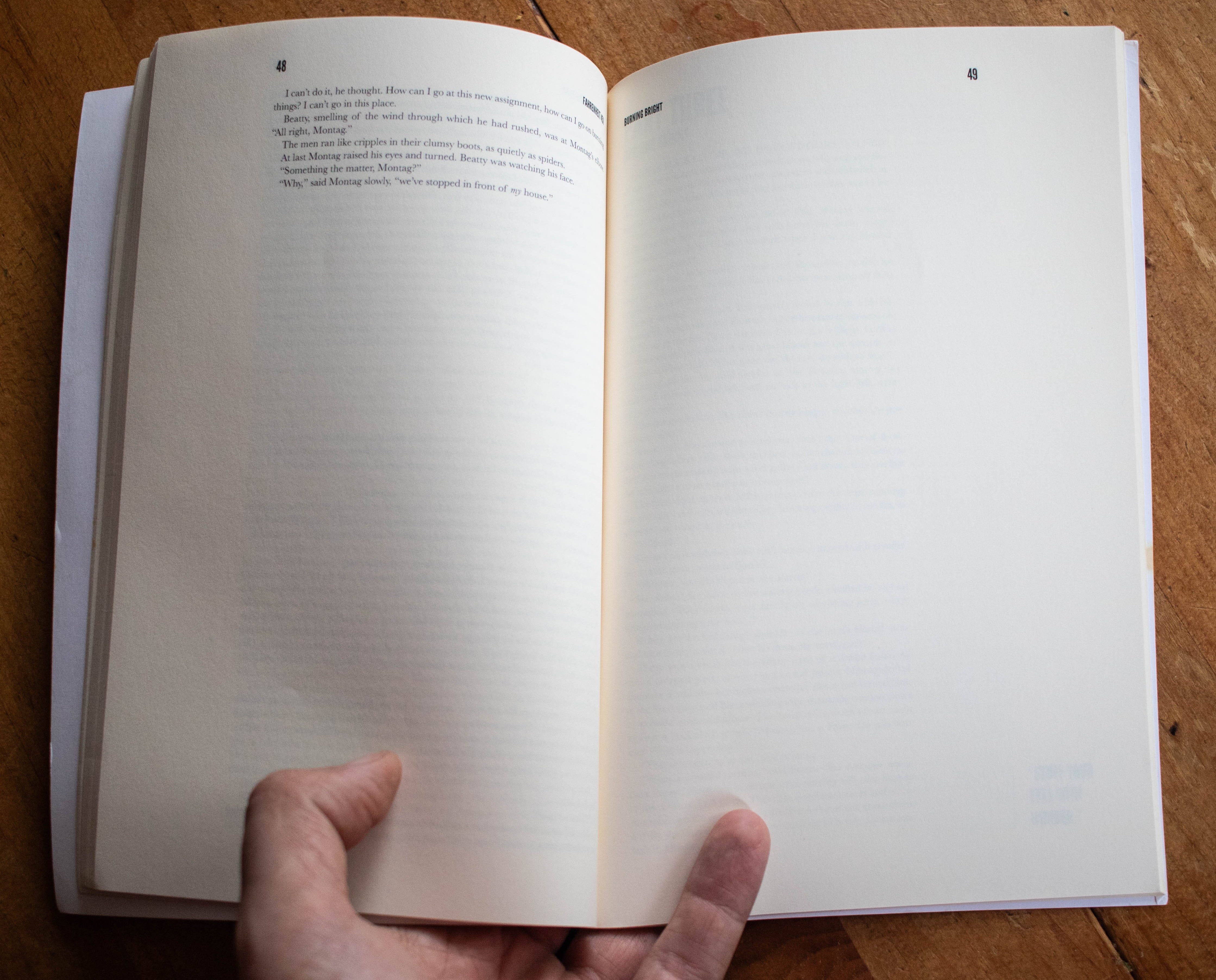
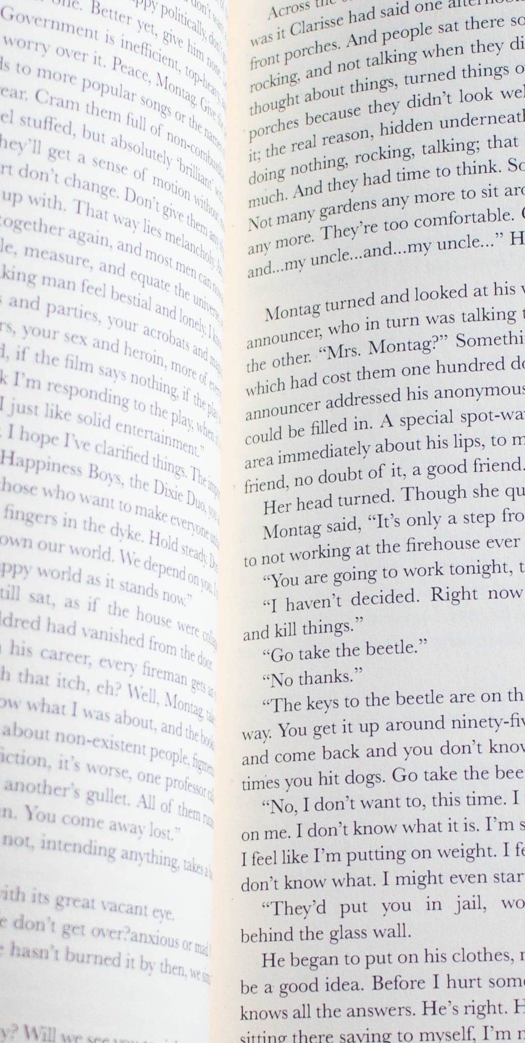
In my opinion, there is little worse than a thin, floppy book. This book may be the genesis of that opinion. With this project, I have a tangible memory of what is a rite of passage for every young graphic designer in the digital era: getting something back from the printer that looks and feels different than you expected. This happens when you lack experience and only work on screens.
The book is thin and floppy (72 pages) because:
It is not a long book. The internet guesses it is around 40–45,000 words.
I chose a 6x9” trim size.
I typeset the interior with small type: 8pt Baskerville to be exact.

Interior
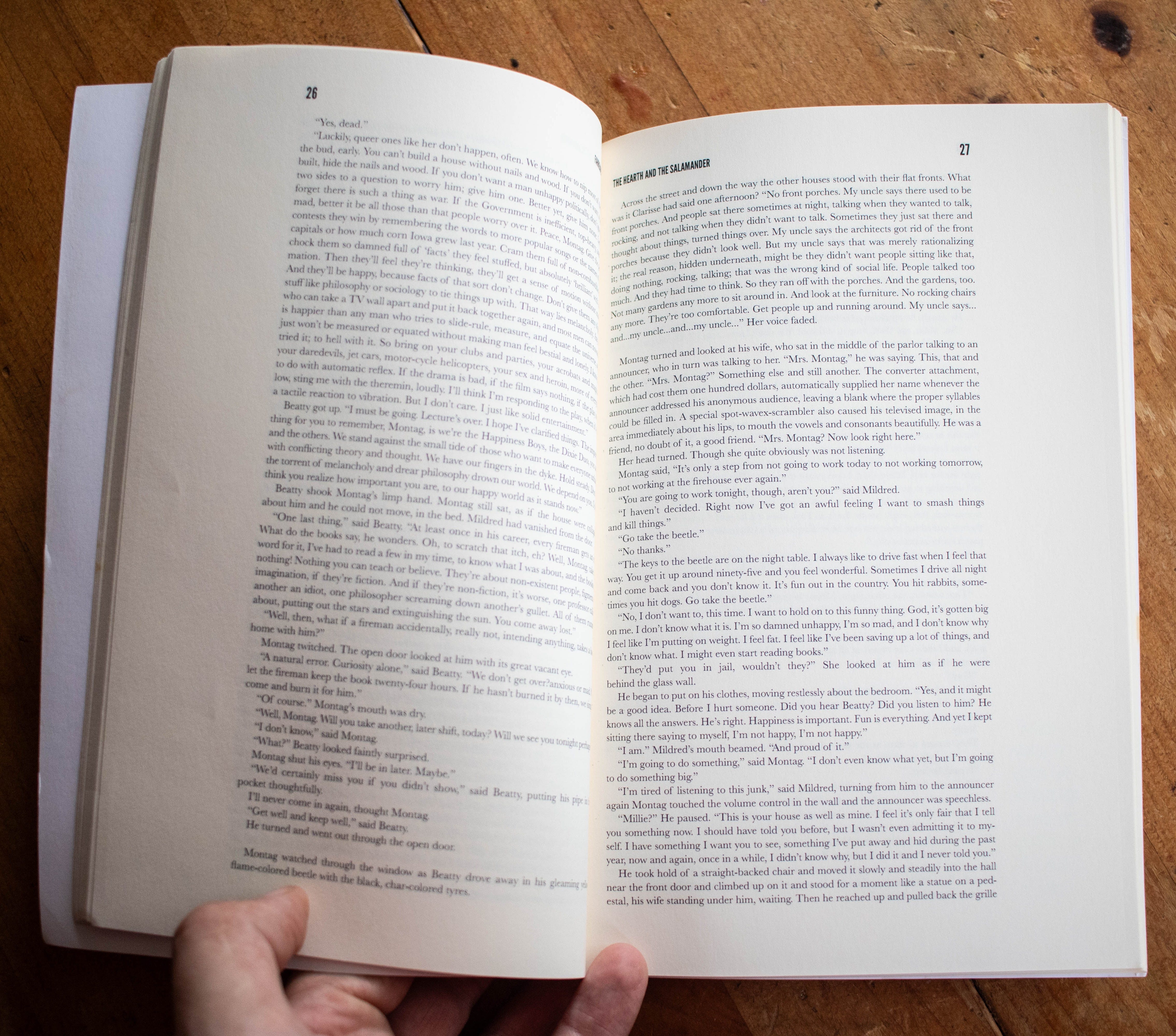
Like I said, I set the type in 8pt Baskerville. This was a bad idea. Baskerville is a nice typeface, but 8pt is too small. As my professor joked, “This book is only for readers under the age of 25.” For reference, most non-large-print books are set in 10 or 11pt. My rationale was basically “I like small type.” This was, hopefully obviously, insufficient reasoning.
HuffPost: One Of Today’s Most Popular Fonts Has A Wild, Centuries-Long History
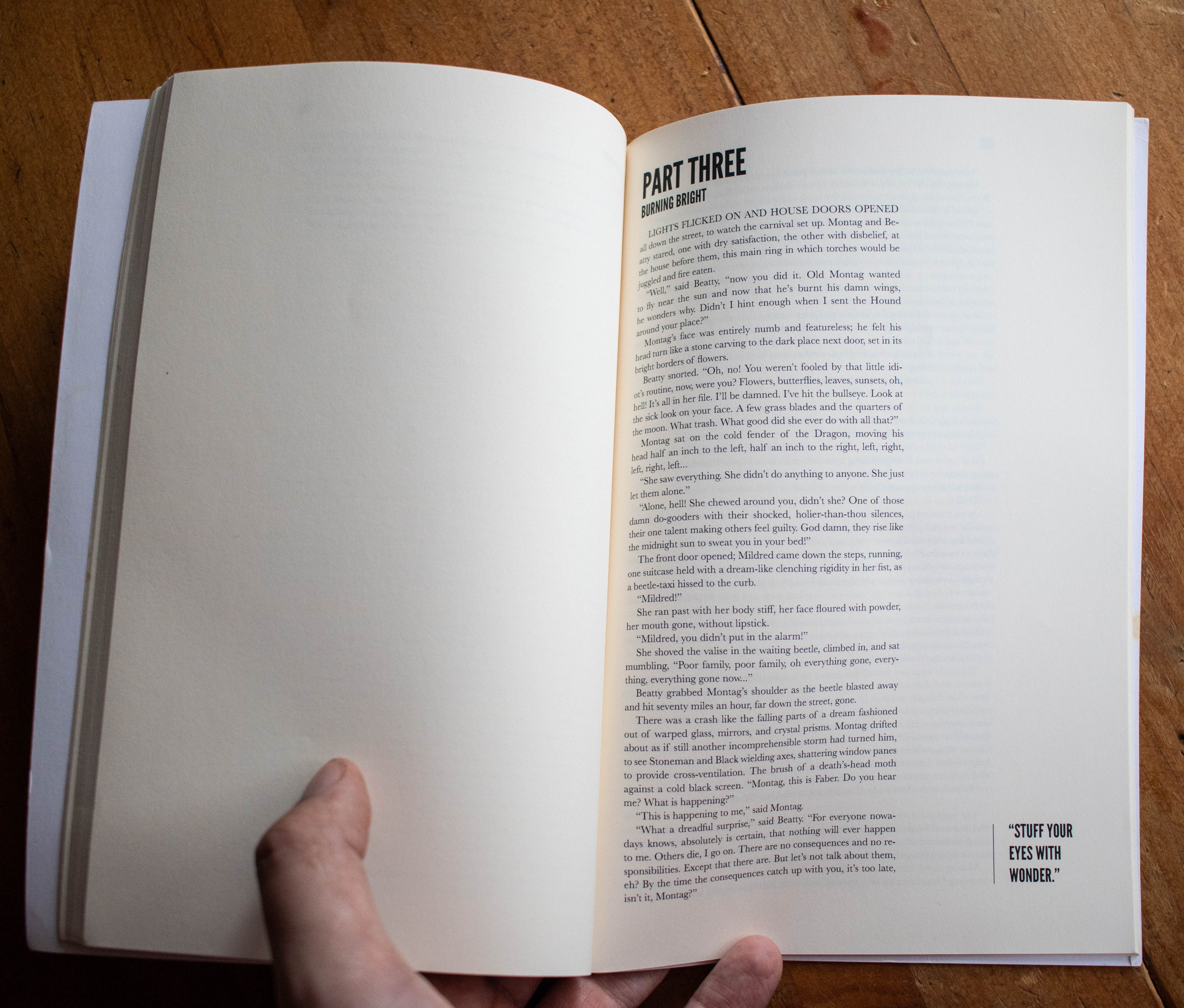
You’ll also notice I did some weird shit with the margins. This was intentional, albeit poorly executed. The outside margin is massive. This was an attempt to accommodate marginalia, or notes in the margins, something I loved then and still do. I like this concept, but I would do things differently now. I think the pull quote on the first page of each of the book’s parts works okay, but not the way I changed the outside margin on these pages to make it even wider.
The most egregious problem with the interior of this book are the inside margins. In a normal, professionally-typeset book, the interior margin is often wider than the outside margin. This is to accommodate the book’s gutter. If not wider, at least 0.75”. The gutter is the middle of a book’s spread where the pages are bound. Because I didn’t increase the inside margin, the book’s text gets sucked into the gutter and becomes difficult to read.
Other notes:
I also indented every single paragraph. As I’ve written before, paragraphs at the beginning of chapters and sections need not be indented.
I used League Gothic, a free and open-source font, for headings. I stand by this choice!5
There are several typos left in the book. I copied the (copyrighted, I should say) text from some PDF I found on the internet and had to fix several of the bad line breaks that often result from doing this. I missed some, as well as several other formatting-related errors. Typesetters should not also be proofreaders.

Cover
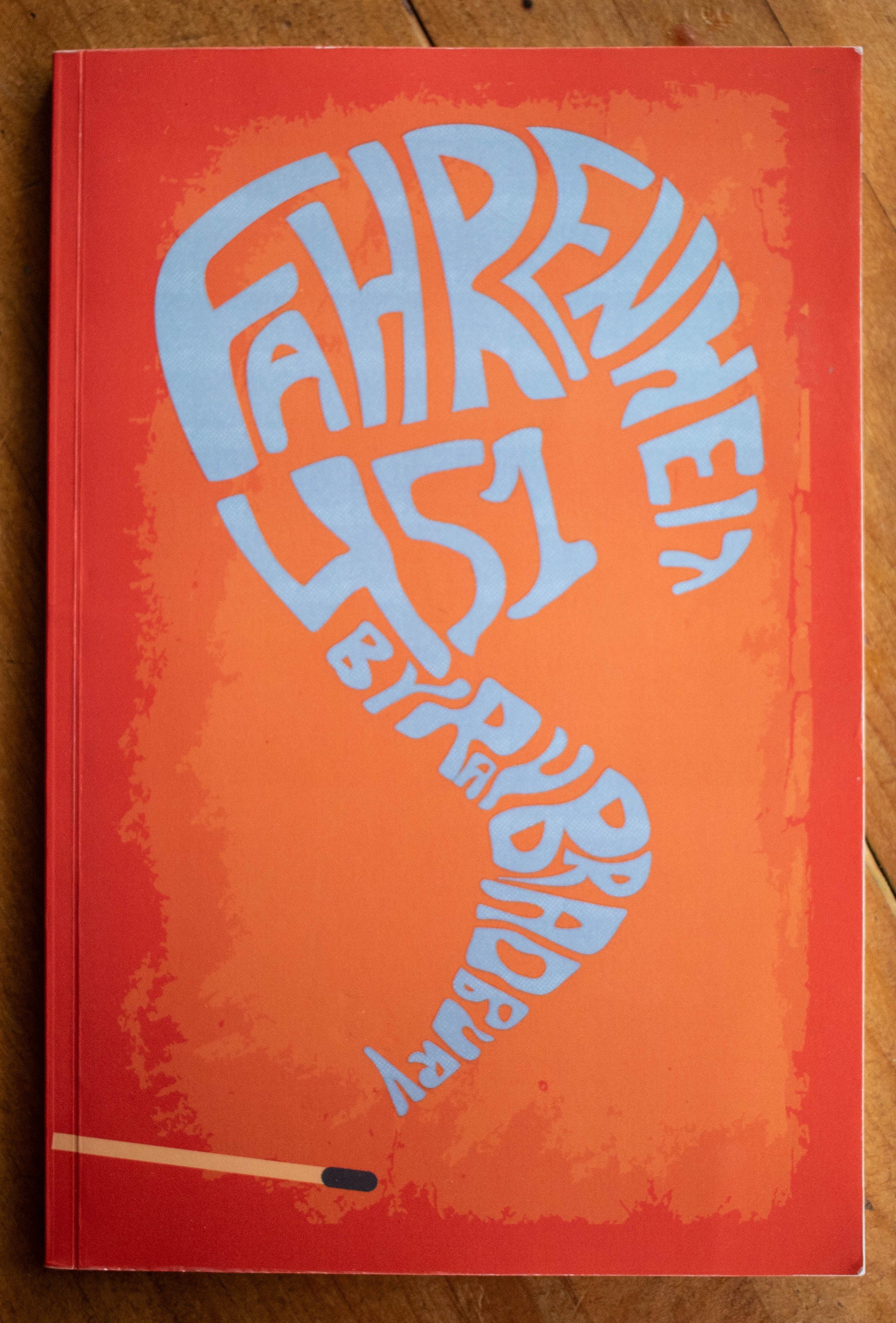
Lettering is not my strong suit now and it was even less so then. It’s not like I didn’t know that, so I suppose I must give my younger self credit for some chutzpah. However, this is an amateur effort.
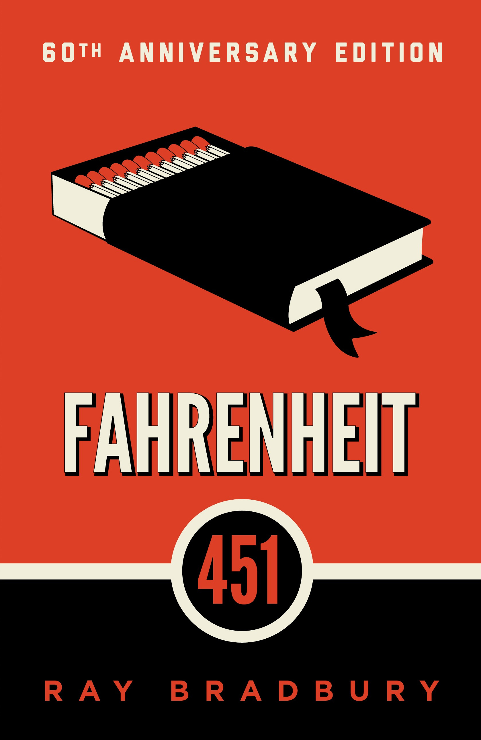
I like, but don’t love, the concept of the title as smoke billowing from a match. The 60th anniversary edition of the book published in 2013 also uses matches, and in my opinion, more successfully. Designing mine just one year later, I bet I cribbed my idea from this edition.
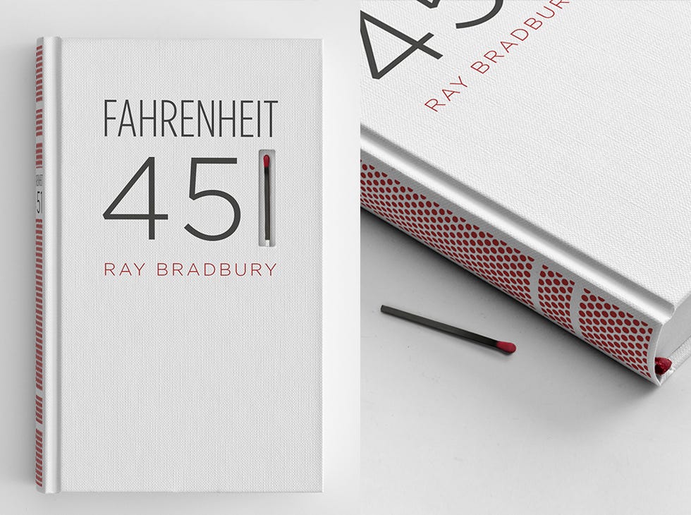
Though neither hold a candle—or matchstick—to the original Joseph Mugnaini cover artwork, this incredible student project that turned the book into a matchbox, or this special first edition of the book bound in flame-retardant asbestos.6
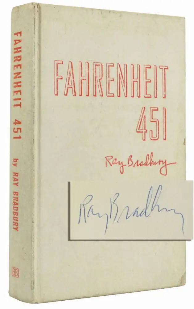
There’s some decent texture on my cover’s background and lettering that adds some visual interest, but it is conspicuously missing from the very flat-looking match in the bottom left corner.
Spine and back cover
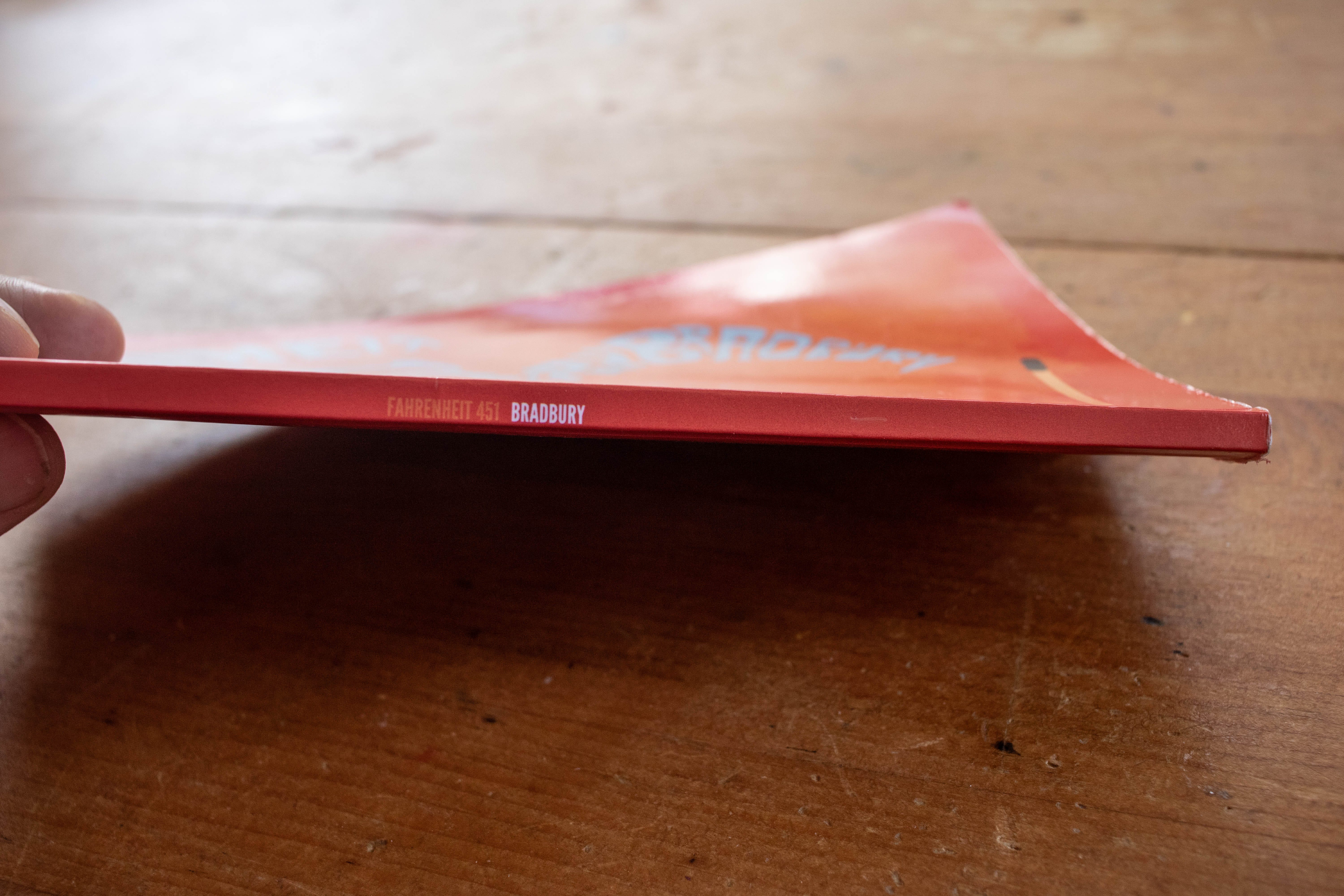
As previously mentioned, this is a thin and floppy book—just 72 pages. As a result, the spine is also thin and left little room to do much of anything. I set the title and author name again in League Gothic in a tiny point size. “Fahrenheit 451” on the spine has too little contrast with the background color, and the text is off-center, though I’m not sure if this is designer or printer error. I was a novice and I used a POD printer, so it honestly could have been either or both.
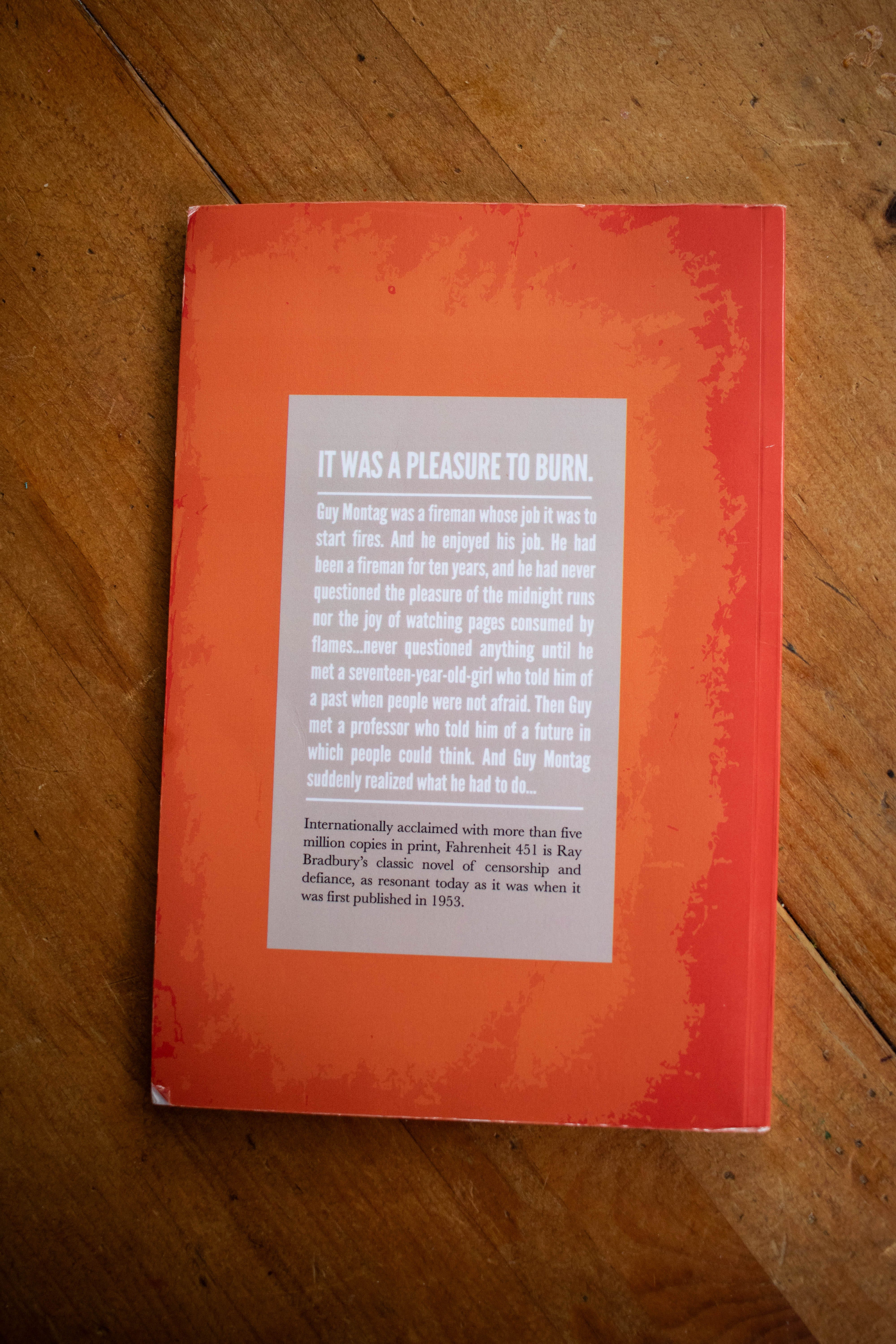
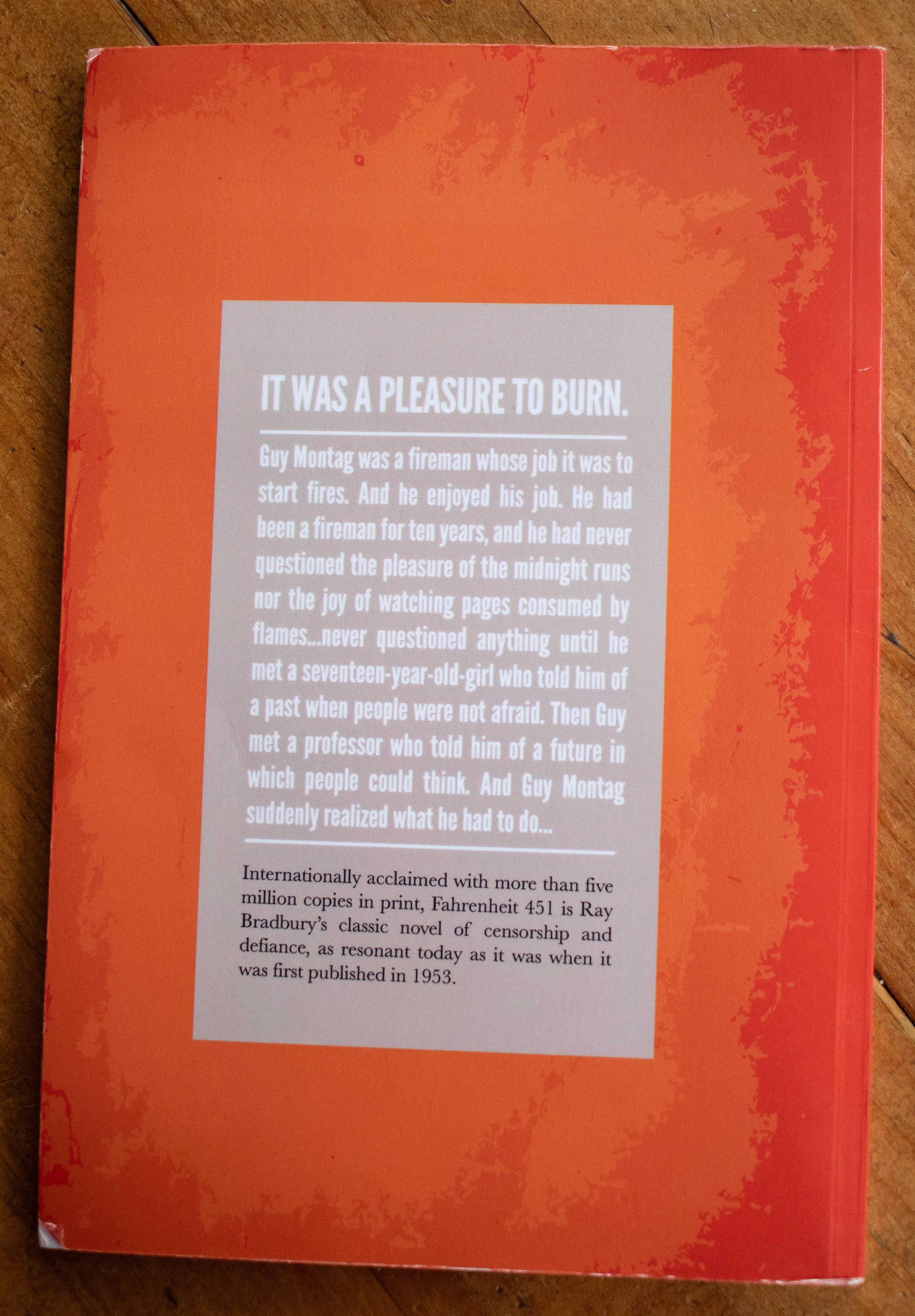
The back cover mirrors the texture from the front, which is a respectable if uninspired choice. Today I might do something similar but alter it so that it’s not just a direct mirror.
The back cover type is okay. Not awful, not great. I would increase the letter spacing of the “pleasure to burn” heading, and adjust the justification and hyphenation settings of the following two paragraphs. There are some minor “rivers,” or uneven spaces between words.
The text is lifted from the back of my Bantam mass market copy of the book, which is fine for a student project, but is of course copyright infringement (as would be the whole project if I had tried to sell it).
What do you think?
So what do you think? Was my critique spot on? Do you like my old design? Leave a comment and let me know your thoughts.

In Case You Missed It

New for Paid Subscribers


What I’m Reading (books)
What I’m Reading (links)
The publishers who don't run away by Derek Krissoff
I Found My Face In The Trash by Peter C. Baker
this is what 80 looks like. by Viv Chen

Thanks for Reading!
Thank you for reading! I mean it.
If you’d like to keep this newsletter going and help me say no to designing soul-sucking books about corporate events, email marketing, and raising capital, consider becoming a paid subscriber or buying me a coffee.
Paid subscribers get access to How to Design a Book Cover, a bonus series illuminating my book design process, and Book Design Critiques, a bonus series in which I kindly and candidly critique a paid subscriber’s book design.
If memory serves, I took this class out of order. I was younger than most of my classmates. One of my peers created a branding project for beer, and brought samples. Everyone could drink it except for me.
I adored this film. If I’m embarrassingly honest, part of me still does.
The following year, I got “asses & fools” tattooed on my arm.
A lighter version of Photoshop with fewer features
The League of Moveable Type is a terrific open source type foundry and they also have an excellent newsletter with links about typography, if you’re into that sort of thing.
Anybody got a cool $17,500 I can borrow?
This is great! I did something similar with the first ever books I self-published back in 2009. Terrible. But I can't expect perfection on the first, as much as I tried to copy one of the "BIG 5" formatting styles cover to cover. Learned so much, and always learning, from your emails. Thank you for sharing. It helps when we see someone whose work is so amazing now to be reminded that we all don't start out that way. We all truly do start at zero before we improve with practice and consistency in our passions over time.
I really love those margins actually - but yes. I am okay with thin books that are small in size. 🫡