Outtakes for an Iconic Book Cover
The Girl with the Dragon Tattoo by Stieg Larsson
One thing I love about contemporary book cover design is the ability to see and share unused designs. The jackets that, for whatever reason—and there are myriad—were deemed the wrong fit for a particular book. Sometimes, it seems there are as many reasons not to choose a cover as there are atoms that make one up. Each feels like a little glimpse into an alternate reality.1
Most of the time, these unused covers are shared via social media. But occasionally, if a designer becomes a big enough deal, they publish a book—what we in the biz call a “monograph.”
Peter Mendelsund is one such designer. His 2014 monograph, Cover, is one of my favorite books and one of the reasons I got into this business in the first place. In his tenure at Alfred A. Knopf, Mendelsund designed the jackets for hundreds of books, many iconic, and none more so than the one for Stieg Larsson’s The Girl with the Dragon Tattoo.
The Girl with the Dragon Tattoo is a Swedish crime thriller. It was first published posthumously in 2005 under the title Män som hatar kvinnor (Men Who Hate Women) and translated to English in 2008.
For my money, whether you like it or not (and I do), this is one of the most iconic jackets of the 21st Century. But like any book ever published, this book might have gotten a different jacket—and, who knows, may have never become a sensation as a result.
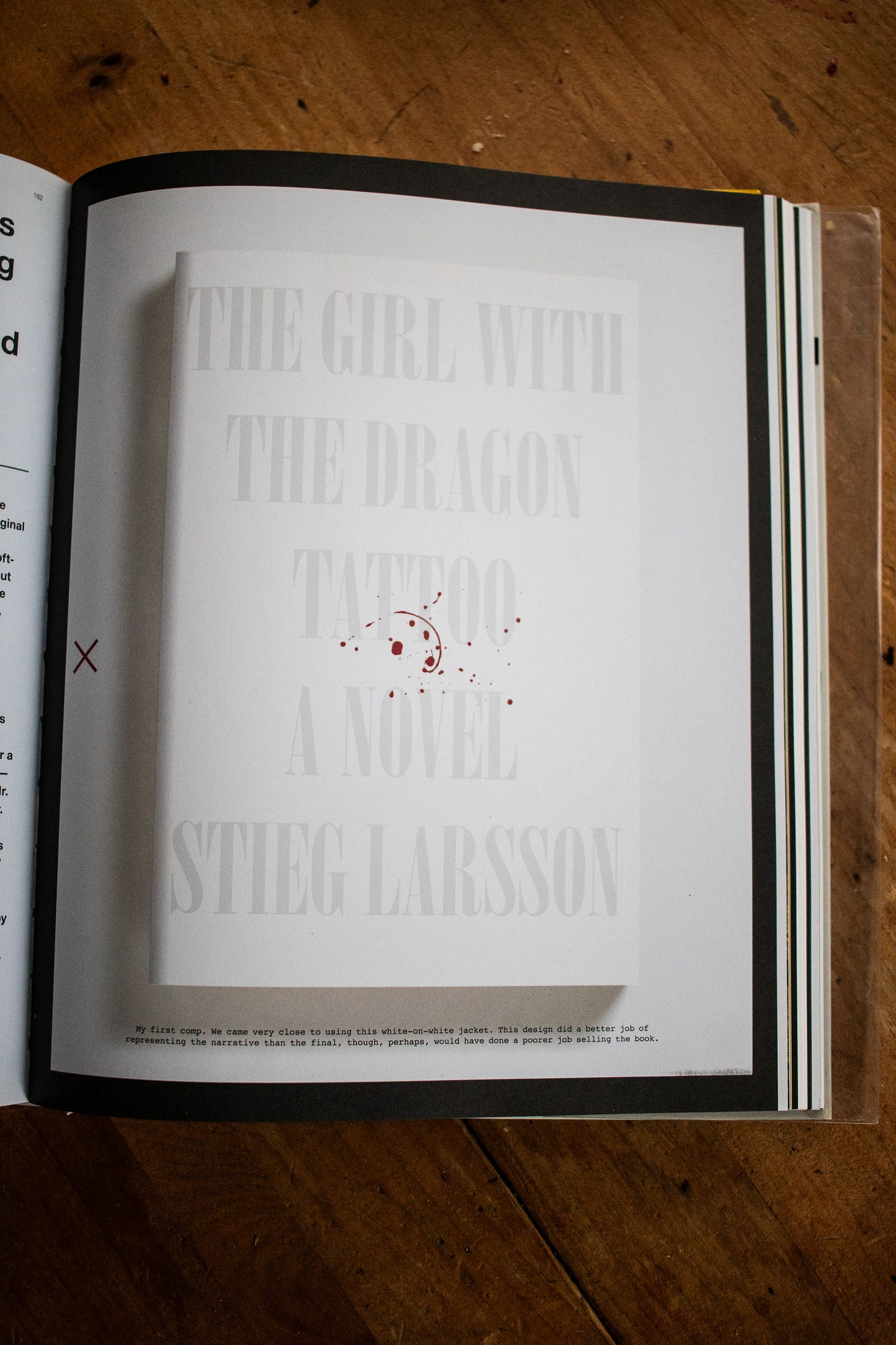
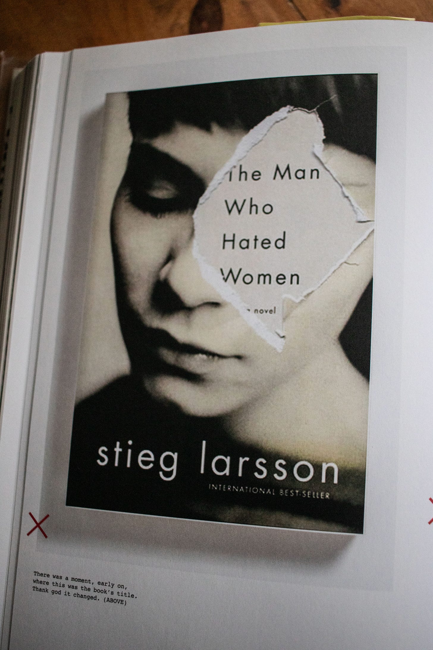
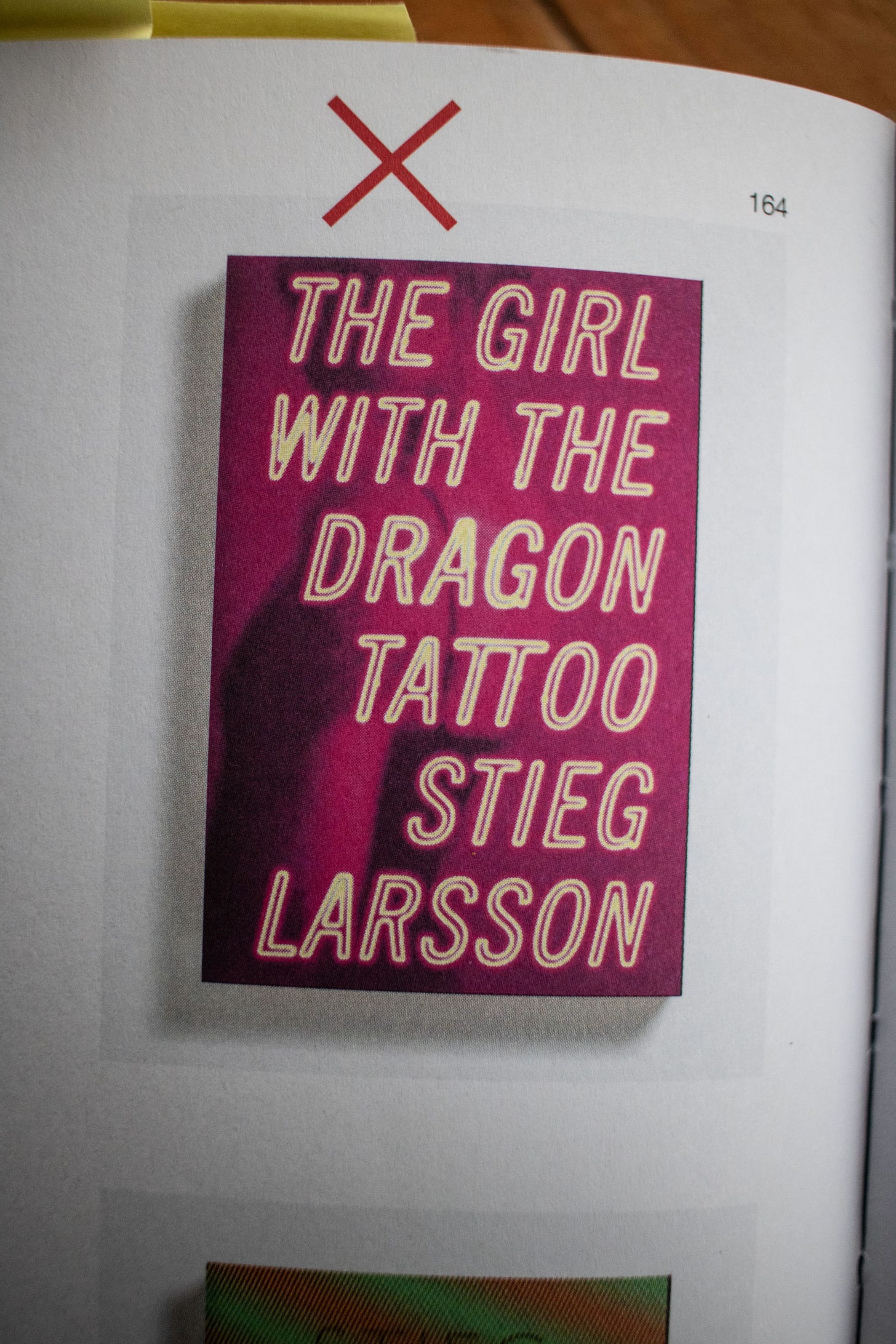
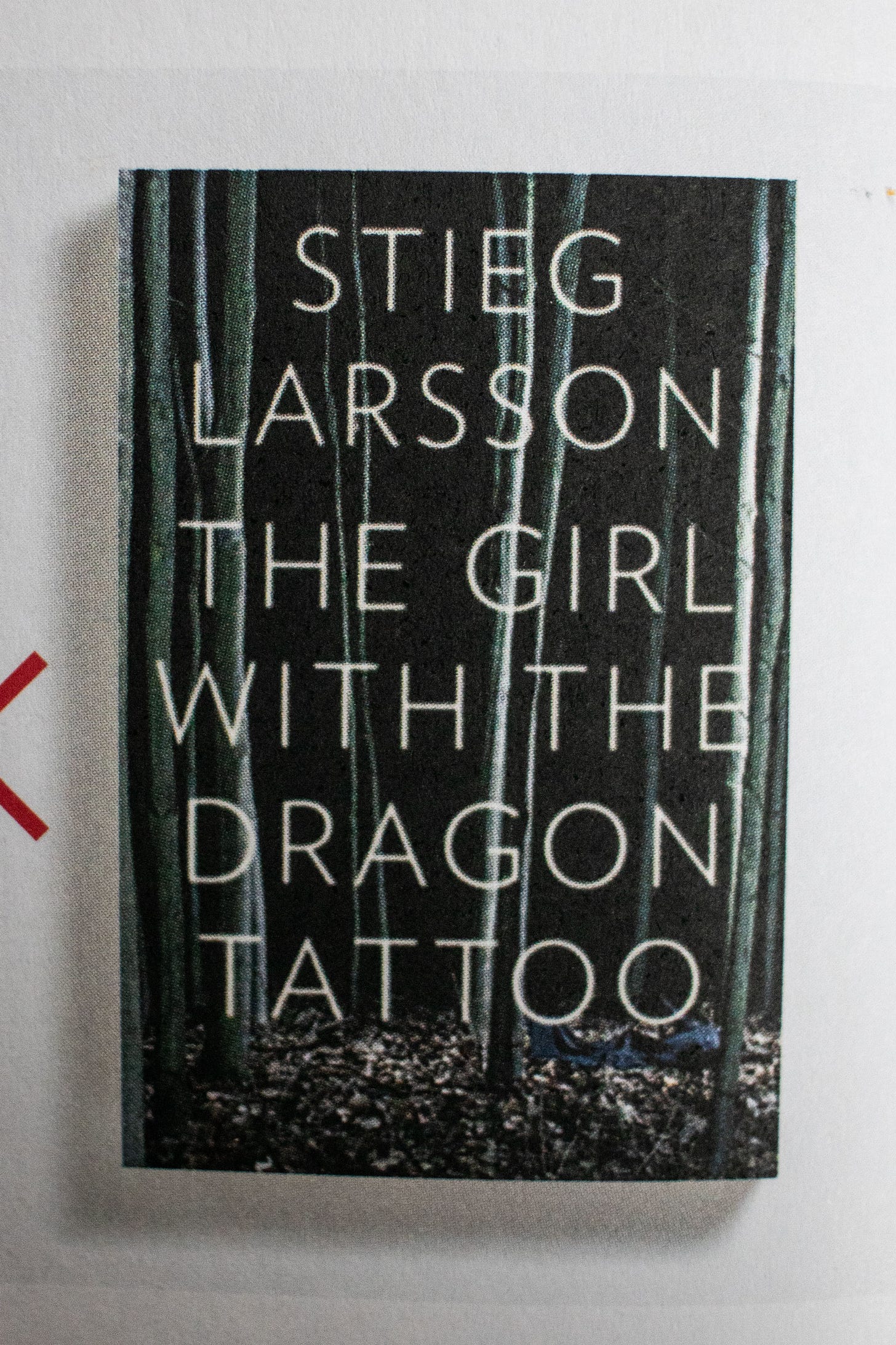
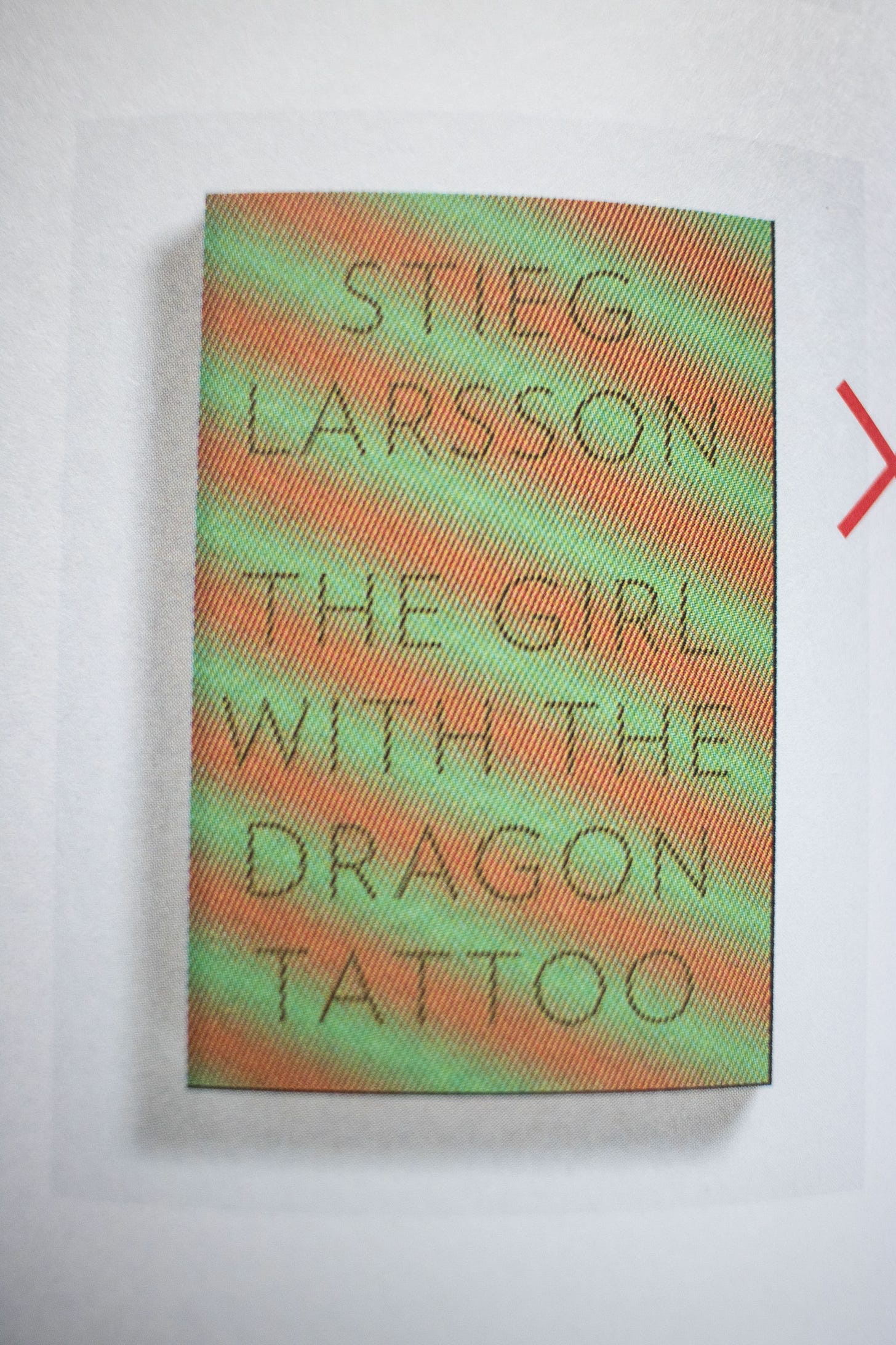
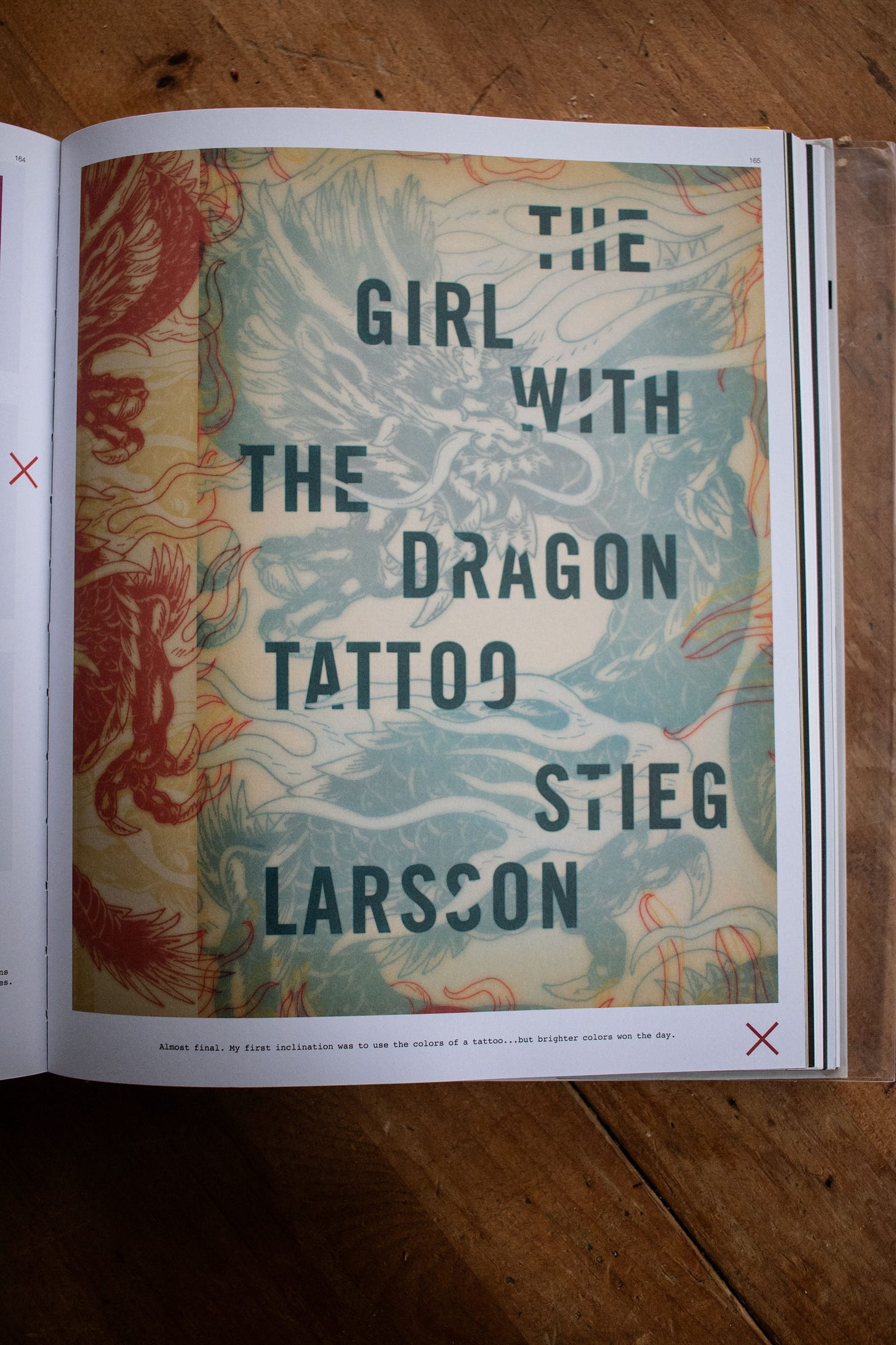
Here are some of the unused covers as shown in Cover.
“My first comp. We came very close to using this white-on-white jacket. This design did a better job of representing the narrative than the final, though, perhaps, would have done a poorer job of selling thee book.”
“There was a moment, early on, where this was the book’s title. Thank god it changed.”
“Almost final. My first inclination was to use the colors of a tattoo … but brighter colors won the day.”
I don’t think these are necessarily unsuccessful designs, and I agree that the first comp is a strong, conceptual design, but none of these feel right. This is most likely a product of such a well-known cover feeling inevitable when viewed in retrospect. Especially because I really like the book itself. I feel the same way about Catch-22.
What do you think? Do you prefer any of these unused covers to the published version? How does something becoming iconic affect someone’s perception of “good” design?
That’s all for this time. Thanks for reading!
P.S. While Googling around, I found this parody book called The Dragon with the Girl Tattoo. Enjoy.
Sharing unused covers also has the added benefit of illustrating how much work goes into designing a book cover that isn’t always obvious.




the dragon with the girl tattoo cracked me UP hahaha! But it was so fascinating to see this design process!
I love seeing the process (and the amount of unused covers, yikes!). Thanks for sharing these. I'm sort of drawn to the "almost final" version where he went with tattoo-like colors. However, I think the final in brighter tones was the correct choice.