

Designing a Book...ish Logo
Process for the Books on the Bed Podcast Logo

On occasion, I design something besides books. You know, like a logo with books in it.
Today I’d like to share the process behind my logo for the Books on the Bed podcast.
First: The Story Made Project
If you are lucky in this life, you get a few interesting friends. You may even have some talented ones. If you are supremely lucky, you have a few that are both. My friend Matt is one such friend.
Matt is and does a number of things, but for the last few years, we have collaborated on a project of his called The Story Made Project. In short, Story Made is a project exploring how stories make a difference in our lives. It is a project that is and will be many things—including, to date, two podcasts. I designed the podcast and episode art for both shows.
The first show, the eponymously named Story Made Podcast, is excellent. Matt and each guest—writers, filmmakers, community organizers, and more—explore how stories have made a difference in their lives. I like the art I made, too. Any excuse to break out the paint markers.
After that show ended, Matt had the idea for a new show, inspired by his conversation with one of the Story Made guests.
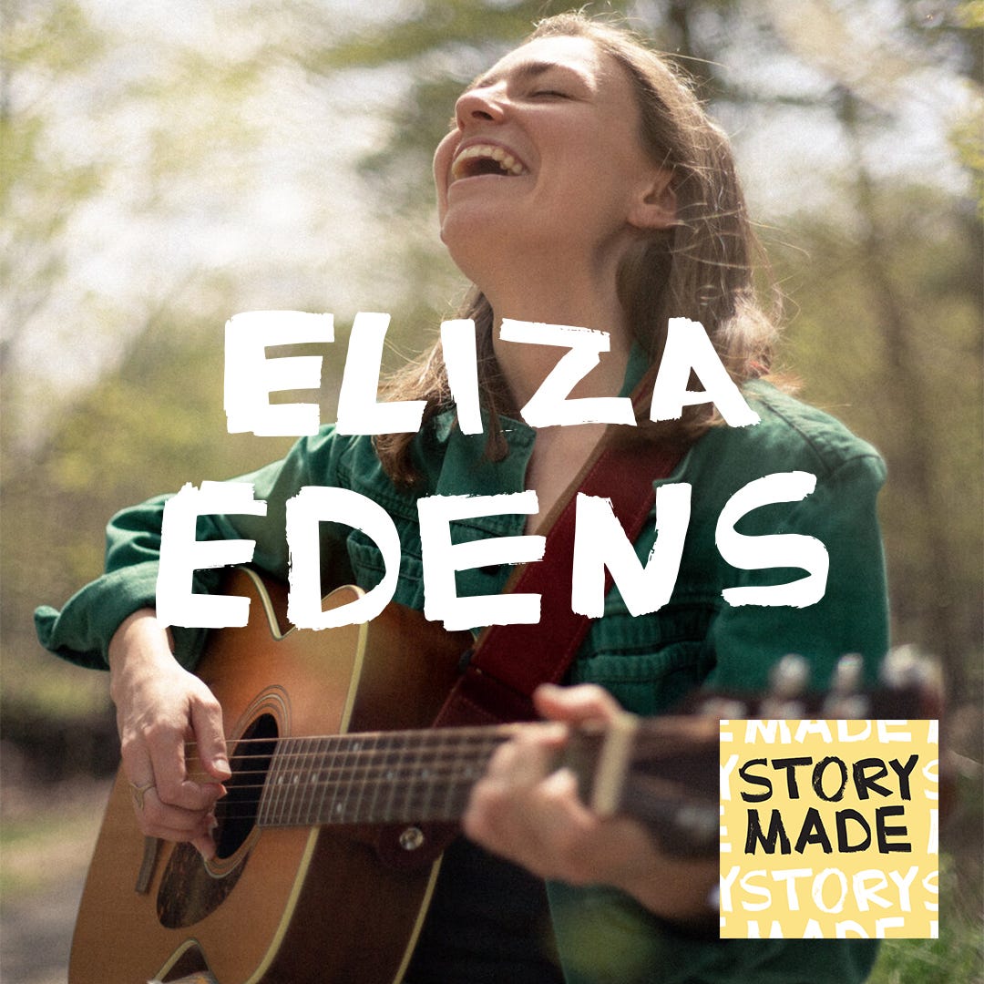
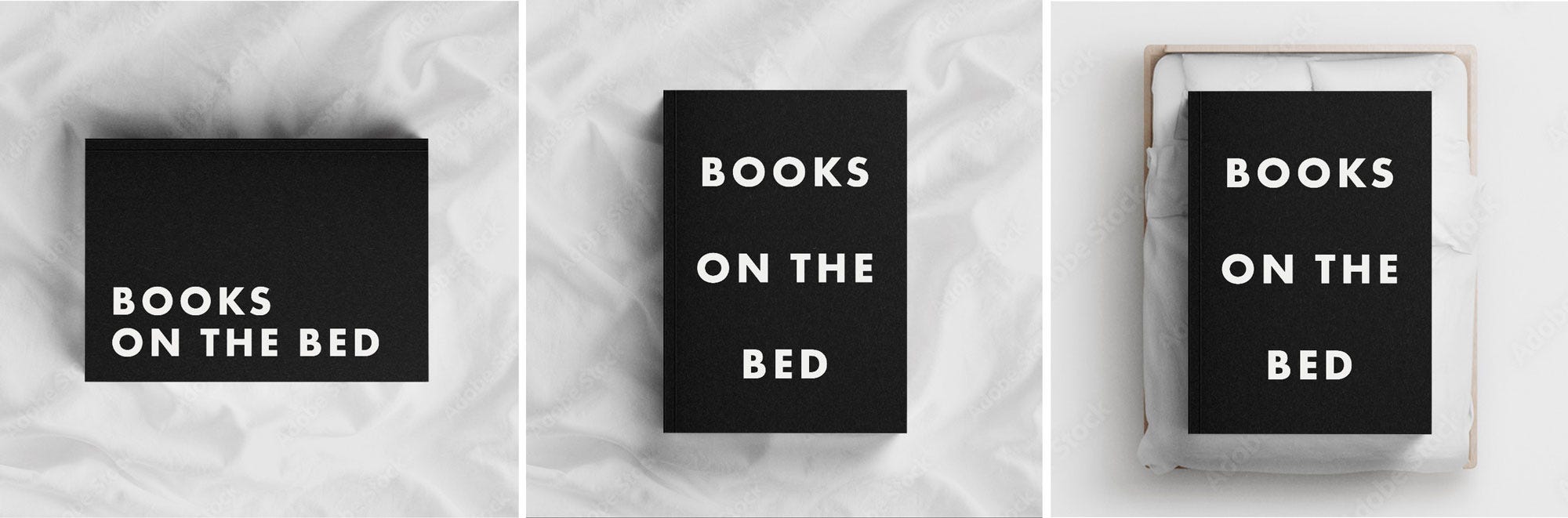
The new show would be called Books on the Bed.
Books on the Bed
“If I came to your town and stayed at your house, what books would you put on my bed?”
This is the question that animates the Books on the Bed podcast. The idea for the show arose when Story Made Podcast guest Curtis Rayborn left six books on Matt’s bed in Rayborn’s Tuskegee, Alabama, AirBnB.
Matt had a show, he just needed a logo. I was more than happy to oblige.
Designing the Logo
My process for designing a logo is pretty similar to my book cover process. I start with writing (bad) ideas, mind mapping, and sketching.
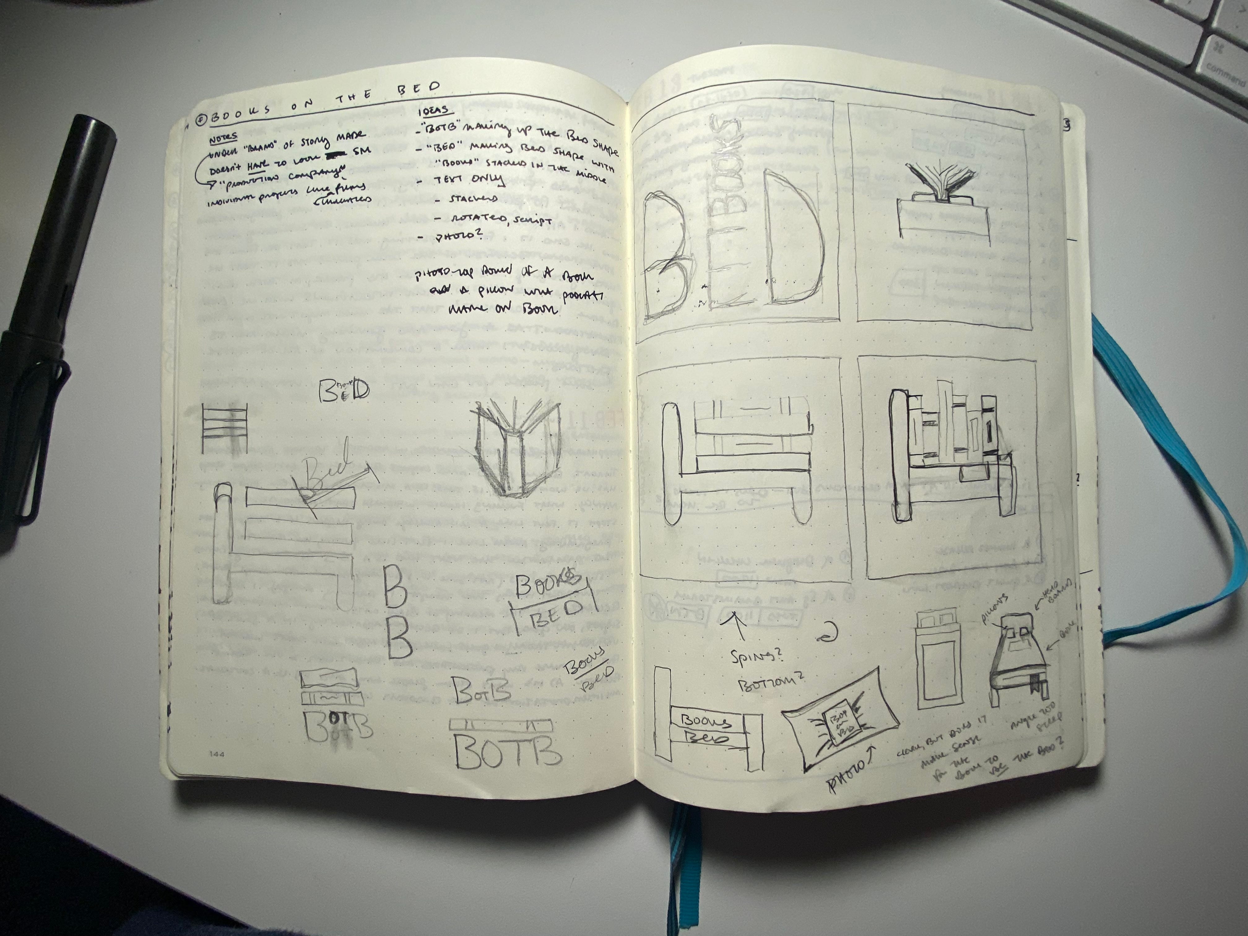
I’m not a great sketcher. I’m decent when I take my time. But I believe sketches don’t need to be great—they just need to work. They need to capture ideas.
“Books on the bed” is such a visual, evocative title. How do you illustrate it without being obvious or corny?
I started by taking a photorealistic approach. I thought that being literal and not trying to be clever might be the way to go. I considered doing a photo shoot, but moved on from the idea before that came to fruition.
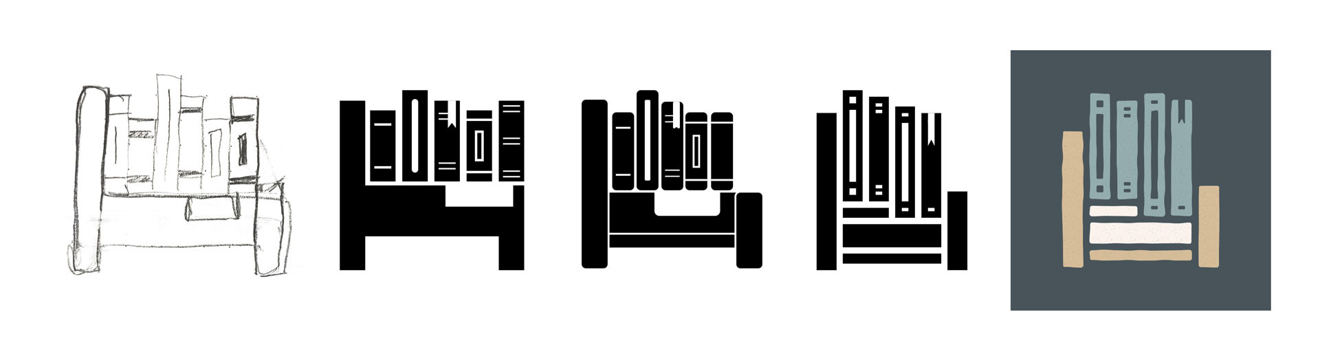
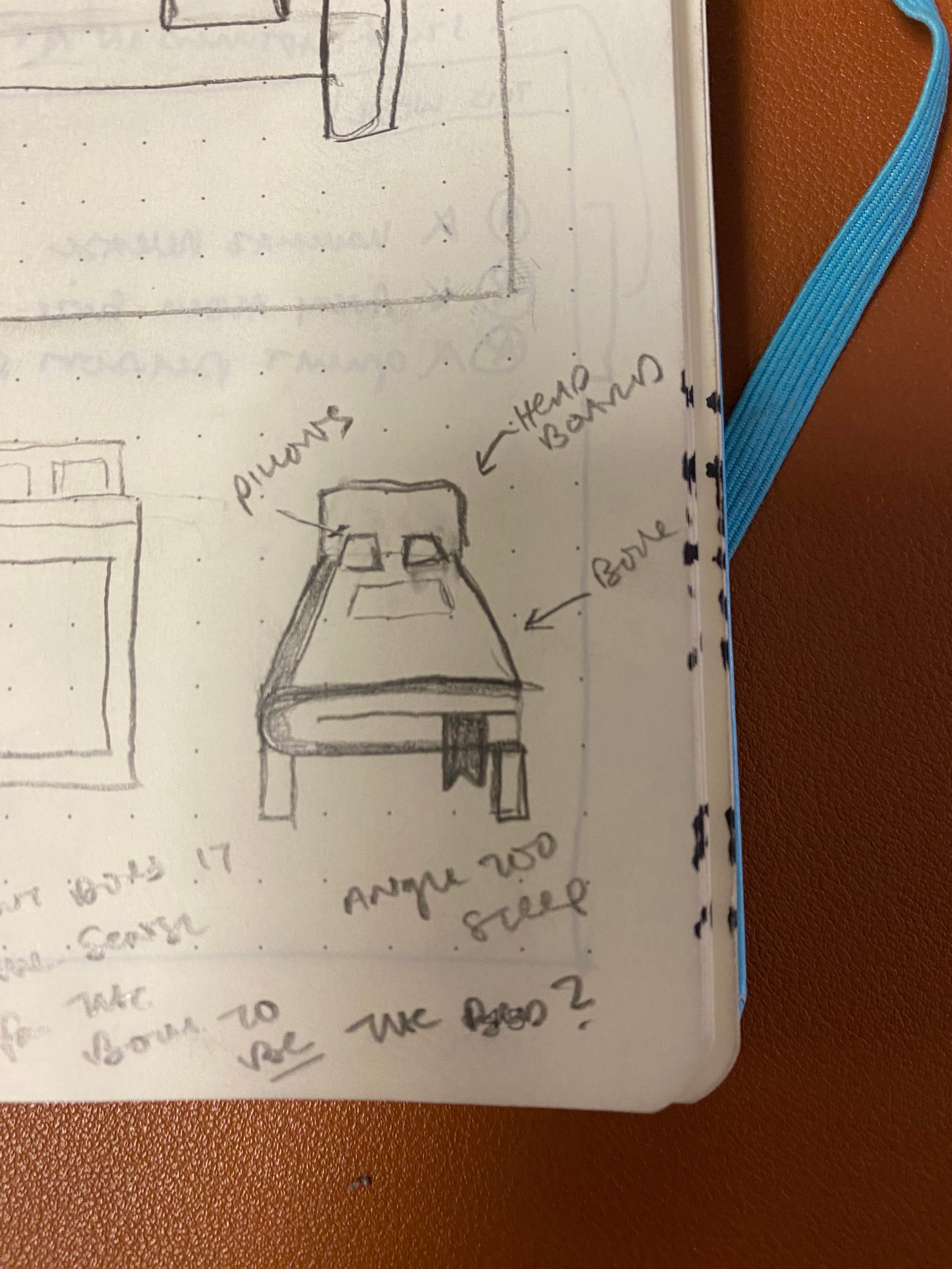
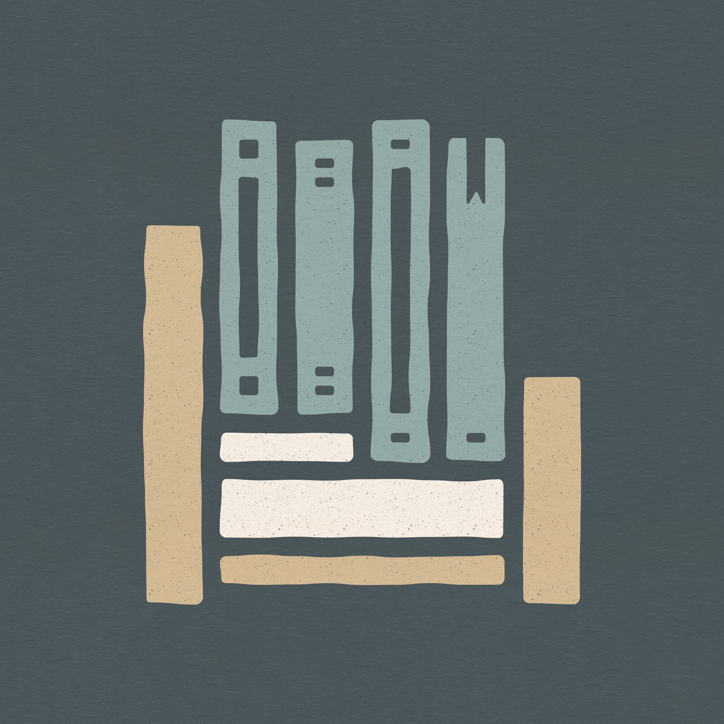
These were okay for sketches, but I wasn’t really excited about them. I set them aside to focus on one of my other ideas, combining a bed and a bookshelf:
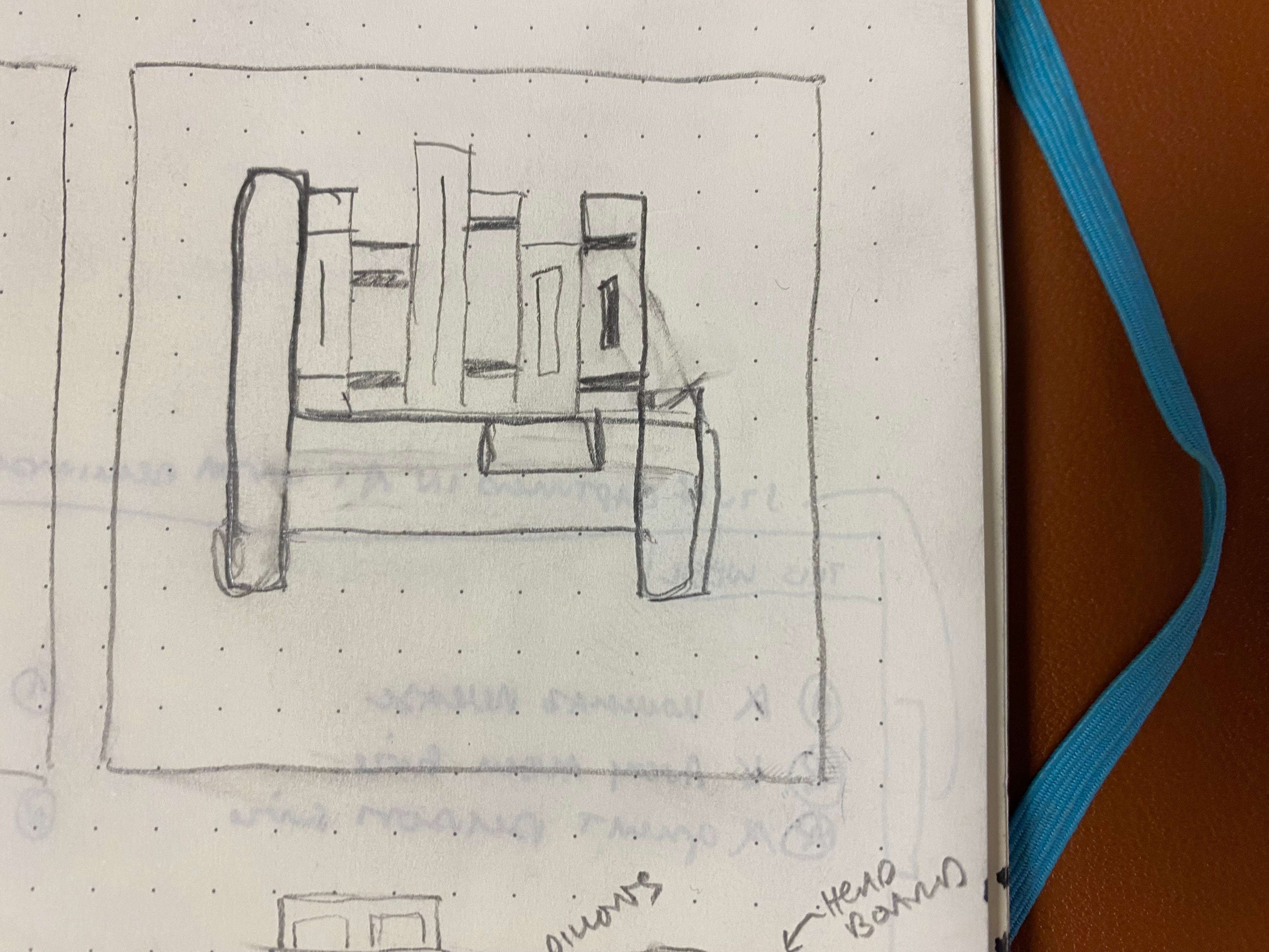

I started in black and white to try and nail the shapes before figuring out color. Even if it’s for colorful podcast art, a logo should work in black and white. I liked this idea, but the illustration wasn’t working yet. I wanted it to be simple, but these still felt clunky and unrefined.
Iterate, iterate, iterate. Like Aaron Draplin says, “vectors are free.”

I simplified the bed, slimmed down the books a bit, and increased the white space between the elements. Then I rounded some corners. I was starting to get somewhere.

It was time to explore color and typography. When picking colors, I always try to choose some that make sense, even if it’s for a logic that no one else will ever know. Rooting decisions like this in reason help me stop second guessing myself and I think imbues the logo with confidence. I don’t usually have to do much in order to convince Matt, but a strong rationale for design decisions can also help convince a client or otherwise invested party.
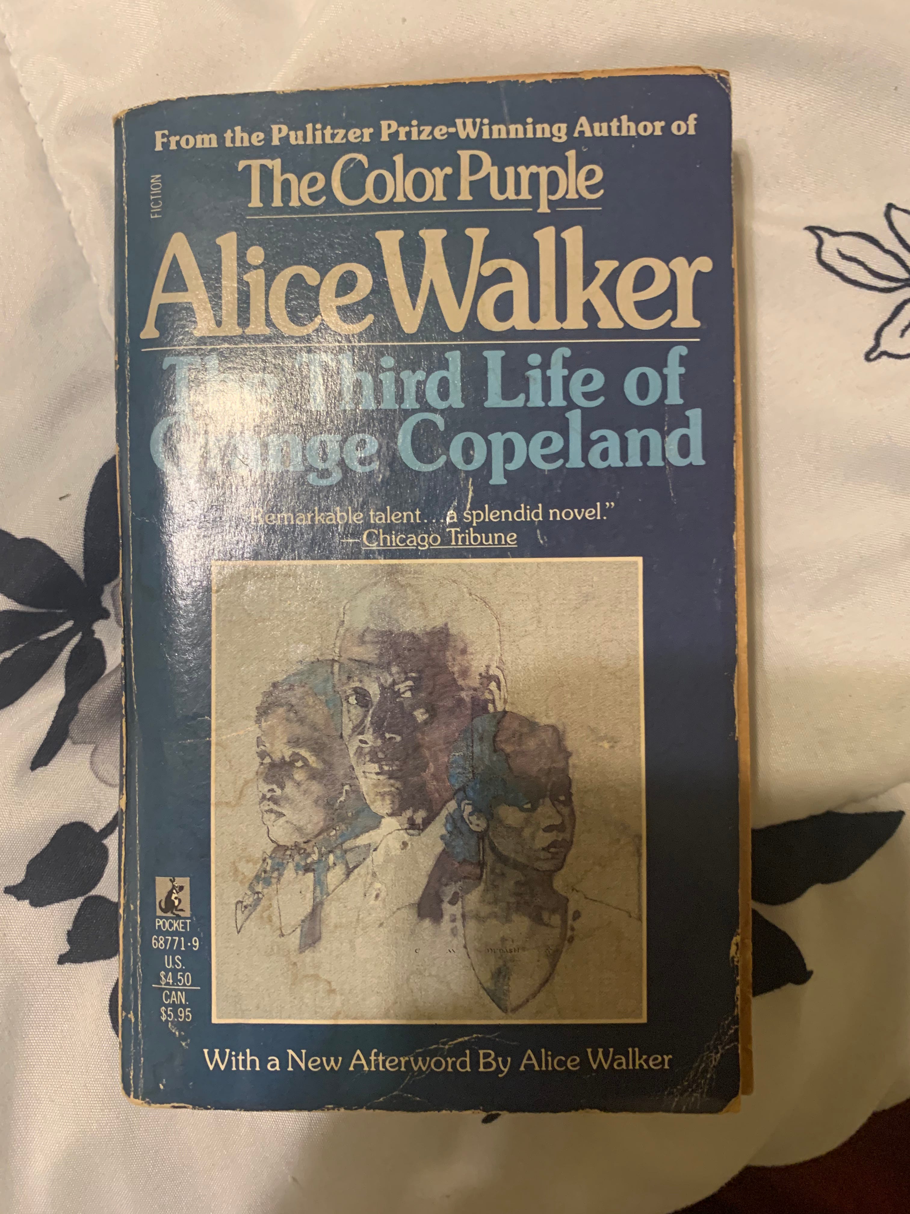
The color for this logo was inspired by the genesis of the show. One of the books that Curtis Rayborn left on Matt’s bed was The Third Life of Grange Copeland by Alice Walker. The book—and this experience—had an indelible effect on Matt. And lucky for me, his copy of the book has some great colors.

From there: I added the colors, some grain, a paper texture, and polished the icon off with a quick hit of the roughen tool in Adobe Illustrator. This logo was designed on a rigid grid, but I wanted it to have a slightly organic feel.
I tried some type I wasn’t sure about.

Then played with hierarchy. Better.

I tried several more sans serif fonts until landing on Brandon Grotesque. I dialed in the grit and roughen and we had our podcast logo.

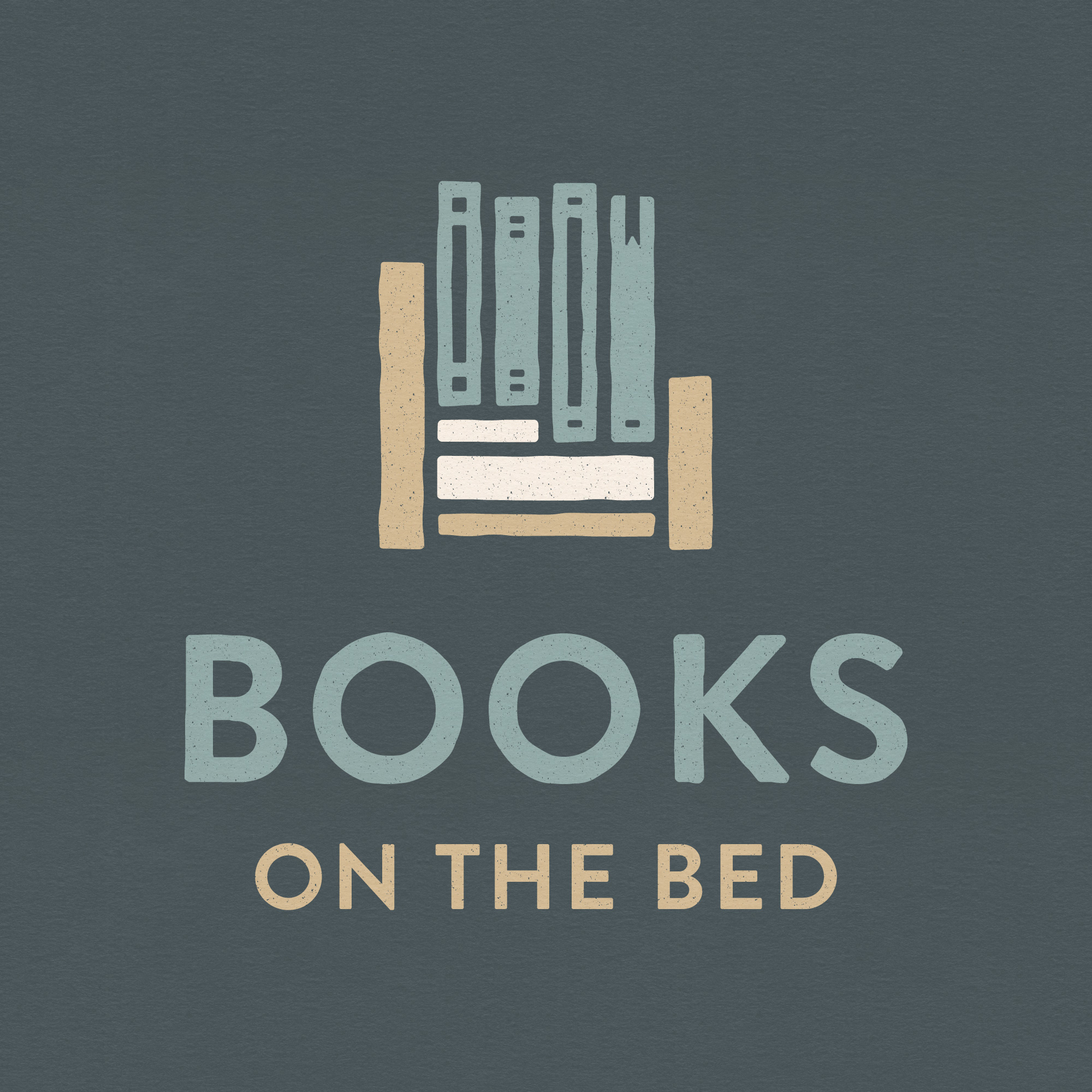
Thanks for reading! I hope you enjoyed this look at my process behind the design of the Books on the Bed logo, and I hope you will check out the show—just in time for its third season dropping March 6.
In Case You Missed It
Book designer Jason Arias wrote a guest post for How to Design a Book Cover, available to all:

What I’m Reading (books)
Persepolis Rising by James S.A. Corey
The Memory Palace by Nate Dimeo1
Next up with mom: Harry Potter and the Sorcerer’s Stone2
What I’m Reading (links)
The Written Image by Erik Winkowski, Paper Films
Your World is Weird Enough by Will Malone, Double Negative Dispatch
The Sobriety-Industrial Complex by Emelie Kaye Peine, Hooch Planet
What I’m Working On
Summer Game stuff at the library
Social media graphics for a nonprofit I love
A book cover about America’s war on terror
A book cover about fairy tales and appropriation
Finding the source of the bad smell in my pantry
If you’d like to keep this newsletter going and help me say no to designing soul-sucking books about corporate events, email marketing, and raising capital, consider becoming a paid subscriber or buying me a coffee.
Paid subscribers get access to How to Design a Book Cover, a bonus series illuminating my book design process, and Book Design Critiques, a bonus series in which I kindly and candidly critique a paid subscriber’s book design.

Slowly, slowly, slowly … I like this one a lot. I’m just reading it in small chunks.
This is a big deal! When I was young, I wasn’t allowed to read these books.
I love the final color scheme. Good work, Nathaniel.
That was super fun to see the behind the scenes! Thank you for sharing.
Am I the only one who wants to know what the bad smell was from? That feels like a terrible tease to have finding it on the list but crossed out...