

How Jason Arias Designs a Book Cover: The Squid and the Spaceman
A free guest post!


Hi there,
Welcome to a very special guest-post edition of How to Design a Book Cover, the biweekly bonus series in which a book designer walks you through their process from start to finish.
This is the first of what I hope are several posts showcasing how other designers create a book cover. How to Design a Book Cover is usually a bonus series for paid subscribers only, but guest posts like this one will be available to all.
Today’s post is by Jason Arias, a kind and incredibly talented book designer I am lucky to know.1

Here’s what it says on his website’s about page:
Through plague, fallen empires, and the “free” internet, printed ephemera miraculously lives on. And despite our collective attention being drawn and quartered across a global atomization of content, people still summon the time to read, even paying to do so. Suckers, the lot of them.
Hello and welcome to my commercial art portfolio. Over the past fifteen years I have shamelessly worked amid the death of print as an editorial designer, illustrator, art director, and book designer. Despite a morbid sense of humor, I love people and their innate yearning to tell their unique story. If you have a story in need of a printed package to reach said suckers, do say hello.
My favorite projects orbit themes of contradiction, duality, music, mythology, natural intelligence, obsession, prehistory, psychology, scent, and videogames.
Off hours you can find me playing The Legend of Zelda, softball, climbing trees, or listening to instrumental metal (on a good day) and doomscrolling AI-evangelism (on a bad day).
Today, Arias shares the process behind his cover for The Squid and the Spaceman by Randy Ross.

While wondering what cover to share for your newsletter, I remembered your post The Easiest Way to Become an Artist, and knew a collaged cover would be in good company here. Your essay was a welcome reminder that collage is a great tool for quelling the feeling of imposter syndrome or intimidation when staring at a blank canvas. I often forget this and then whenever I revisit collage-making for a project, I get that—“Hey, we should totally do this more often!”—feeling like after meeting up with an old friend.
And so, here’s my process for designing the cover of The Squid and the Spaceman by Randy Ross. Once I read the title I was already 90% in, and then the humor in the synopsis made it an easy yes:
A comedic novel that combines romantic dysfunction, edgy humor, while exploring the fluid nature of intimacy, independence, and bodily functions. It also addresses the question: How much can-and should you-change for someone you love?
It’s 2015 and Boston is being colonized by gendertrenders, biotech hipsters, and artisanal pickle shops. Two tone-deaf fifty-somethings, unhappy with the city’s transformation, meet and fall in love.
Randall is chronically single. Jackie doesn’t date men; she marries them. He’s Jewish and trying to reinvent himself as an artist. She’s Chinese-American and drives a muscle car. Both are struggling with their ethnic identities and worry they’ve aged out of the local dating pool. Both fear that this relationship is their last chance for happiness.
After four months of dating, Randall develops insomnia and Jackie develops an ulcer. Because Randall has never been married, they both agree he’s the problem. He locates a therapist, Dr. Byrnes, who creates a plan for turning him into marriage material. On Byrnes’ suggestion, Randall and Jackie attend a fetish conference to resuscitate their middle-aged sex life.
Along with the description, Randy included his vision for the cover:
an astronaut sitting cross-legged in a kitchen chair with squid tentacles visible inside his helmet
…and some more context on the characters and how they tie into this vision:
Jackie is represented by the Squid—needy, been married three times wants to get married again. Randall is represented by the Spaceman—needs his personal space, afraid of intimacy, never married but considering it with Jackie. Their relationship is intense and contentious.
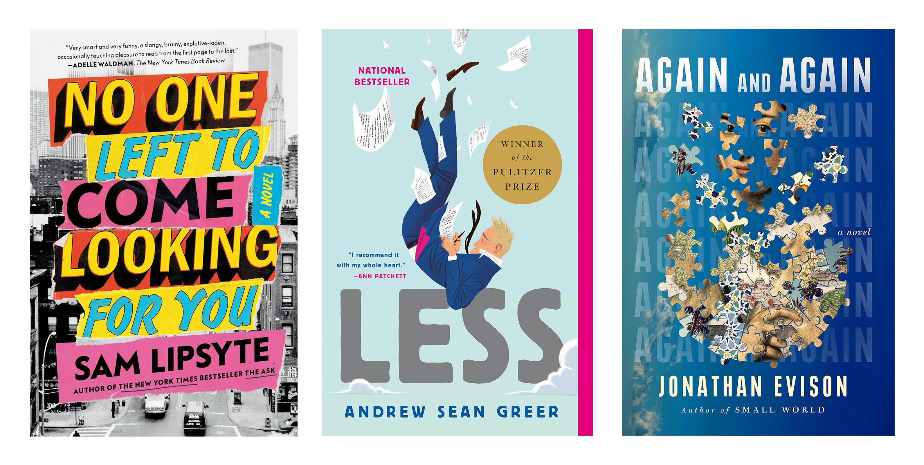
…and the book’s target market: readers of dark humor, love gone wrong, and fans of Phillip Roth, Jonathan Tropper, and Sam Lipsyte.
Randy provided cover inspiration with some brief notes: “I like the edginess of No One Left to Come Looking for You by Sam Lipsyte, the humor of Less by Andrew Sean Greer, and the striking imagery of Again Again and Again by Jonathan Evison.”
Before I get into the designs, I have a side-rant for any imminent authors about to work with a designer for the first time—there’s a collaborator archetype out there that feels if they provide any thoughts or preferences about what their book cover should look like, it will stifle the creative process, and so they offer the designer a blank canvas and the responsibility of interpreting said void. Don’t be that archetype, it’s helpful to no one.
I suspect most authors that feel this way do so in good faith. They want to be pleasant to work with and not get in the way. Unfortunately, it puts quite a lot of guesswork on the shoulders of the designer, which inevitably will require multiple rounds of design and communication to suss out veiled preferences, unless by some miracle the designer nails it on the first go.
If you’re unclear on what you want your book cover to look like, that’s a sign that you need to do some work getting to know what your preferences are. Take a look at your bookshelf, what books please you visually? What patterns can you notice about the imagery? Is there a design style (photographic, illustrated, collaged, or type-driven) you’re liking more than others? Do you gravitate towards a particular color palette or typographic style? Visit ineedabookcover.com, view covers in your genre, save the ones you like, and take a few notes about what you like and dislike about the covers. You can do all of this preliminary work in less than an hour and it will save you and your designer lots of time and preempt a sour collaboration. That’s all, thanks for hearing me out.
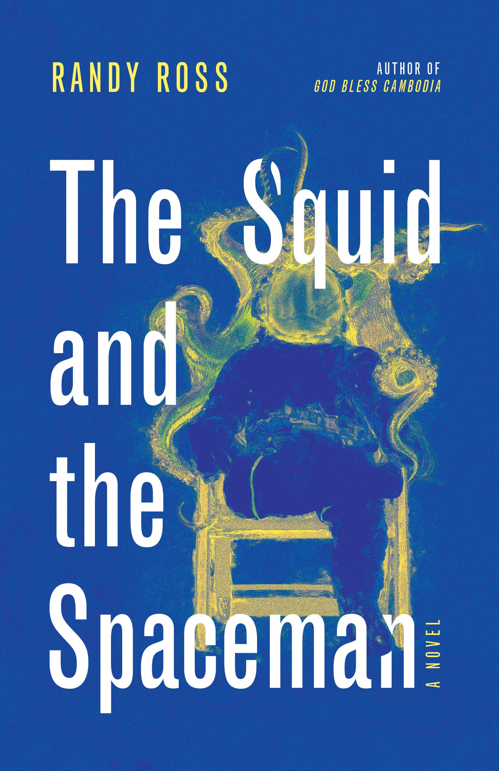
My initial image research lent me to Bruce McCandless’ first untethered space walk in 1984. I chopped up the photo to make it look like he’s sitting in a chair, added a bunch of squid tentacles behind him, and then painted over it in Photoshop to add some texture and grit. I went with a condensed sans serif for the cover text to add to the deadpan delivery of a serene astronaut about to be enveloped by a squid. I wanted the title to feel claustrophobic, mirroring the characters’ relationship dynamic, so I set it like a frame, boxing in the astronaut.
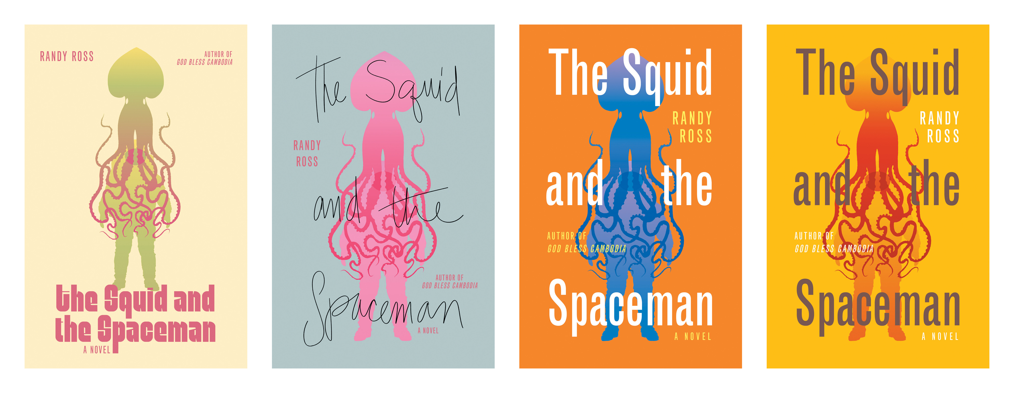
For the next option, I illustrated overlapping silhouettes of the characters with gradient fills. The writhing tentacles placed over the astronaut’s torso were, to me, reminiscent of guts and felt like a visually interesting way to convey anxiety and losing oneself. I experimented with multiple color palettes that might hint at the tension in the story’s relationship:
For the third option, I leaned into a vintage collage composition after finding a gorgeous illustration of a squid, and separately, an astronaut working outside of a spaceship. I liked how the coloring of the squid and the astronaut both complemented the characters’ relationship attachment styles—the squid in a warm skin tone, suggesting closeness and the astronaut in blue conveying remoteness:
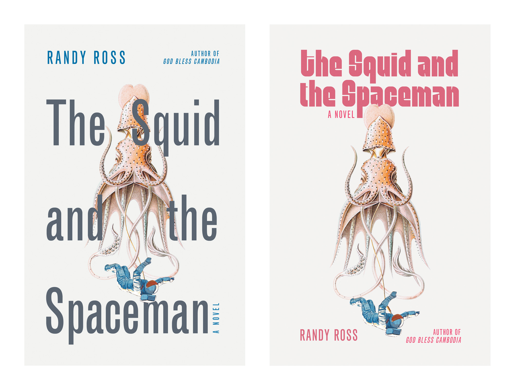
Randy’s favorites from R1 were the blue silhouettes on the orange background and the vintage collage.
The typography, illustration style, and color palettes were working, but the compositions needed some adjustment. For the gradient silhouette direction, he wanted to see more detail in the astronaut’s suit and to have the squid inside of the spacesuit with a few tentacles sticking out.
For the other option he requested reversing the positions (showing the astronaut falling down into the squid below), reducing the size of the astronaut slightly, and wrapping one of the tentacles around his leg to show him being dragged down. Here’s where we ended up:
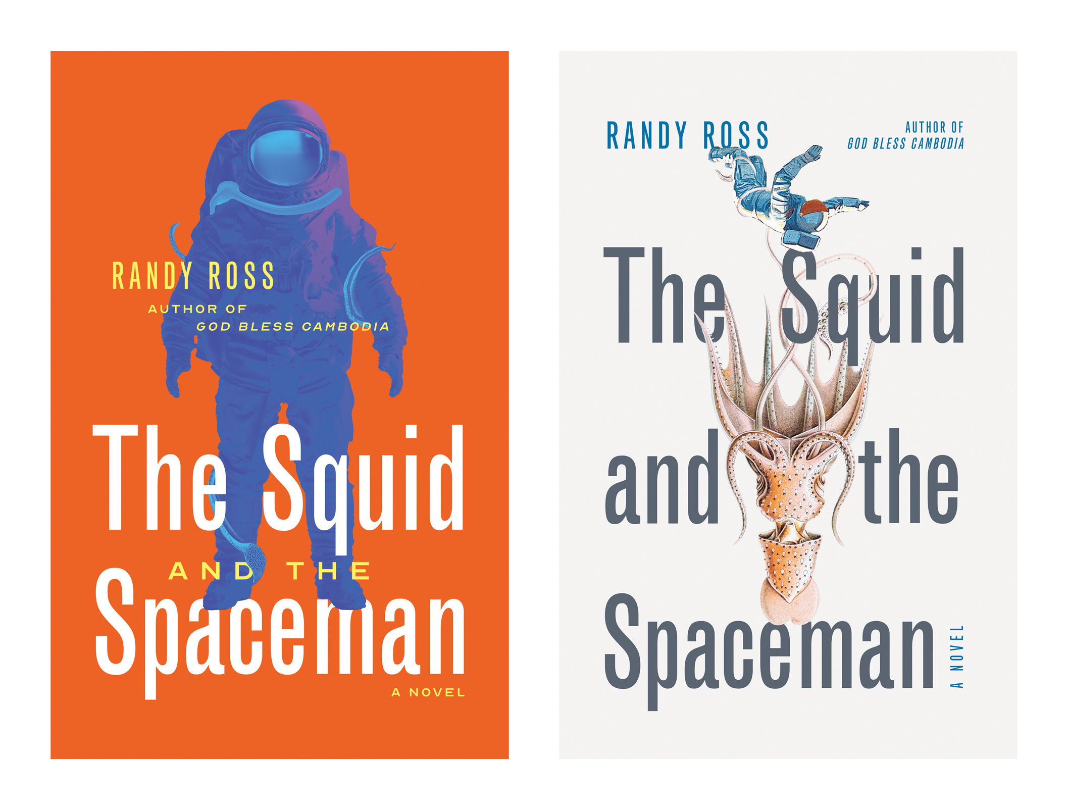
These were working better compositionally, but Randy had a few more ideas—in the orange option—making the tentacles look more tentacle-like by including suckers and adjusting the placement of the tentacles, and in the other option—straightening the astronaut’s legs to make him appear more helpless:
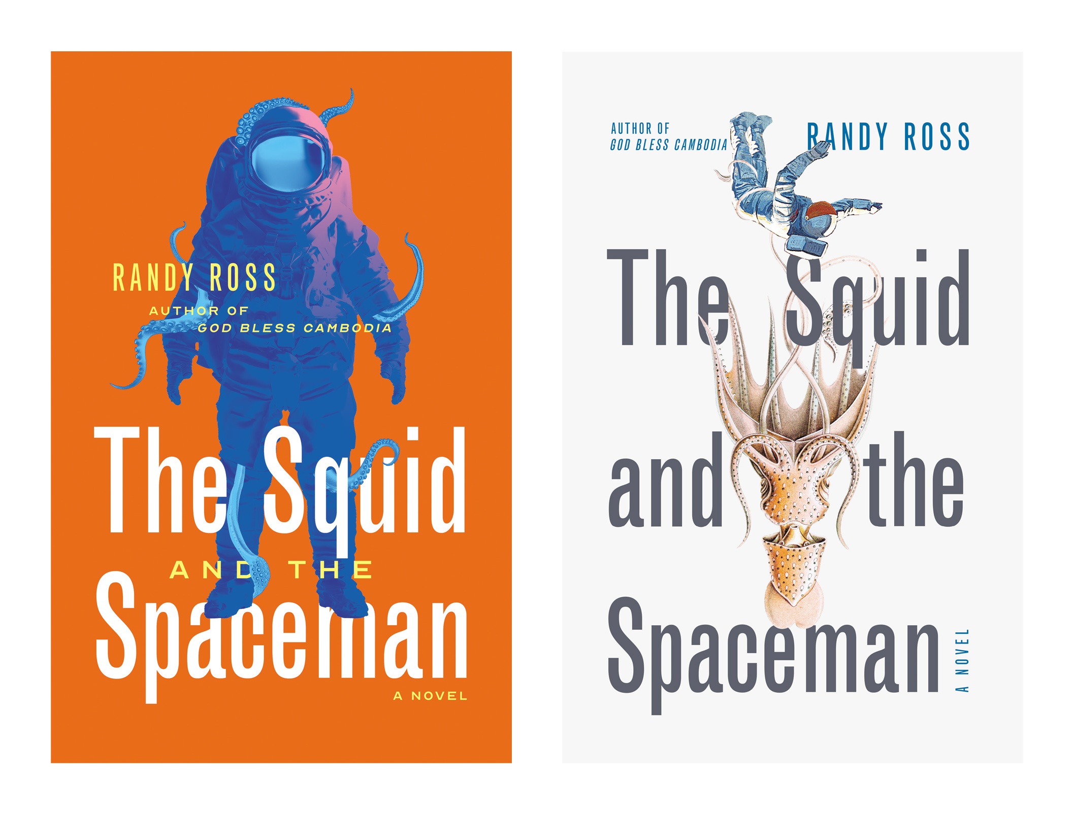
And Randy’s final choice:
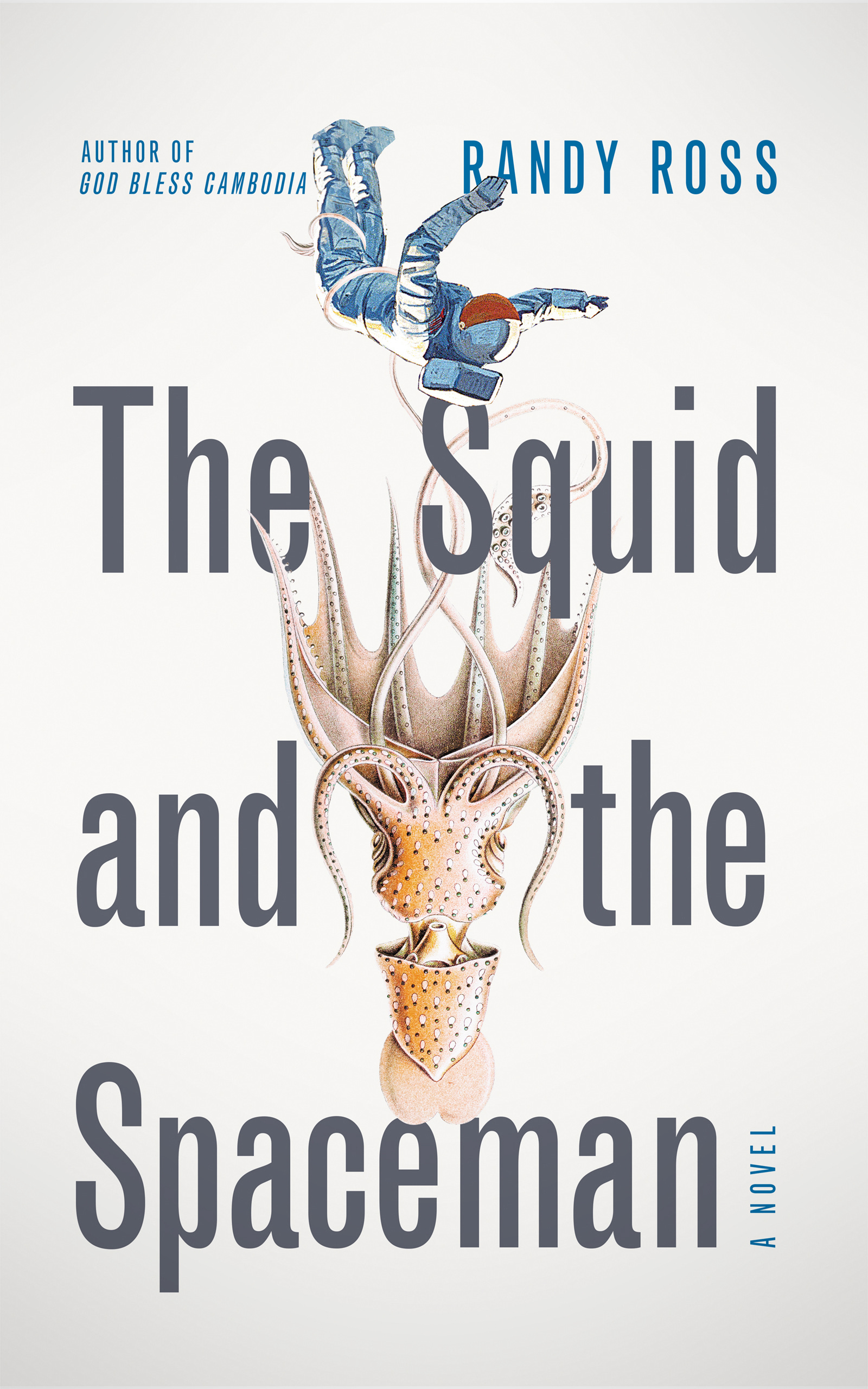
I was thankful this one made it to the end. On first glance the cover reads as vintage sci-fi, so in subverting this context, the design complements the humor in the story. The falling astronaut’s descent feels inevitable despite the look of zero gravity, giving the beautifully menacing squid all the power, which clearly communicates the couple’s relationship dynamic.
Even though we pursued a different direction than originally planned, we felt we arrived at a better solution than where we started. Having an initial vision, however tenuous, and some flexibility in the process are usually all you need to get there and Randy had both at the ready. That’s about as much as I can ask for in a collaboration.
Thanks for letting me share this one with your readers!

Thanks for reading!
Thanks again to Jason Arias for sharing his work! I think this is a terrific cover and I loved seeing how it came together. And thank you for reading.
If you liked this and want more like it in your life, consider becoming a paid subscriber to A Book Designer’s Notebook. Paid subscribers get full access to the biweekly How to Design a Book Cover series, as well as:
One complimentary book design critique per year
Access to Book Design Critiques, an occasional bonus series where I share the critiques solicited by other subscribers
Access to subscriber-only chats
Paid subscriptions and coffees bought help keep this newsletter going and will help me say no to designing covers for soul-sucking books about corporate events, email marketing, and raising capital. Thank you.
Until next time,
Nathaniel
He also introduced me to the show Detroiters, so I owe him a huge debt.
i love love love this as i'm trying to design a cover for my serial and unsure where to start. it won't be close to your caliber, but seeing the process was helpful! thank you!
also, the cover y'all went with is chef's kiss. i do digital collages so it hit me in all the right places.
Nate, you’re a gem and thank you for the guest post opportunity!