

What Should 'Lolita' Look Like?
You Tell Me.


This one is too long for email. Click here to read it in your browser.
Let’s get this out of the way: I do not know. There are, to my mind, few books tricker to design a cover for than Lolita. Thankfully, I doubt I will ever be given this task. But, if I am, there is one book—besides the novel itself, of course—that I will undoubtedly reference.
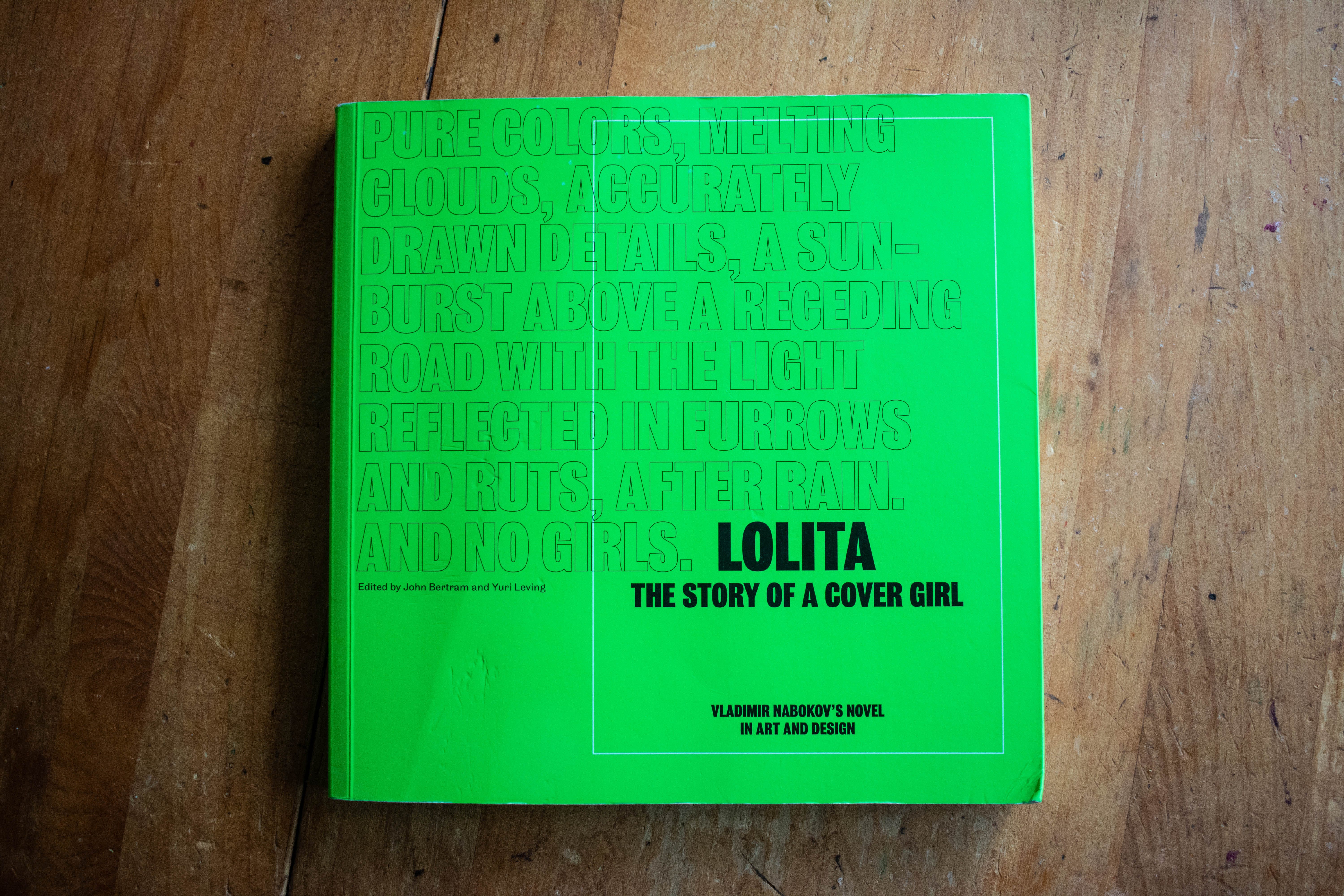
Lolita—The Story of A Cover Girl: Vladimir Nabokov’s Novel in Art and Design is a 2013 book edited by John Bertram and Yuri Leving.1 To quote the blurb from Ellen Lupton on its back cover, “Behold an obsessive book about an obsessive book.” This floppy, lime green paperback is a rigorous piece of graphic design criticism and exploration featuring a survey of more than half a century of Lolita covers and eighty(!) new takes on the book’s jacket by renowned designers and illustrators.
Being honest here, I don’t have many of my own concrete thoughts and opinions about designing Lolita, but I am utterly fascinated by the discussions presented in this book. So, I thought I’d give you an abridged tour of this terrific book with lots and lots of quotations and pictures.
Introduction: Colorful Misunderstandings, Graphic Misinterpretations
“It is difficult to think of another book whose cover design has been as fraught with peril,” Bertram and Leving write in the book’s introduction. This book, they say, sets out to explore why “covers have so reliably gotten it wrong.” Wrong, to put it perhaps too simply, in that these covers sexualize Lolita—a 12-year-old girl.
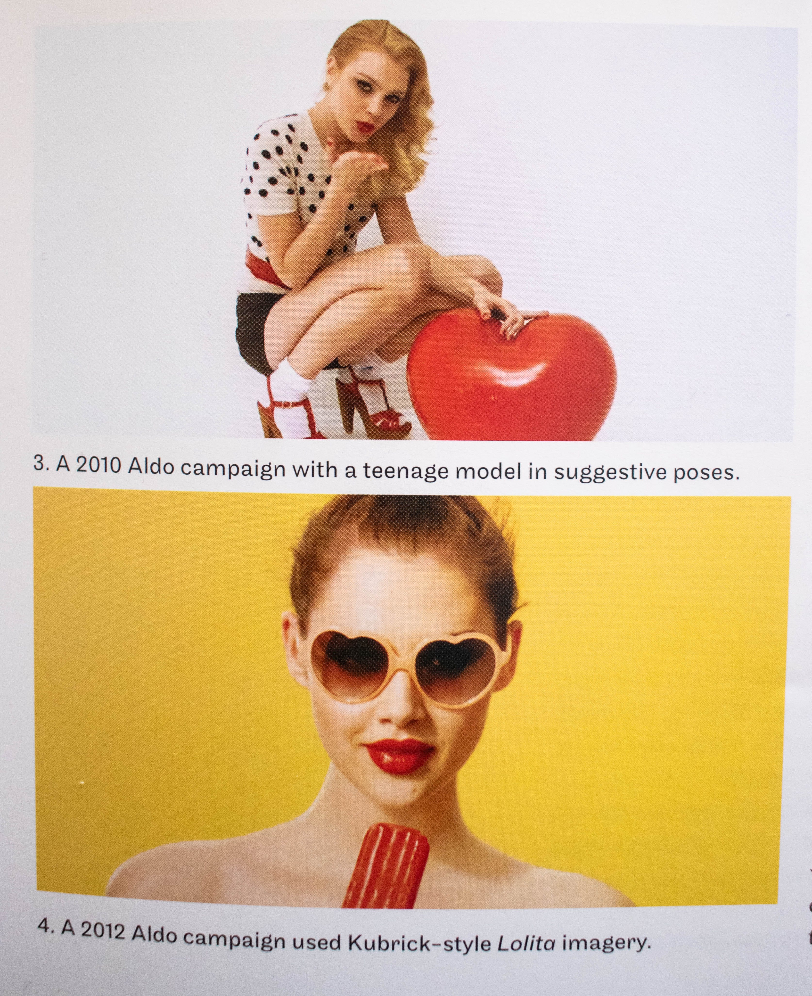
One culprit, they argue, though certainly not the only one, is Stanley Kubrick’s 1962 film adaptation. The film’s interpretation of the titular character creates what Duncan White calls “a more palatable subject of sexual desire.” Covers, and indeed, pop culture at large, have taken cues from Kubrick’s depiction of the suggestive heart-shaped glasses and lollipop. The introduction references various contemporary advertisements and Lana Del Rey, and would, I imagine, touch on Sabrina Carpenter’s dalliance with the imagery—intentional or not—had it been published about a decade later. While Lolita’s original cover was a reserved, green cover with only text and no imagery, future covers both foreign and domestic cemented the sexualized imagery of the eponymous preteen in popular consciousness.
")

While doing the requisite work to set the table for the rest of the text, Bertram and Leving ask questions that, while specific to the task of designing a cover for Lolita, I think are also important for book designers to consider in general:
Is a cover responsible for fairly representing the book? Taking it a step further, can a cover be said to have a responsibility to a fictional character, particularly one who has been abused and victimized as Lolita has? When might a cover incorporate images that are not supported by the text, and what problems could arise with such an approach?
These questions are complicated because what we know of Lolita comes from Humbert, the epitome of an unreliable narrator, charming and devious in the masterful subterfuge that is his “confession.”
And:
After all, how can one design a cover for “a tale that hovers between alarming depravity and slapstick?” Or, for that matter, how can one represent a character who remains elusive but also is, or desperately wants to be, just a normal twelve-year-old girl?
Questions and Answers
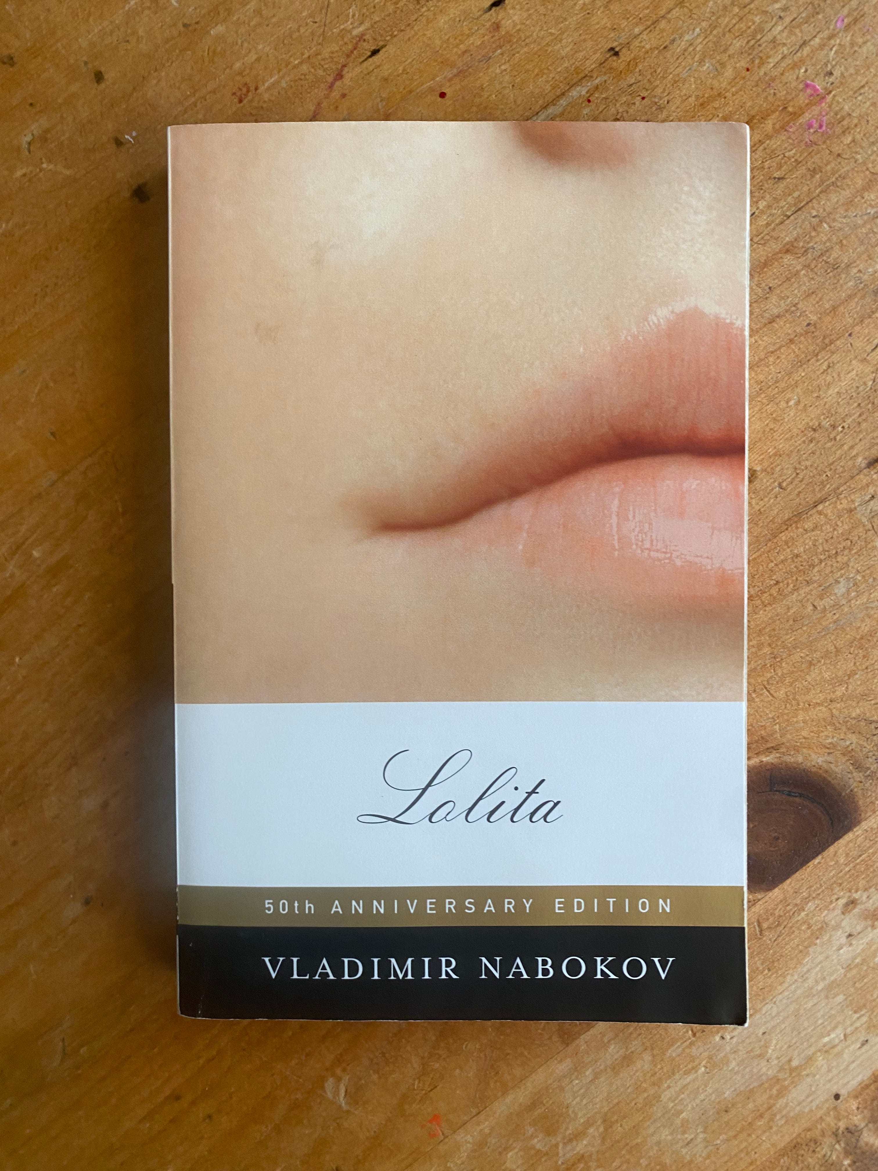
One of the things I like about this book is the variety of angles it takes at the central question animating its text. There is straightforward design criticism, what I would call a graphic essay on the portrayals presented by Nabokov, Kubrick, and publicity photographer Bert Stern, a gallery of new Lolita covers, and, toward the beginning of the book, a Q&A between editor John Betram and book designer John Gall, the designer behind the cover of Lolita’s 50th Anniversary Edition.
Here are some choice quotes from the exchange:
John Bertram: Nabokov wrote: “I want pure colors, melting clouds, accurately drawn details, a sunburst above a receding road with the light reflected in furrows and ruts, after rain. And no girls.” And: “Who would be capable of creating a romantic, delicately drawn, non-Freudian and non-juvenile, picture for LOLITA (a dissolving remoteness, a soft American landscape, a nostalgic highway—that sort of thing)? There is one subject which I am emphatically opposed to: any kind of representation of a little girl.” What weight do you give this and his other well-known opinions about what should or should not appear on the cover of Lolita?
John Gall: I completely agree with Nabokov on what I think is his main point: No little girls. On the other hand, his description of what he would like reads beautifully but would be a complete yawner as a cover. It is so non-specific that it could be the cover of almost any novel ever written. A question I like to ask myself when designing a cover is: “Can this be the cover for any other book?” The closer you get to a “yes,” the worse off you are.
There are two directions for this cover: either you take the title head on and go with some representation of Lolita, or you don’t. But be careful; the land of metaphor is filled with furrows and ruts and roads going off into the distance.
All that being said, I love the concept of “pure colors” as an approach. “Melting clouds” . . . ?2
JG: Lolita is not only a book but also a cultural touchstone, and it carries a lot of baggage. There is so much visual reference associated with this book. There have been hundreds of covers. These schoolgirl uniforms and lollipops are all part of the visual language attached to the book. This has to be dealt with in some way. The visuals associated with the book are probably better known than the book itself.
JG: Lolita will sell 50,000 books per year regardless of what is on the cover. Is it worth it to a publisher to put something on a cover that will turn off a segment of the readership? I don’t think so. Is it worth it to do something controversial with the cover of a controversial book? It doesn’t need it.
Fictions by Peter Mendelsund
Next, designer and writer Peter Mendelsund reflects on the designer’s approach to representing Lolita. The essay is framed by his recollection of judging a design competition, and one proposed cover for the book that stood out to him, designed by Emmanuel Polanco.

Is it the crude handwriting that makes it so effective? Doesn’t the entire composition, in its offhandedness, carry the faintest suggestion of the childish about it? It is neither lusting nor leering, nor overly proud of its own wit. It seems to eschew the urbane gaze of Nabokov’s old world narrator in favor of a naive and guileless one. The painted lips hint at an underdeveloped, mythologized understanding of romance; it is the cover, I could imagine that a young Dolores Haze might have drawn.
I’m sure the effect is unintentional. And yet, the naiveté suggested by this cover reminds me that the unequal object of Humbert Humbert’s attentions is a child. And this line of thinking, in turn, reminds me that Lolita is, and should continue to be treated as (despite its verbal gymnastics, lasciviousness, and intermittent humor), a shocking and sad book … it is not a sexy book; not an erotic book.
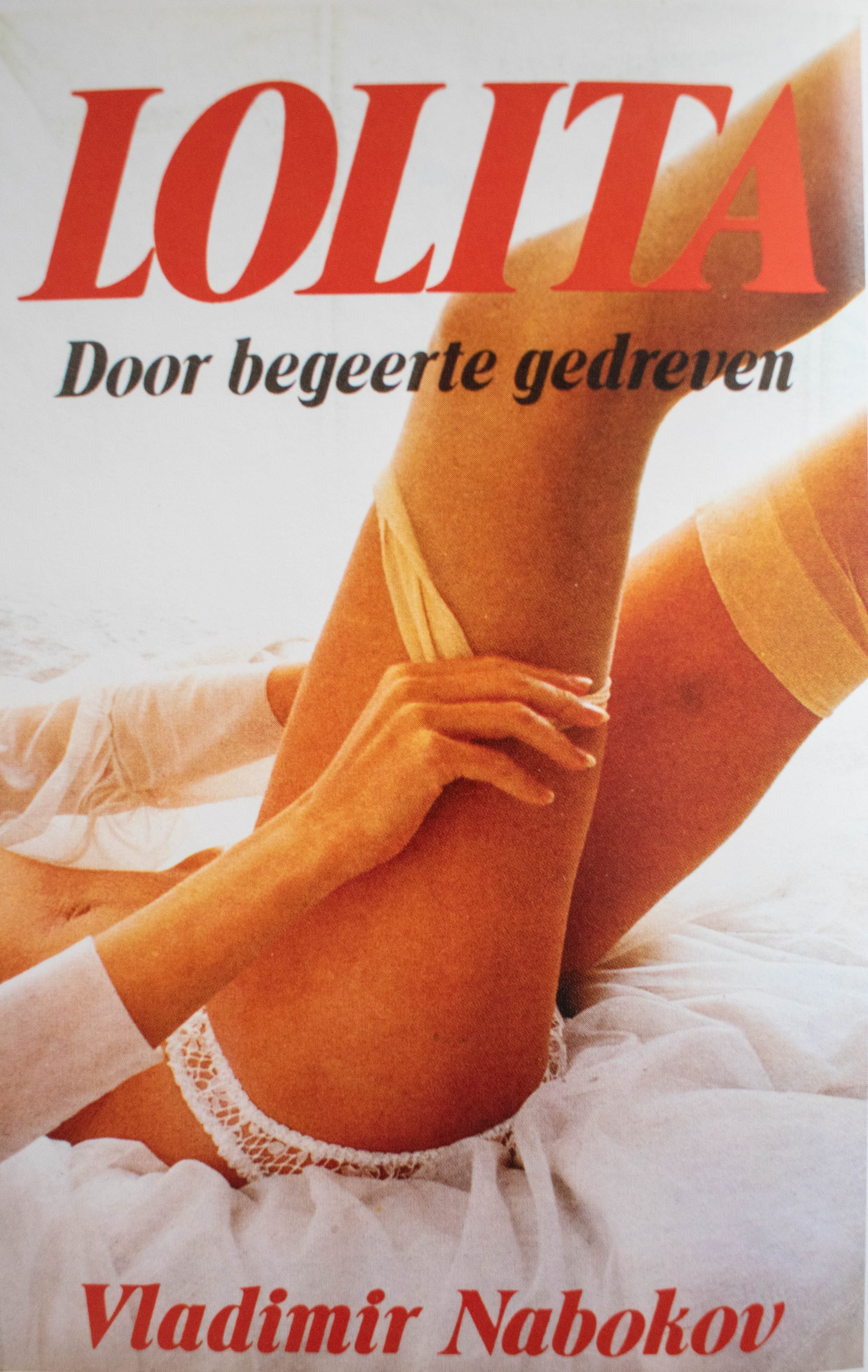
Mendelsund goes on to discuss both the overtly sexual interpretations of the cover, and questions if these representations are speaking on behalf of the book or are contemporary responses to what might be seen as mid-century mores or prudishness. He quickly dismisses these covers, calling them “false and pernicious.” However, he also critiques the opposite approach:
Pretty depictions of softly lit Lolitas (anatomized or whole) on book covers seem to perform the opposite function: They downgrade our outrage and our complicity (and in so doing they also lessen the effect of the book’s central metaphor.) They are the cover design analogue of porn stars in schoolgirl uniforms—there is no longer anything obviously discordant about them, as they are the fantasy fulfillment of a culture that has long since sexualized its young … it no longer represents innocence; thus, it cannot represent fallen innocence either.
On the conceptual cover:
[It] is satisfying and comes pretty damn close to achieving the requisite unease I’ve been discussing, thanks to a stark visual double entendre. And yet, though clever, the jacket somehow feels too narrow in focus to be a proxy for Nabokov’s striking array of ideas. It performs its circumscribed task well, but it doesn’t capture the book’s gestalt.
Which leads me to my next point: Maybe it’s simply impossible to give this book the jacket it deserves, if one believe it deserves a representation of the central sexual relationship between a young girl and an older man.
But, as it turns out, this book is not actually about a deranged pervert lusting after a nymphet. I mean, it is, but it is clearly much more than merely that. Lolita’s central argument concerns the young and the old, but the Old World and the New World. As most of you know, Lolita is a book about America: a young, robust, bobby-socked, dewey-eyed, and apple-cheeked America, an America of “sweet hot jazz, square dancing, gooey fudge sundaes, musicals, movie magazines, ad so forth.” This is an America of license plates, motel-room keys, Coke bottles, chewing gum—a young, fresh, insolent, unaware America.
Dolly as a Cover Girl by Dieter E. Zimmer
In more than half century since 1955, there have been at least five hundred editions of Lolita published in thirty-five to fifty countries, each with its own book cover and, at most, every second or third with an original one. What cover do you consider best?
Paired alongside a tour of just a fraction of those five hundred editions, Dieter E. Zimmer writes what amounts to a scholarly essay discussing what, he admits, is not exactly a scholarly question.
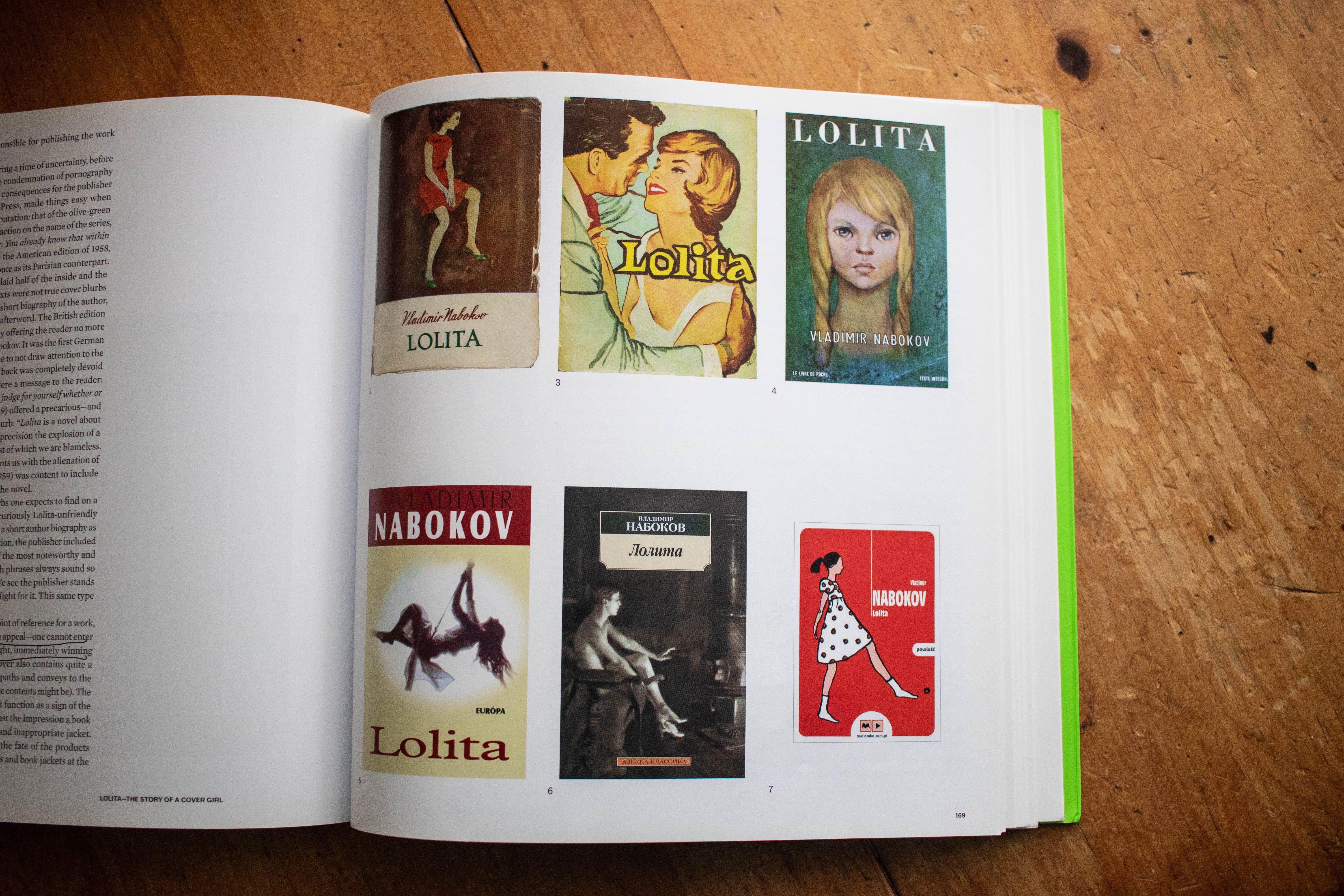
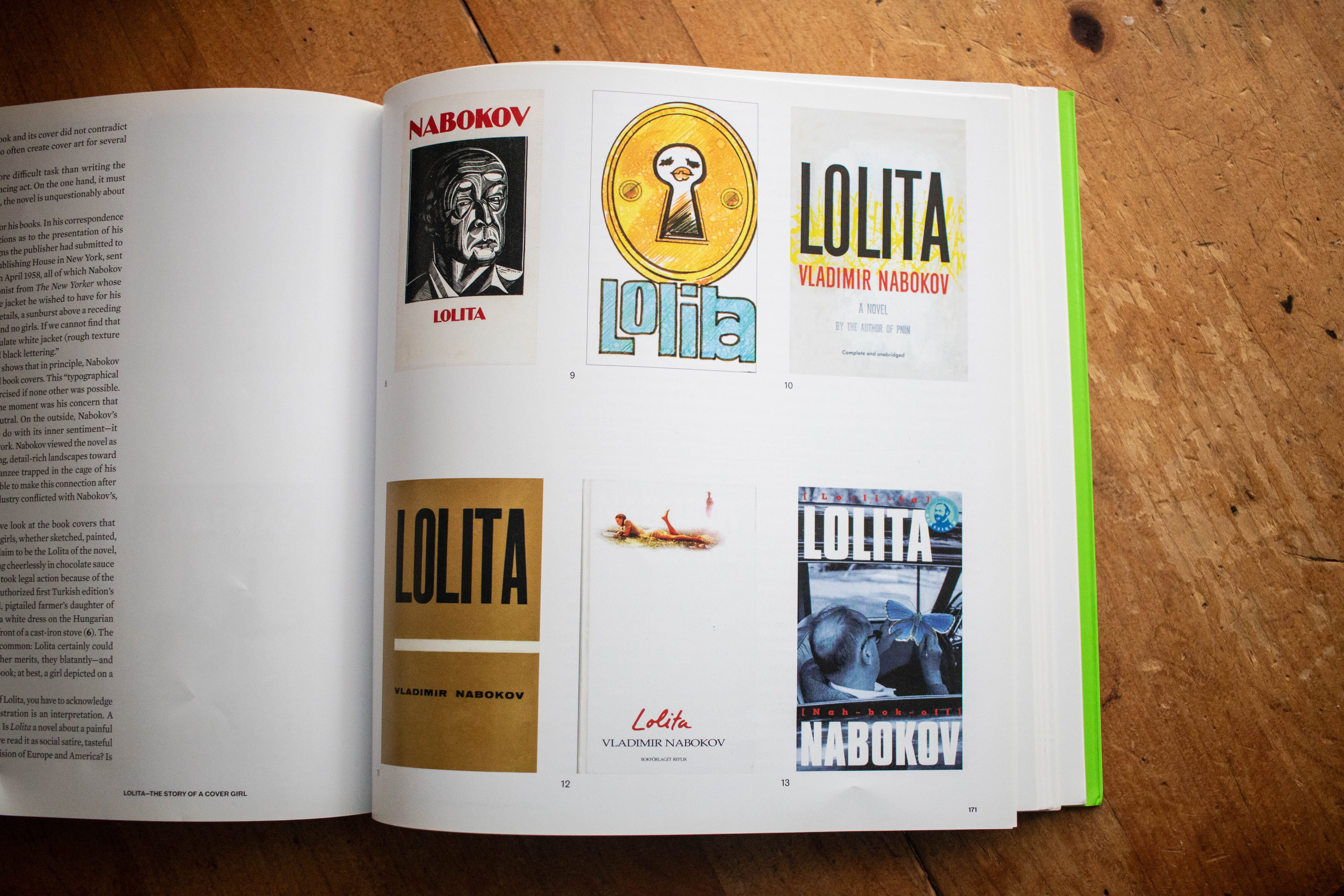
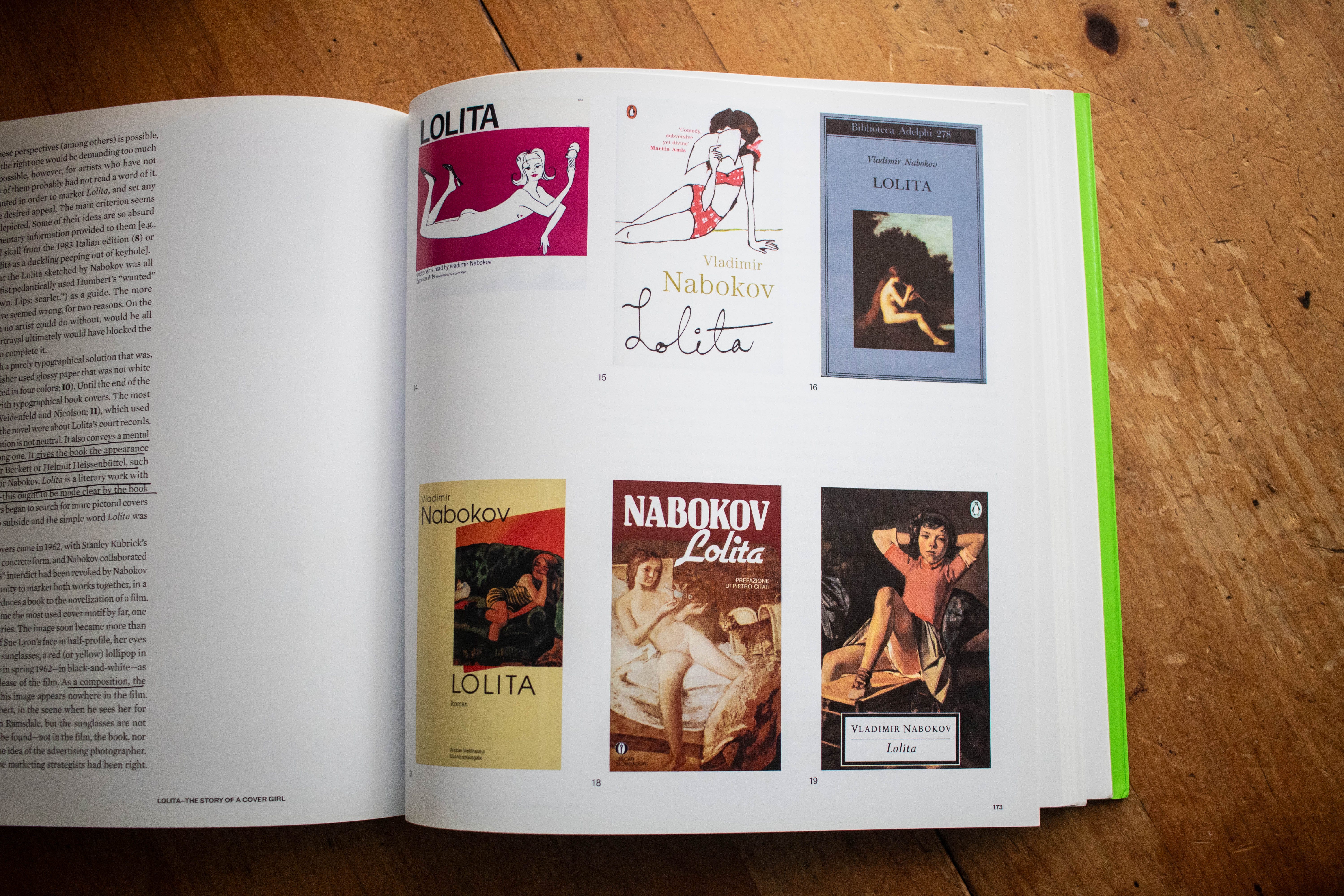
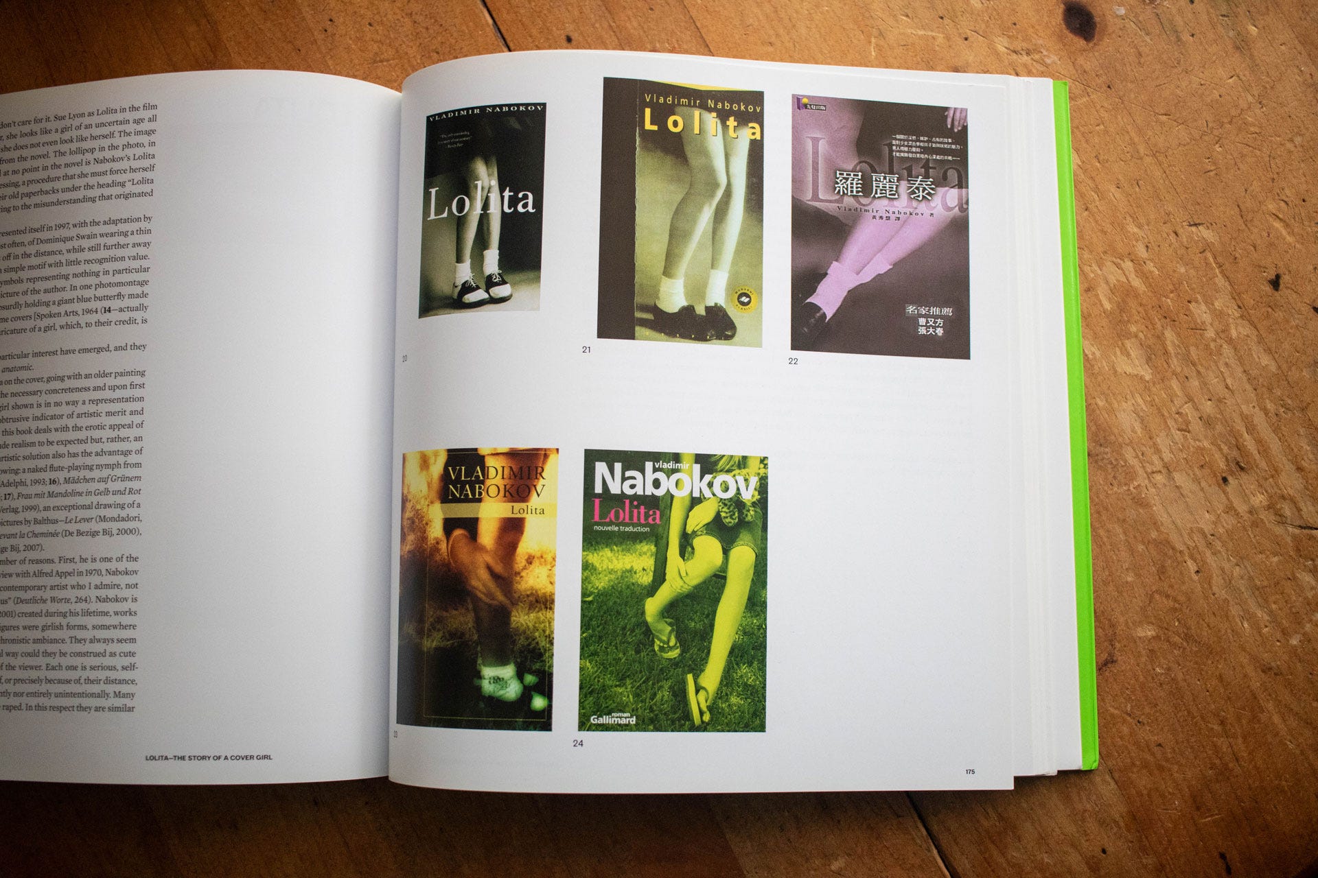
The Covers
At the heart of Lolita—The Story of a Cover Girl is the gallery of commissioned and reimagined covers for the novel. Unburdened by commercial viability, these covers were created by “a selection of international designers, including in-house designers at publishing houses and freelance book designers, as well as those for whom designing book covers is a rarity.” The designers were free to do whatever they liked.
Here are just a few of the covers presented in the book:


There are so many more I could share. Buy the book or flip through it on The Internet Archive to see the rest of the covers.
There is more to this book, such as Yuri Leving’s analysis of the various Russian Lolita covers, a discussion of Nabokov’s other work in their paperback covers, an essay on the imagery inside Nabokov’s writing, and more scholarship about “paratext” that, to be honest, makes my eyes glaze over a bit. Absolutely worthwhile, but alas, there is only so much space and attention for a newsletter (and I have already exceeded your email inbox limit) and so I have focused on the parts of this book that most pique my interest.
What do you think makes a good Lolita cover? If you’ve made it this far, let me know.

Thanks for Reading!
Thank you for reading! I mean it.
If you’d like to keep this newsletter going and help me say no to designing soul-sucking books about corporate events, email marketing, and raising capital, consider becoming a paid subscriber or buying me a coffee.
Paid subscribers get access to How to Design a Book Cover, a bonus series illuminating my book design process and diary updates on the process of turning this newsletter into a book.
Until next time,
—Nathaniel
Note: this is not an affiliate link. The paperback doesn’t seem to be widely available elsewhere online, otherwise I wouldn’t link to Amazon.
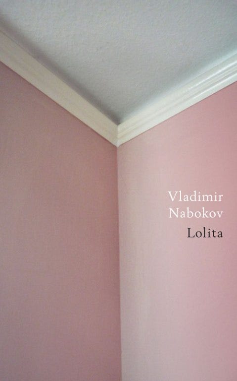
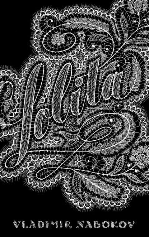
It looks like the most recent version of Lolita available for purchase is the closest we’ve gotten to Nabokov’s original wish:

Outstanding. The challenge of making a cover for Lolita is certainly formidable. We are told when we are kids that we should not judge a book by its cover, yet we do this all day long.
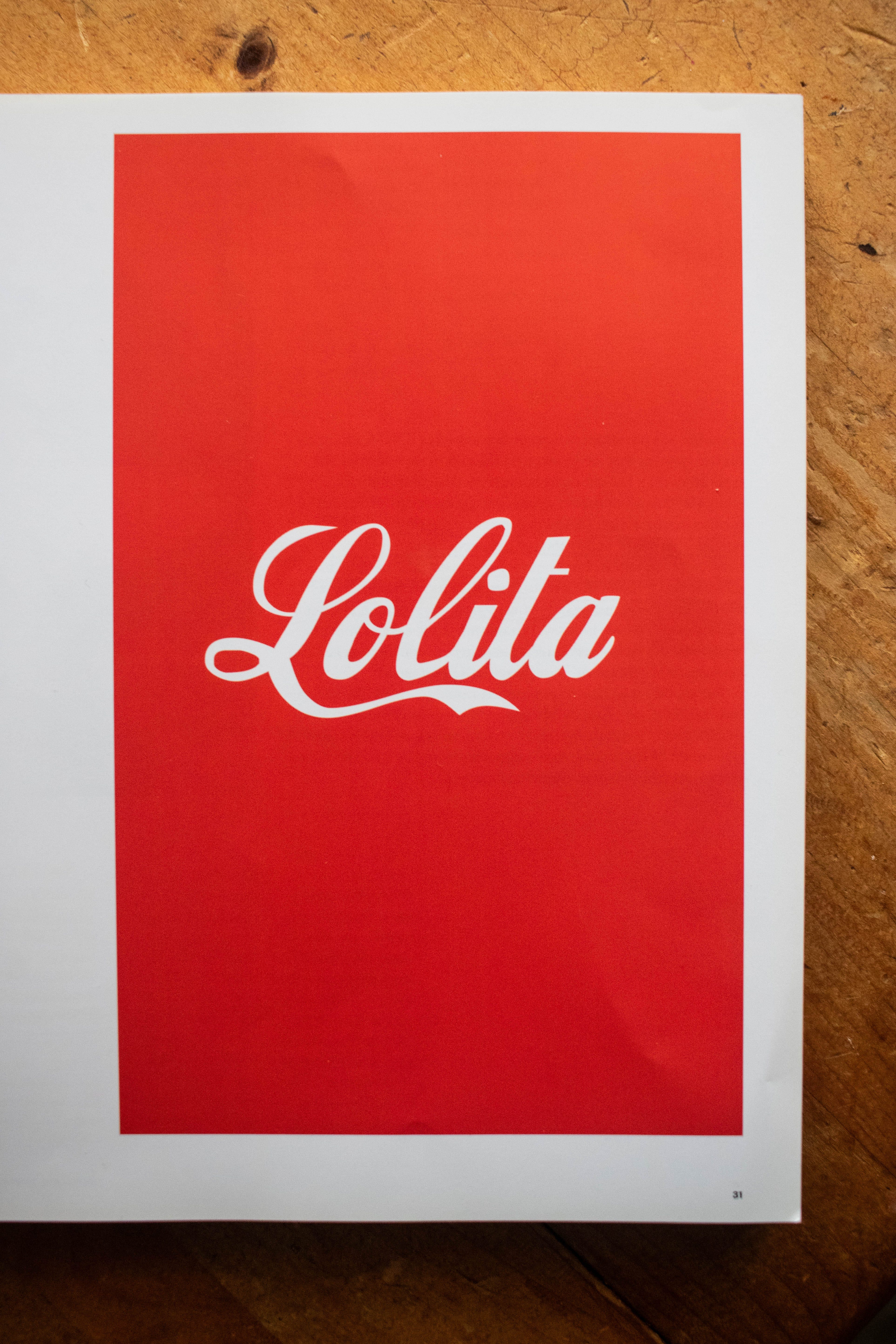
If I had to pick one that I saw in your newsletter, it would have to be the Lolita’s name in the Coca-Cola font. That’s just perfect.
Side note: I did a study of book covers of Flannery O’Connor‘s work, and it really made me appreciate the artistry of the whole endeavor. Great stuff!
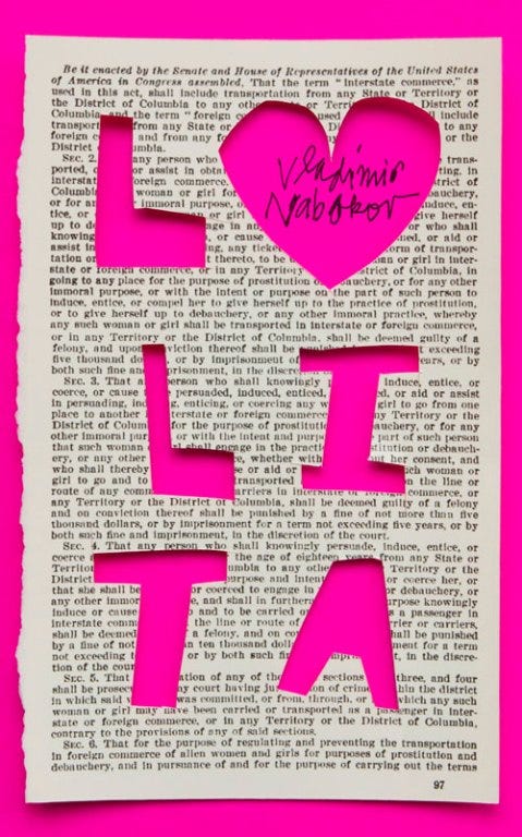
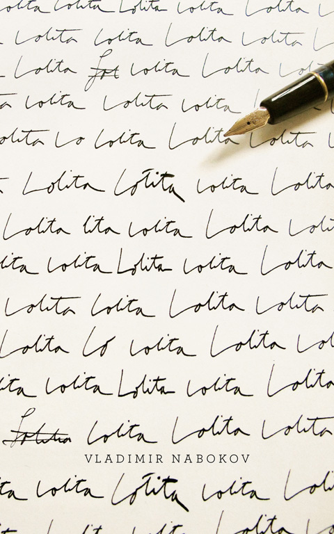
I’m all about the one that’s just the title written all over the cover because it’s a direct reference to something in the book. Smart.