

Vintage Book Cover Inspiration
Old books on my shelf


If you tell me that book covers are not good at all anymore, I will literally write an entire newsletter to argue with you. I think there have always been good covers, there have always been bad covers, and there will be both until humankind makes itself extinct.
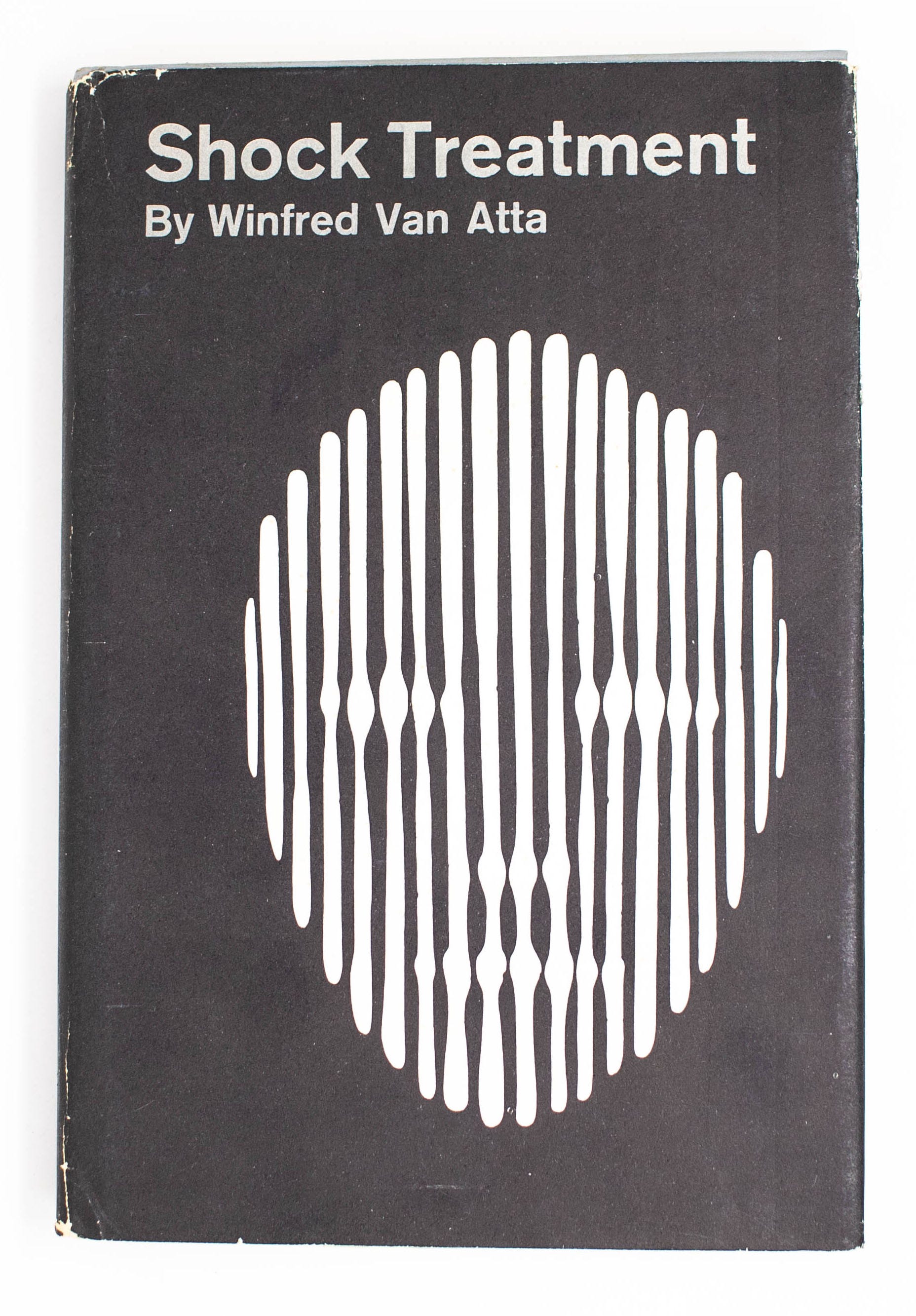
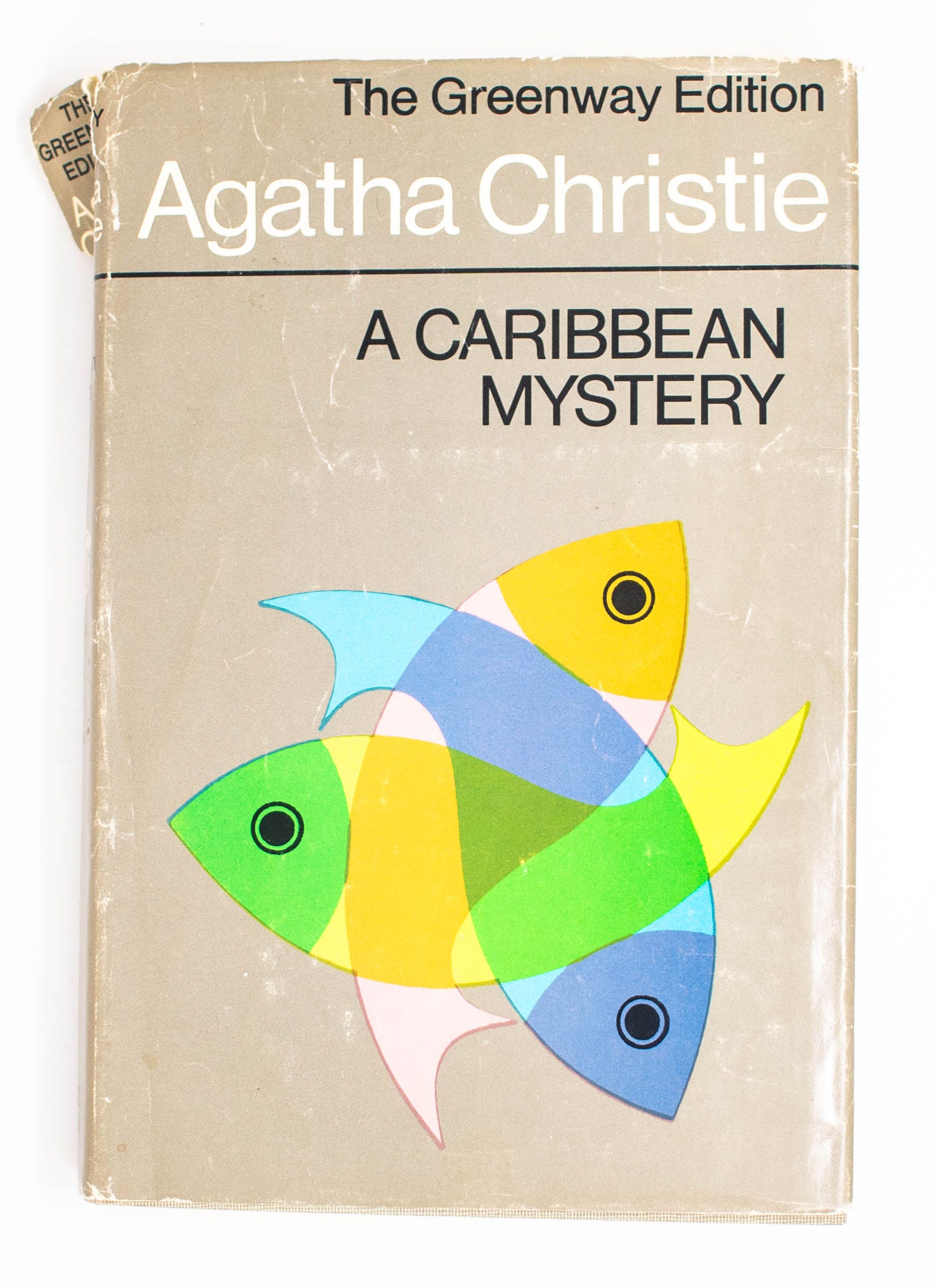
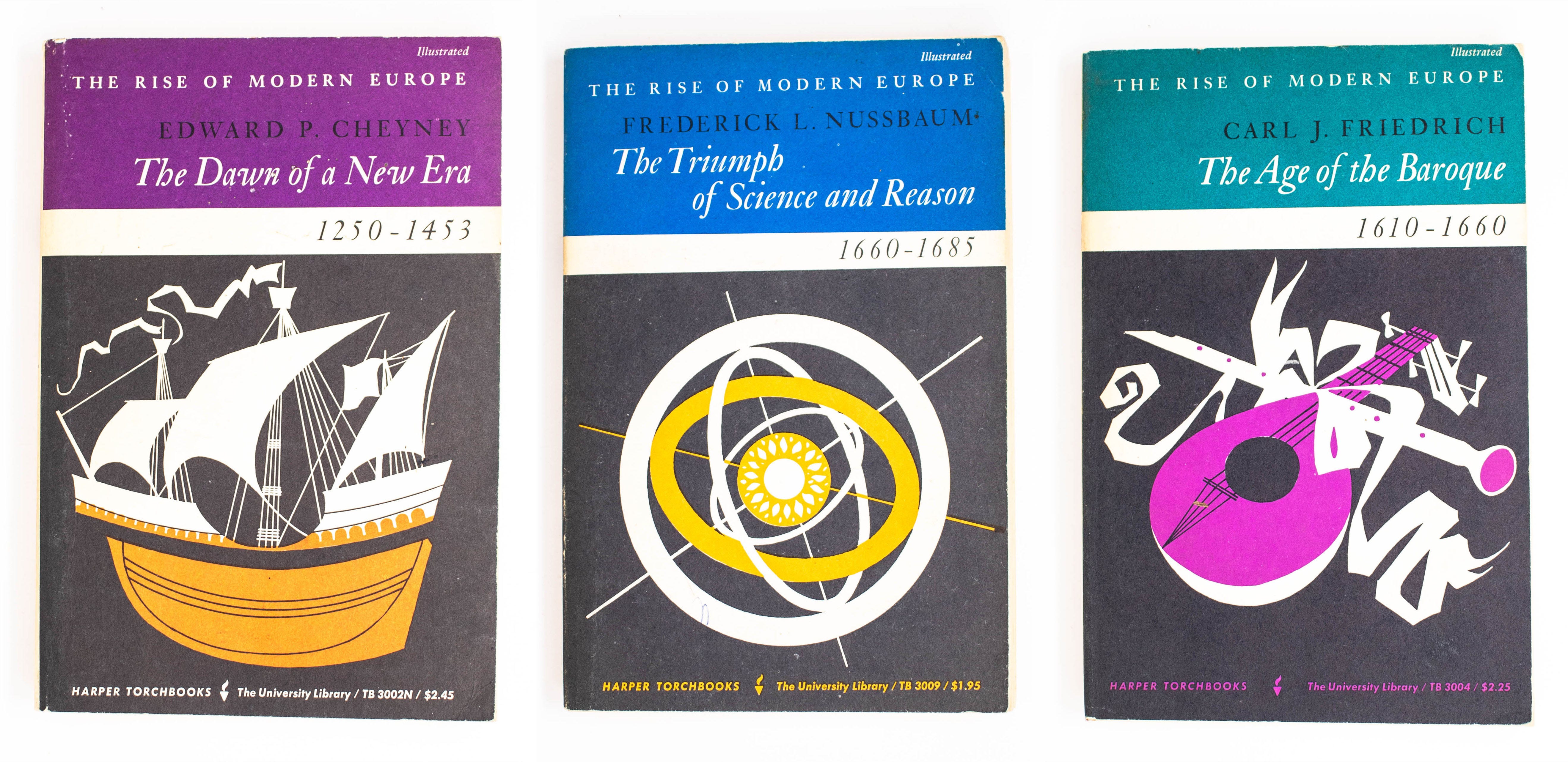
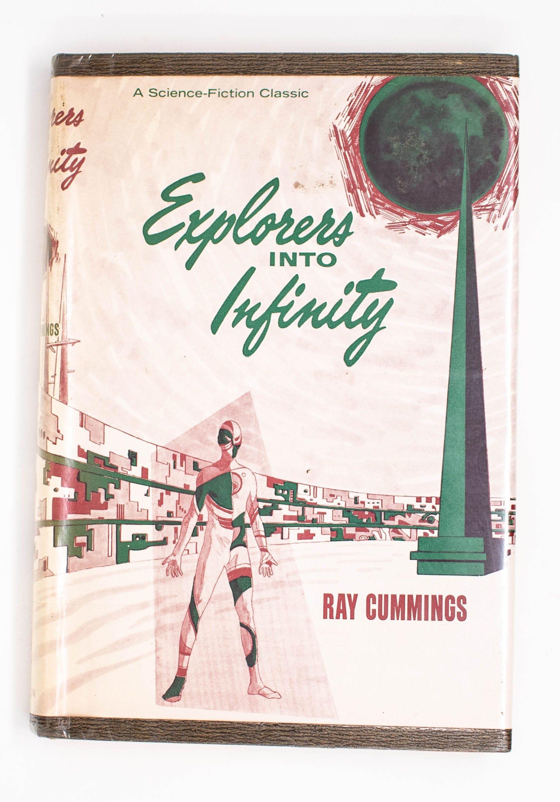
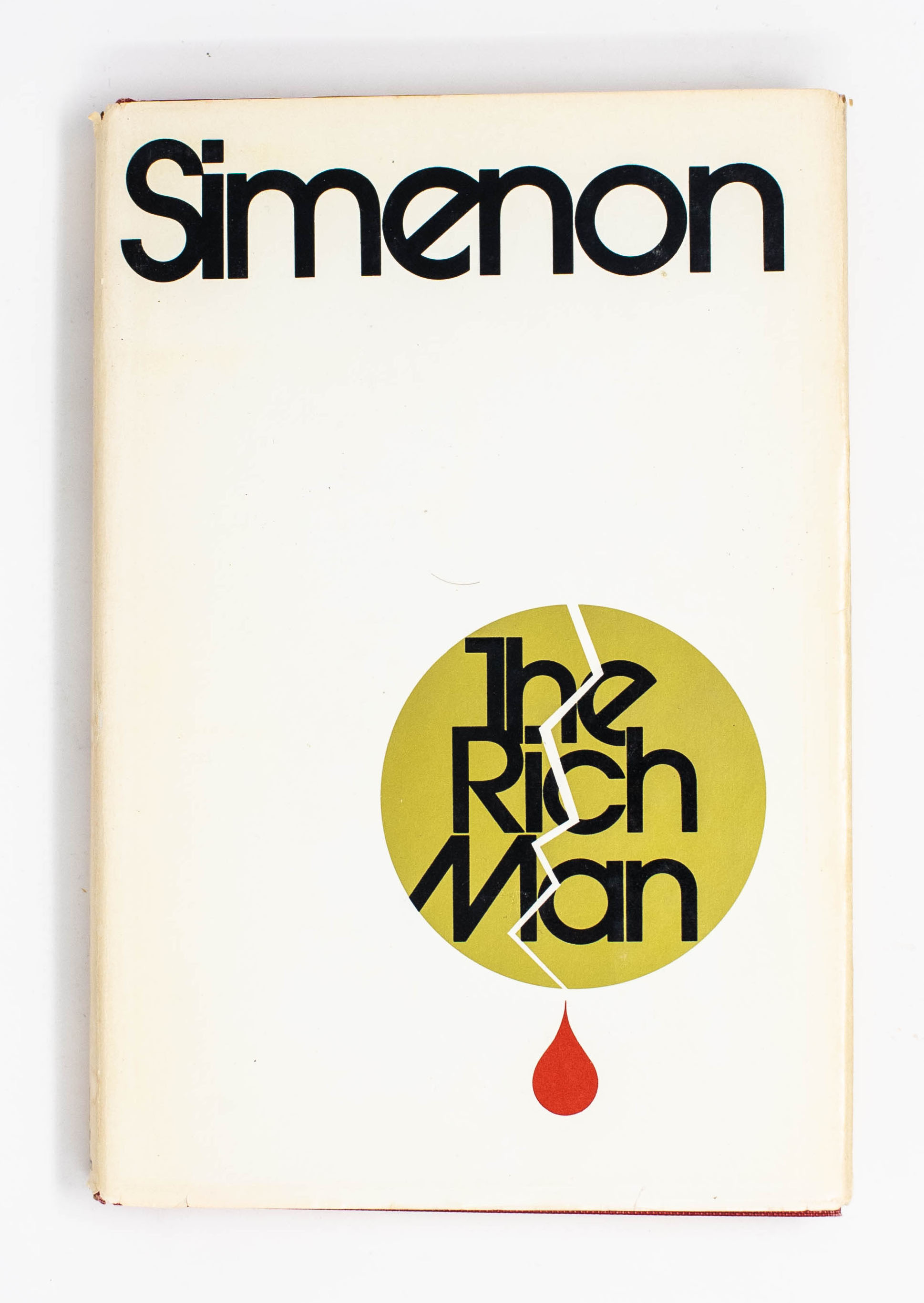
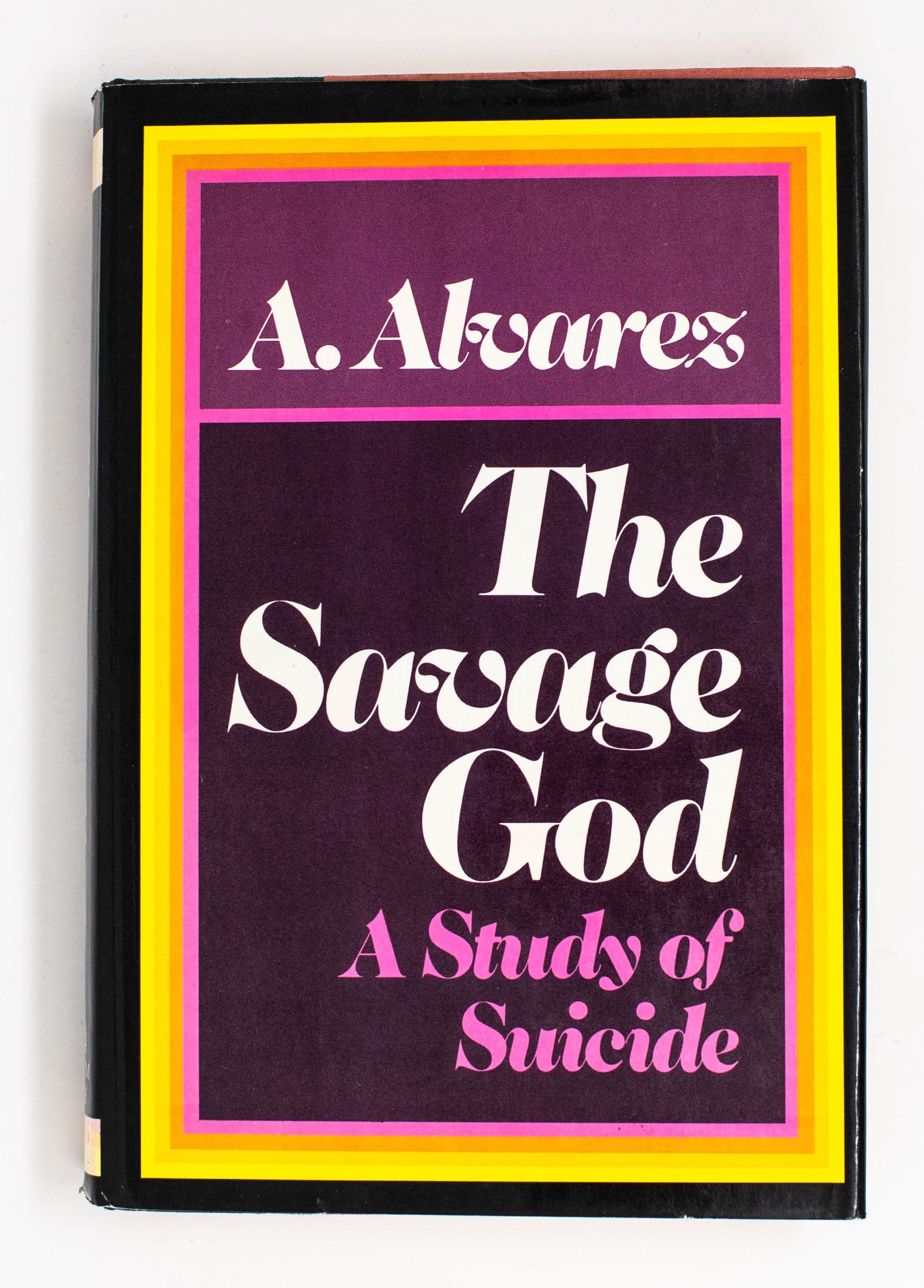
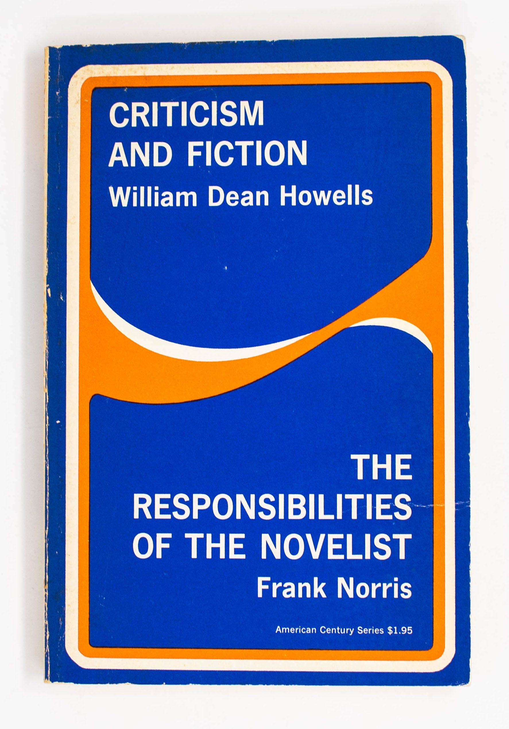
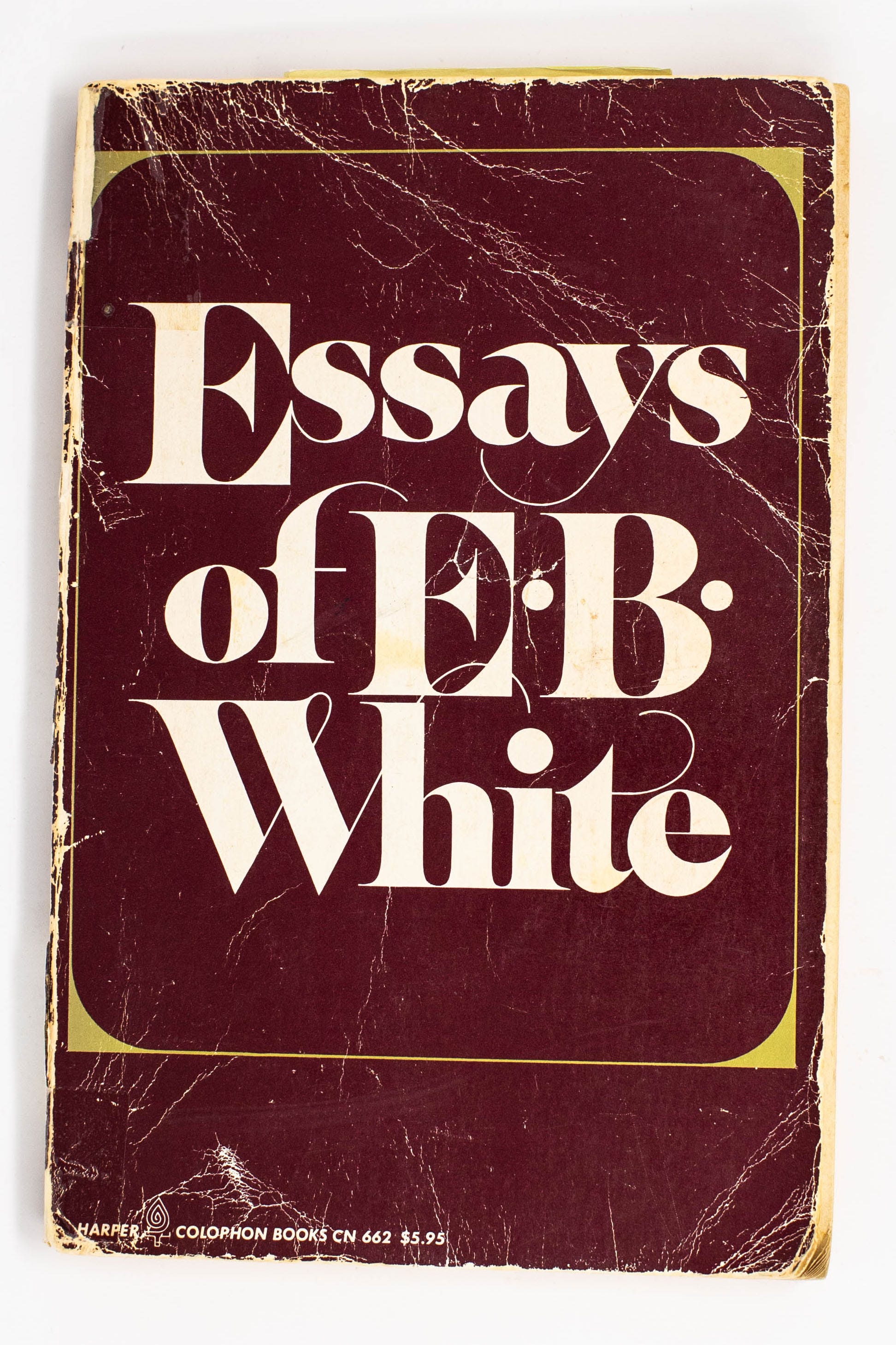
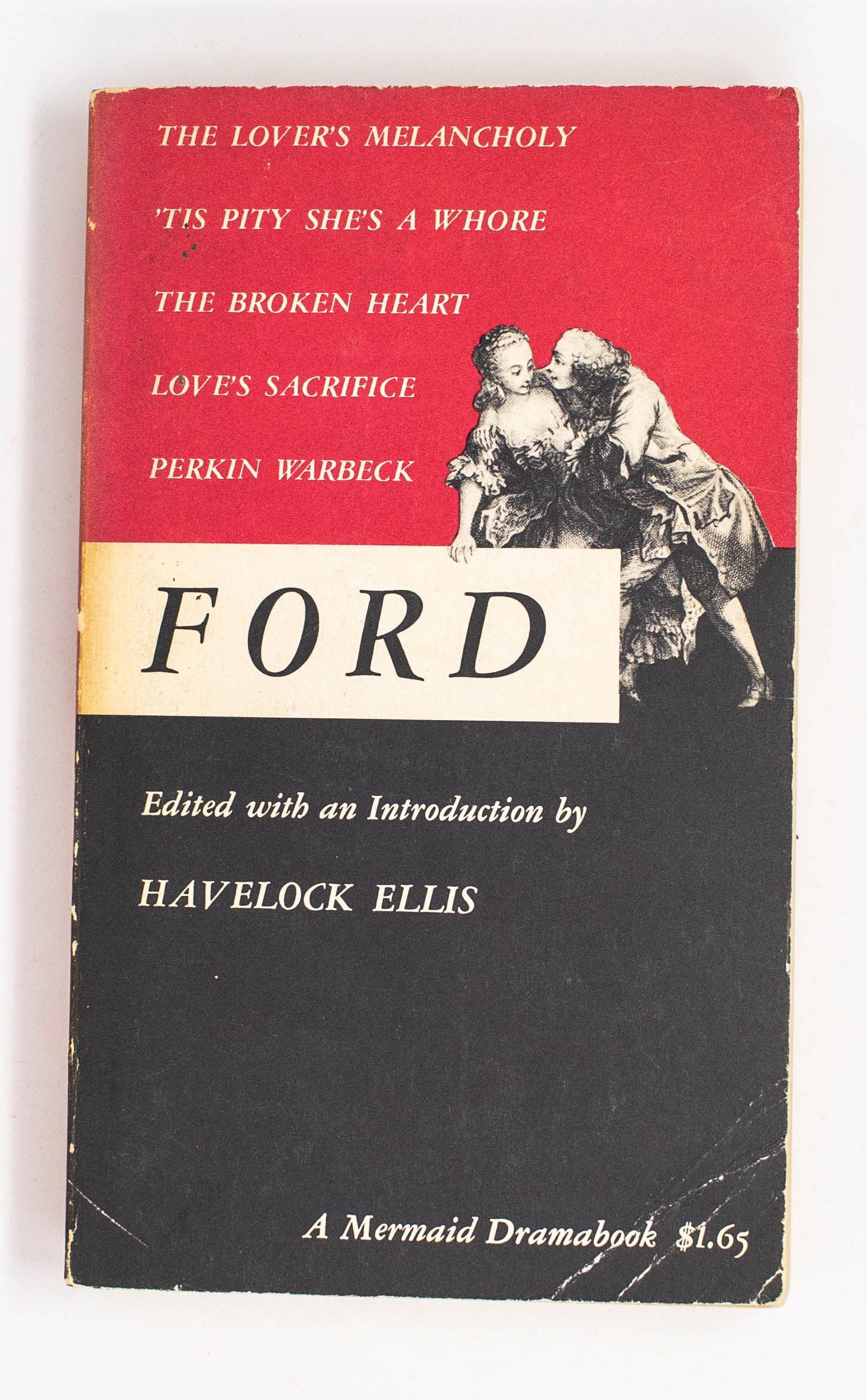
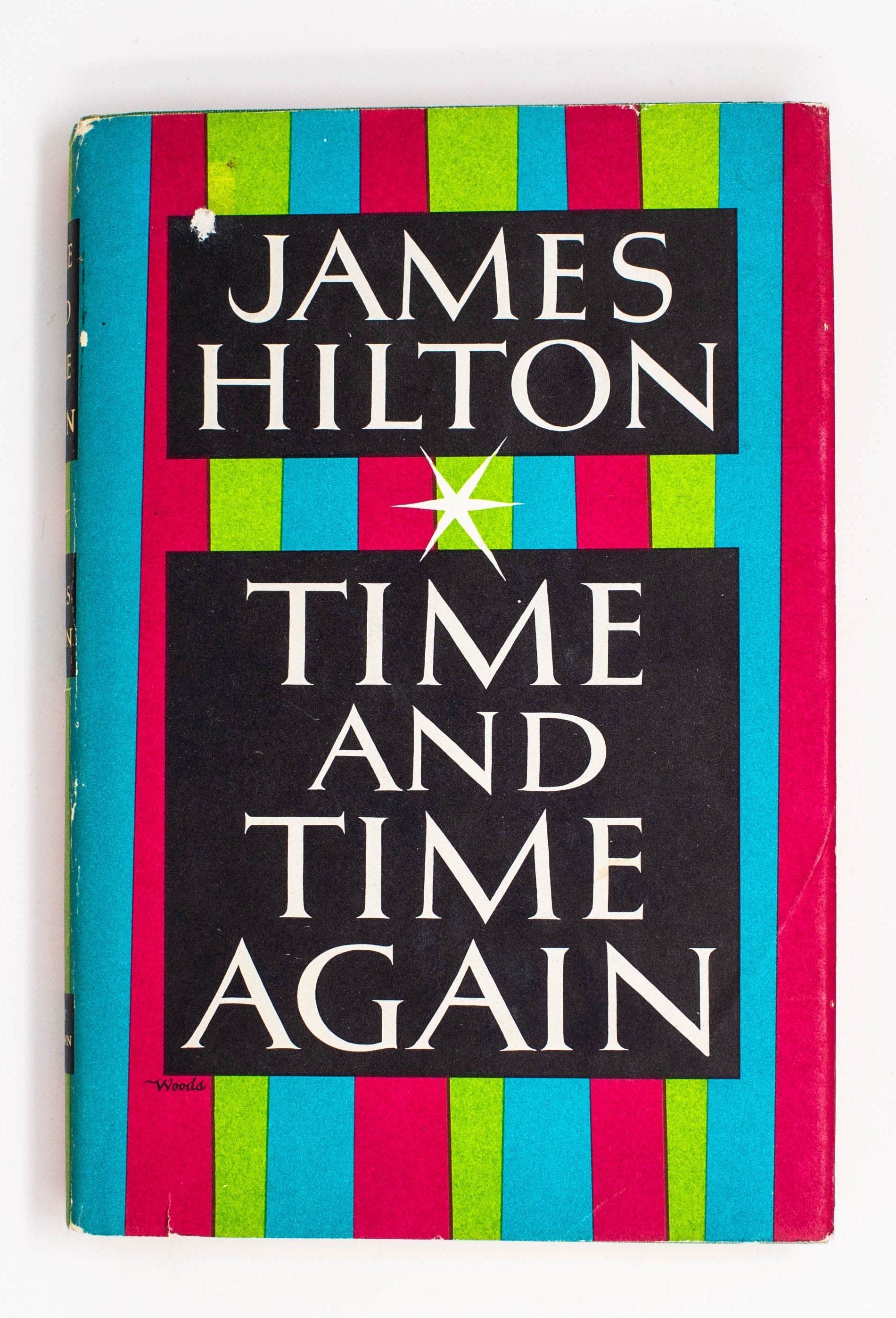
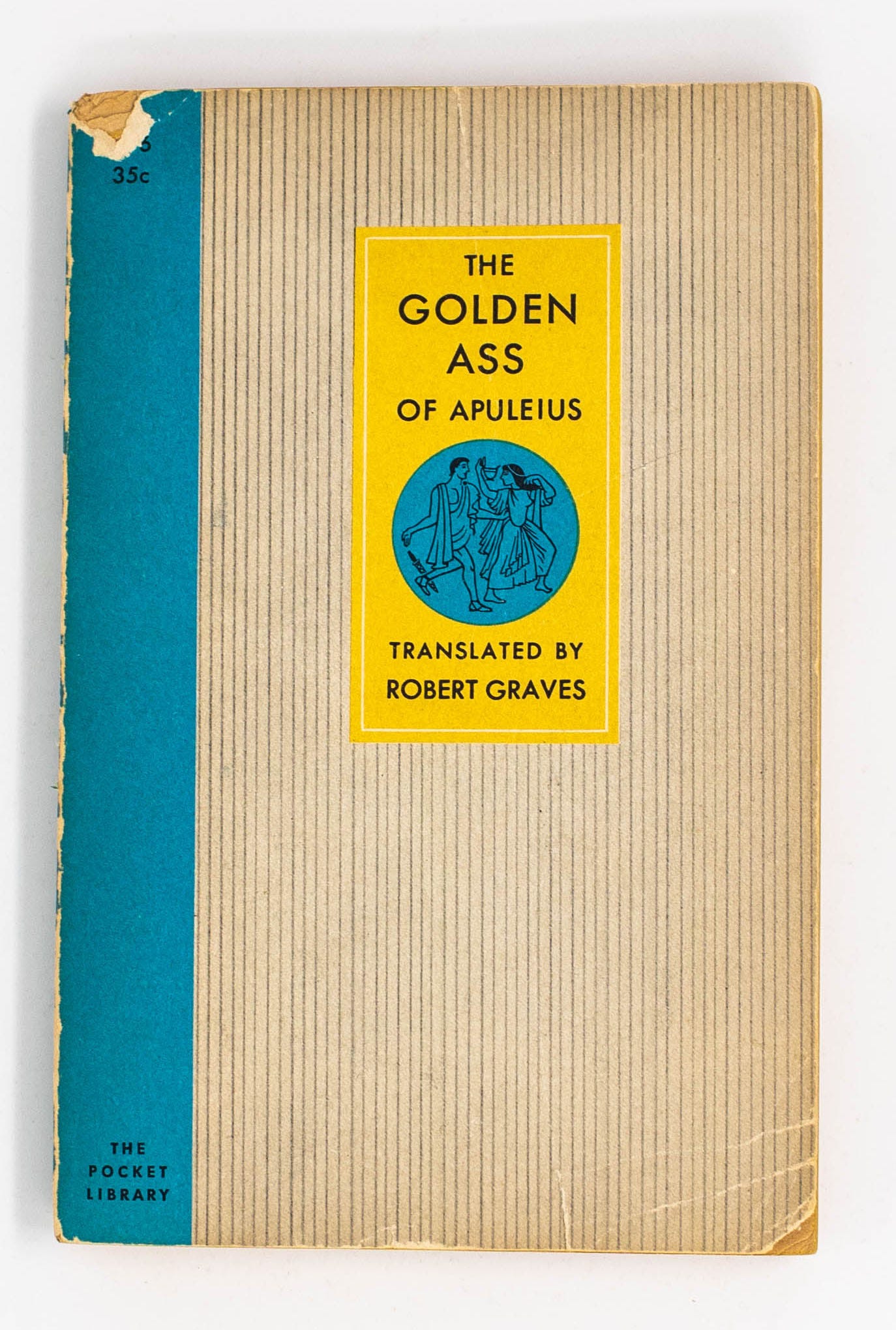
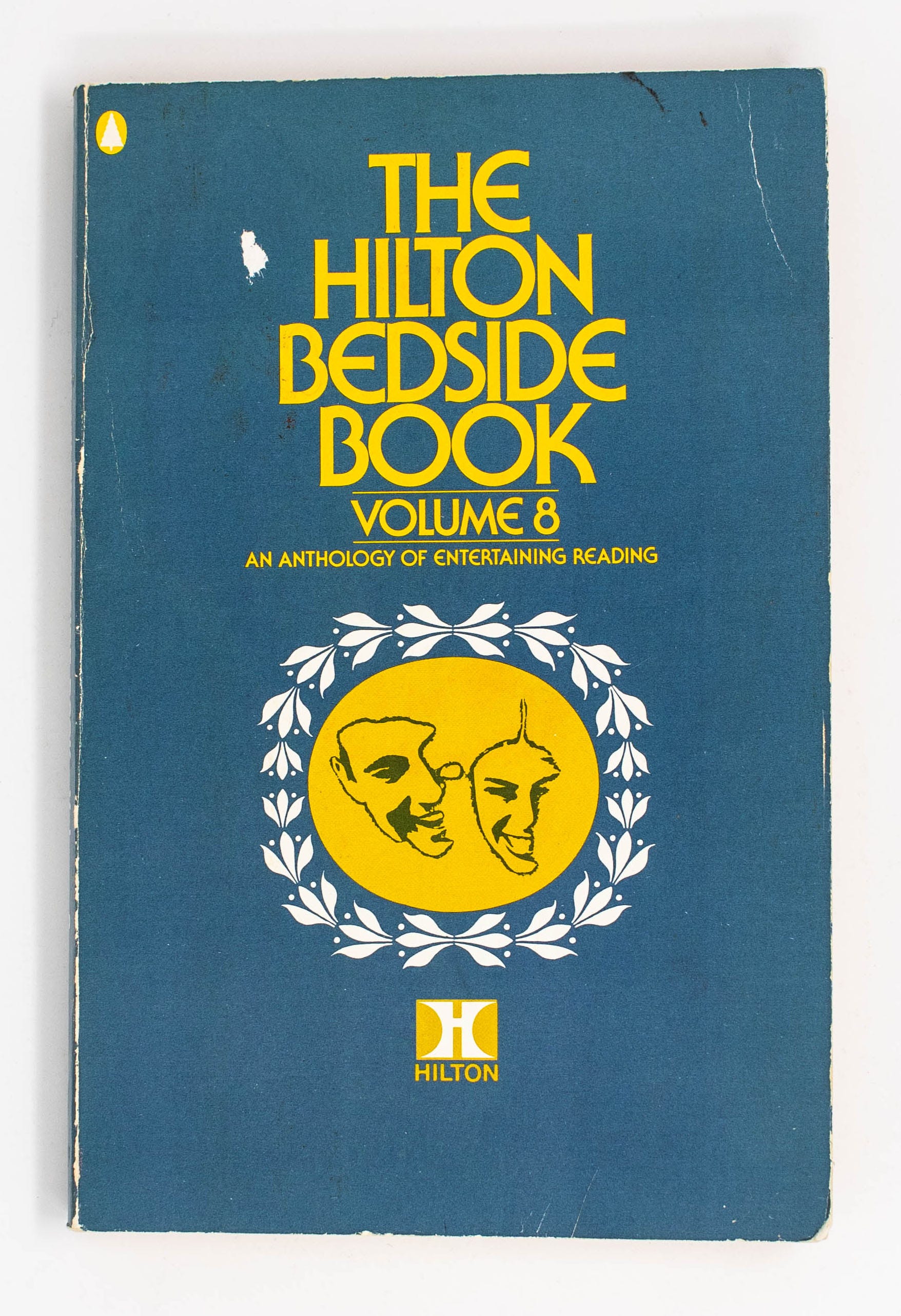
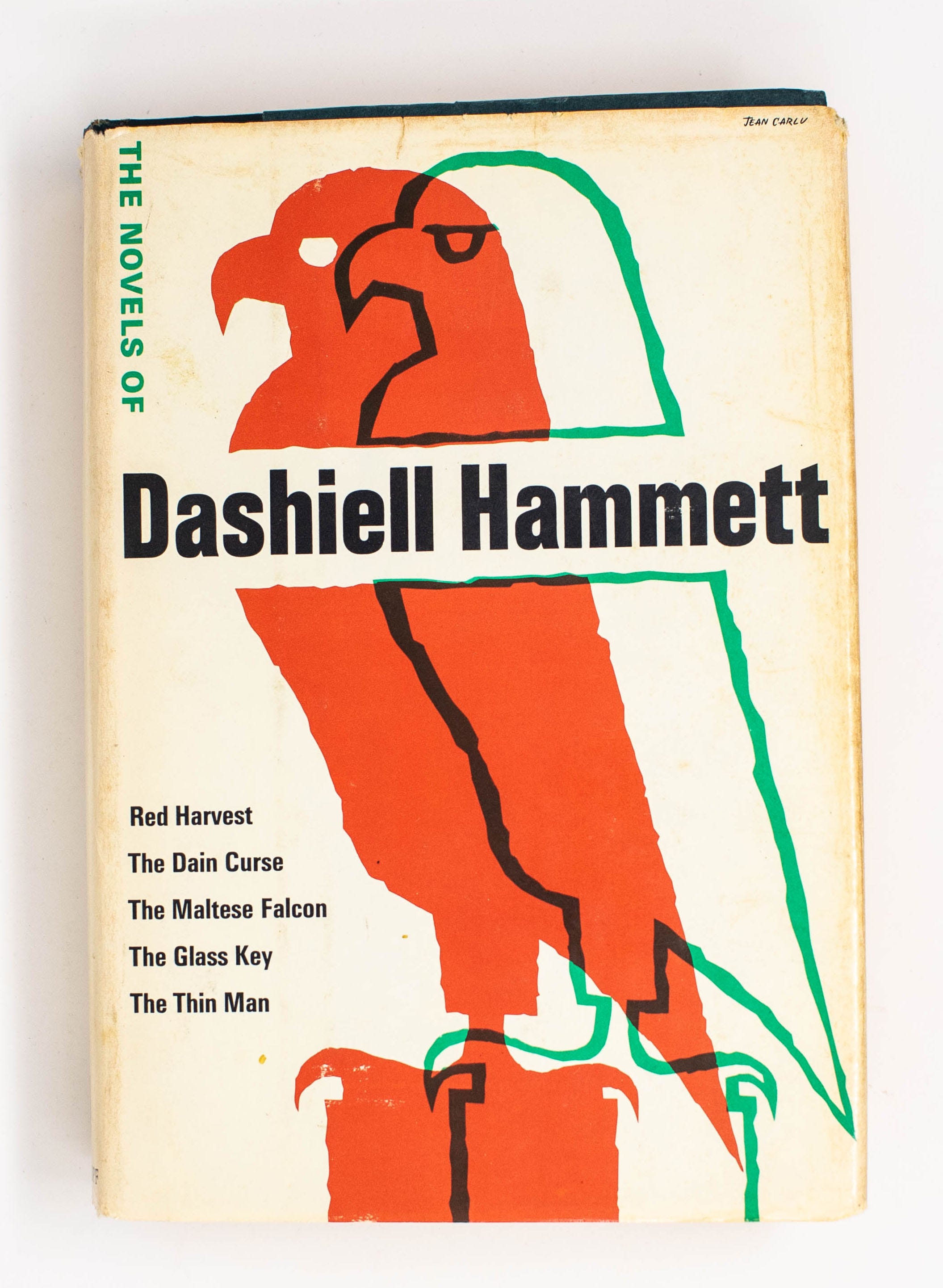
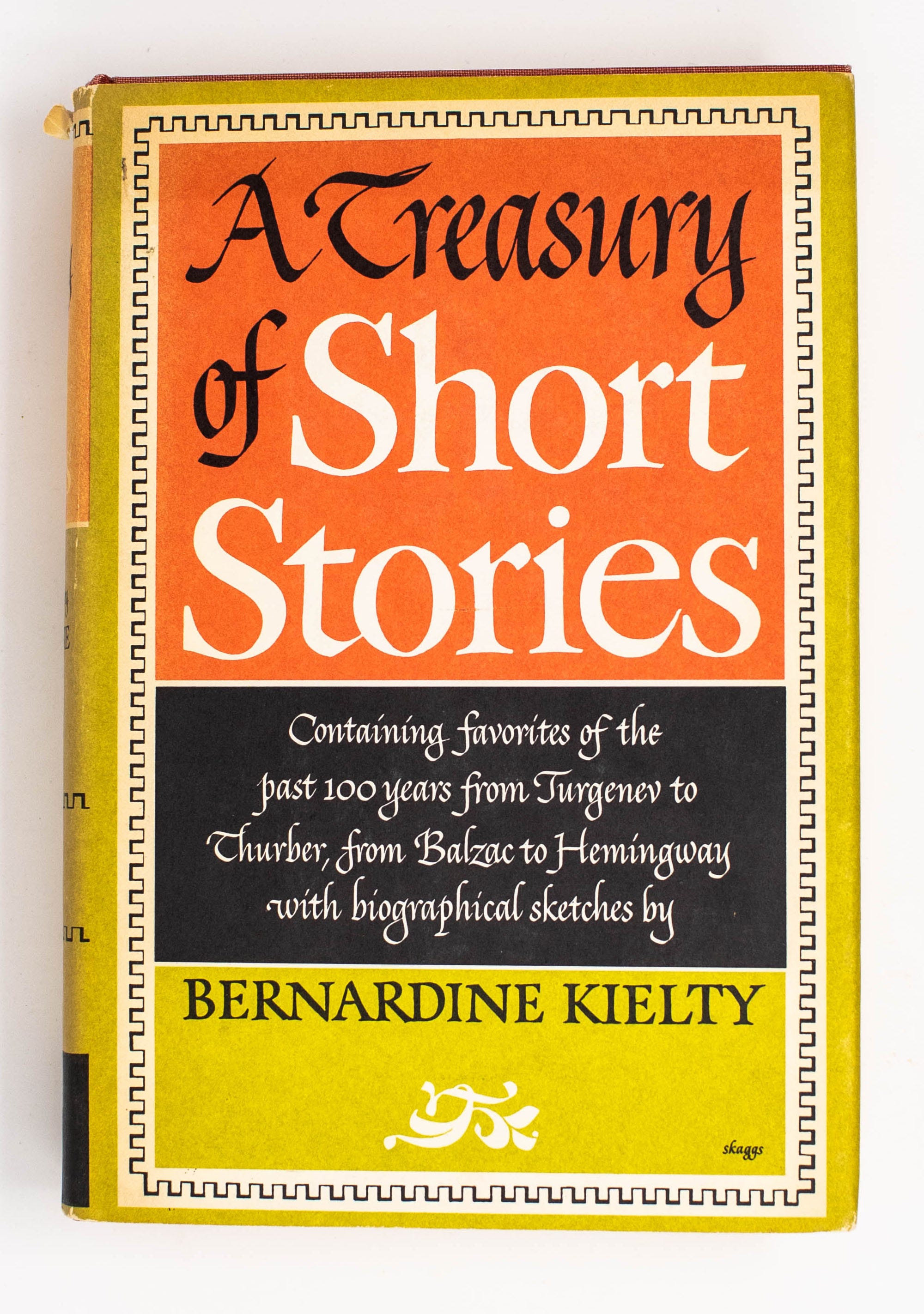
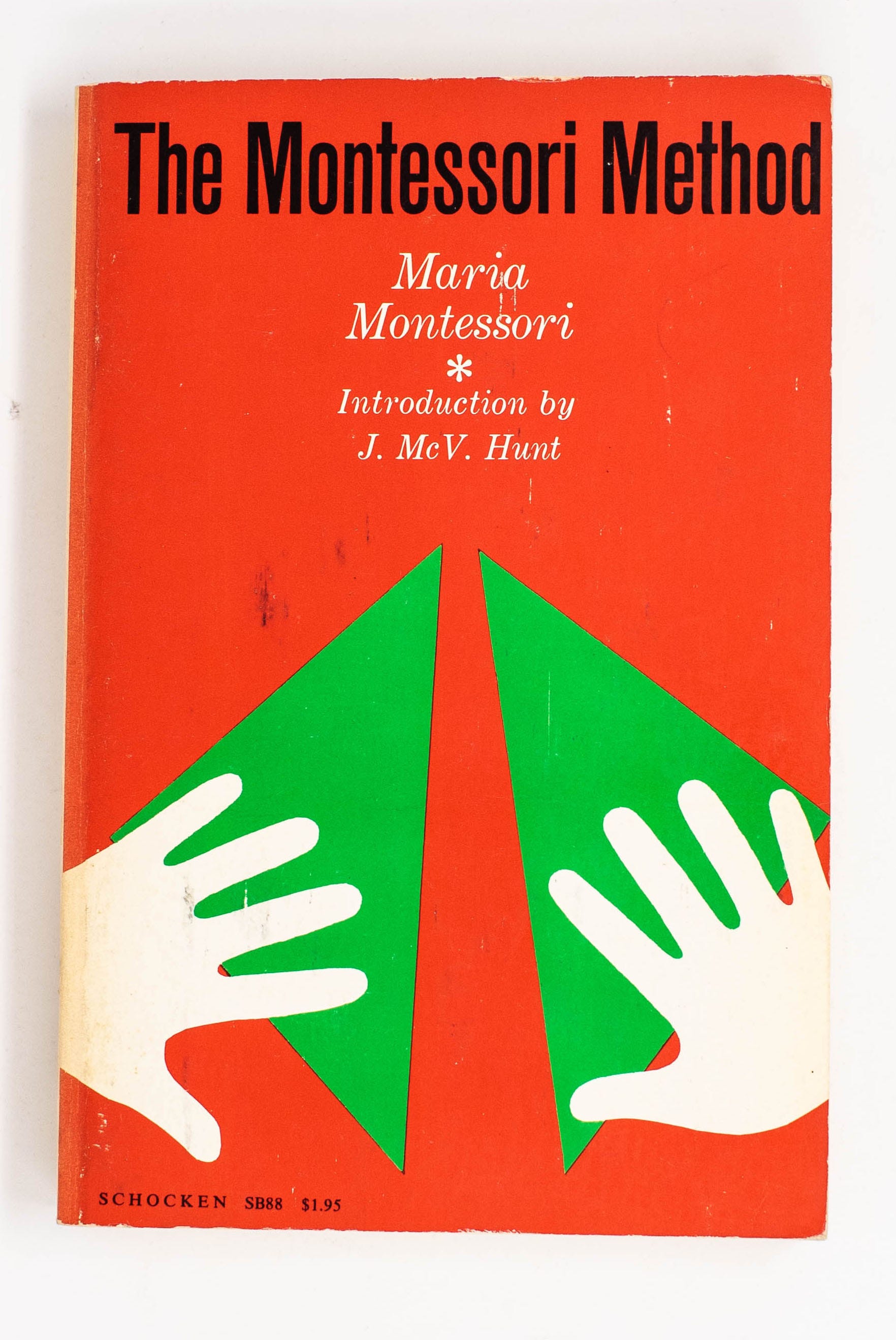
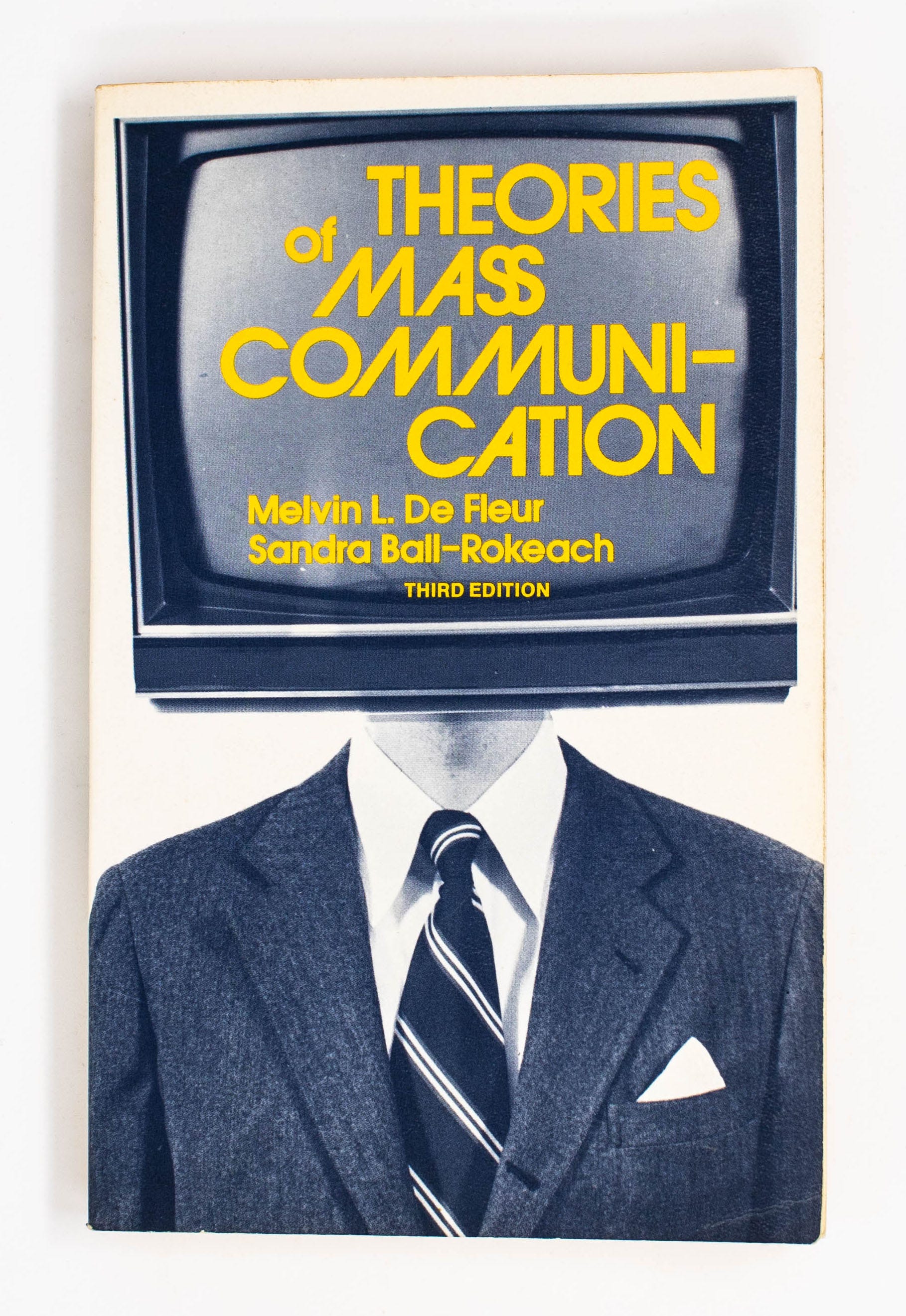
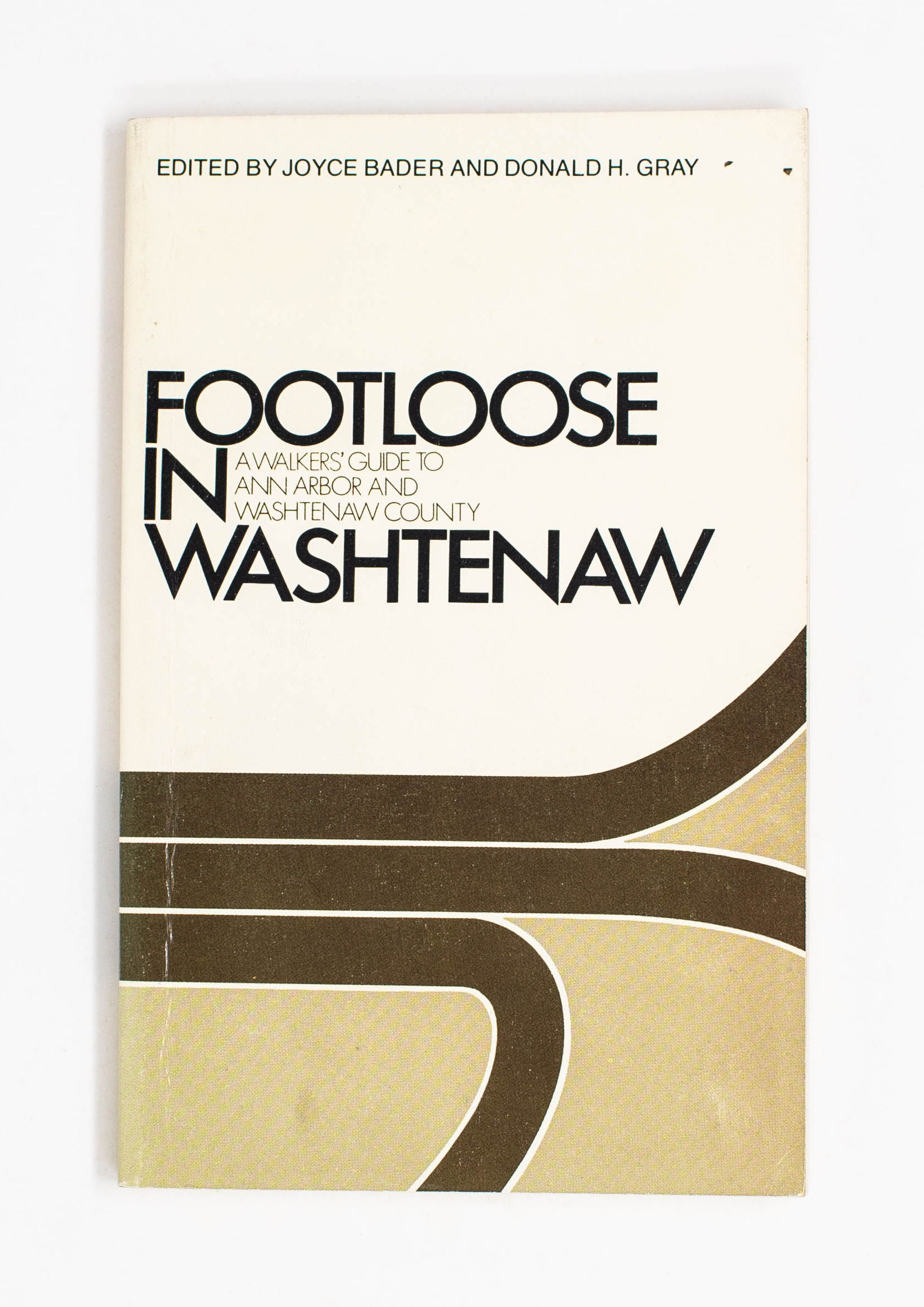
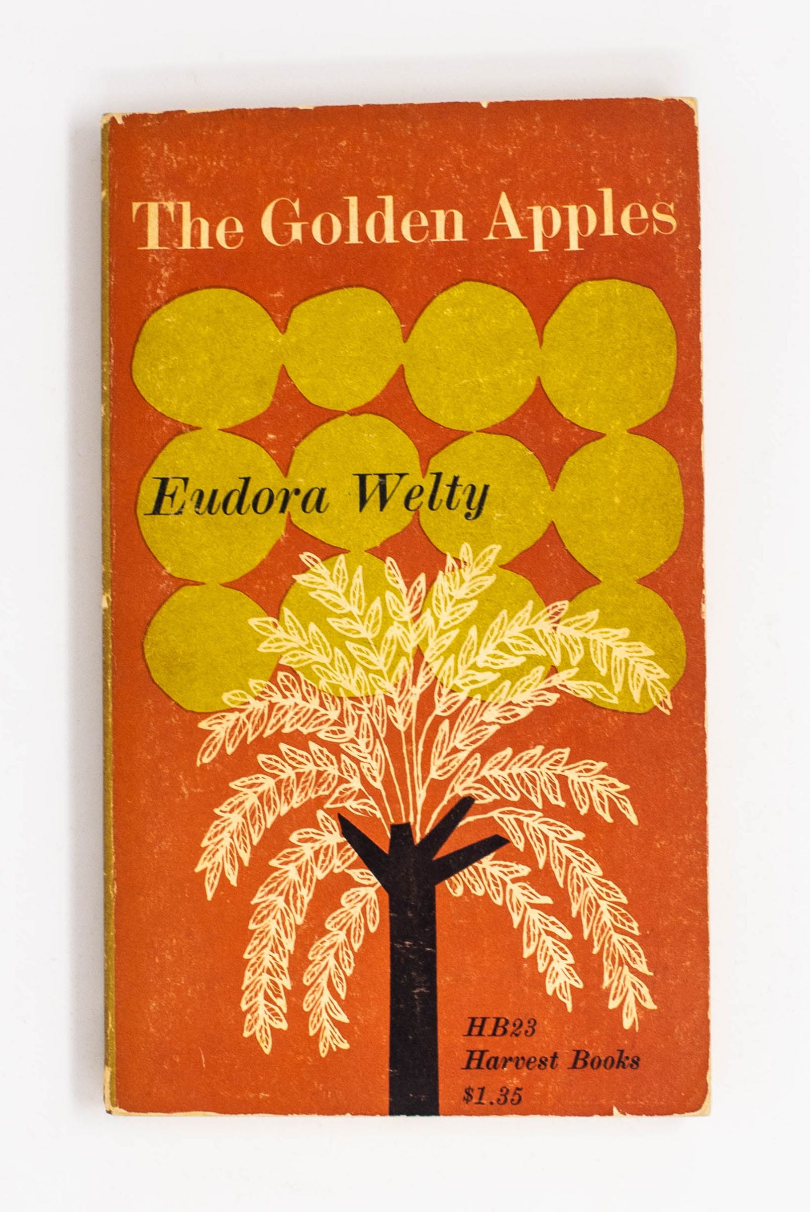
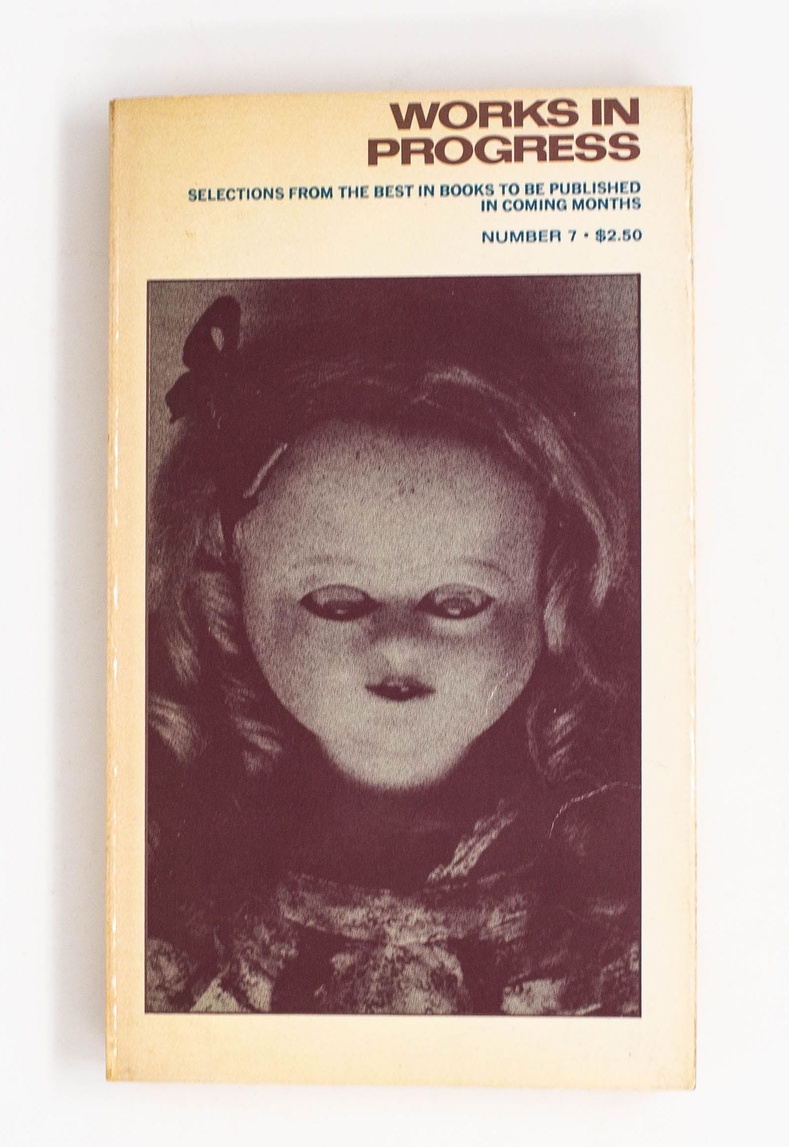
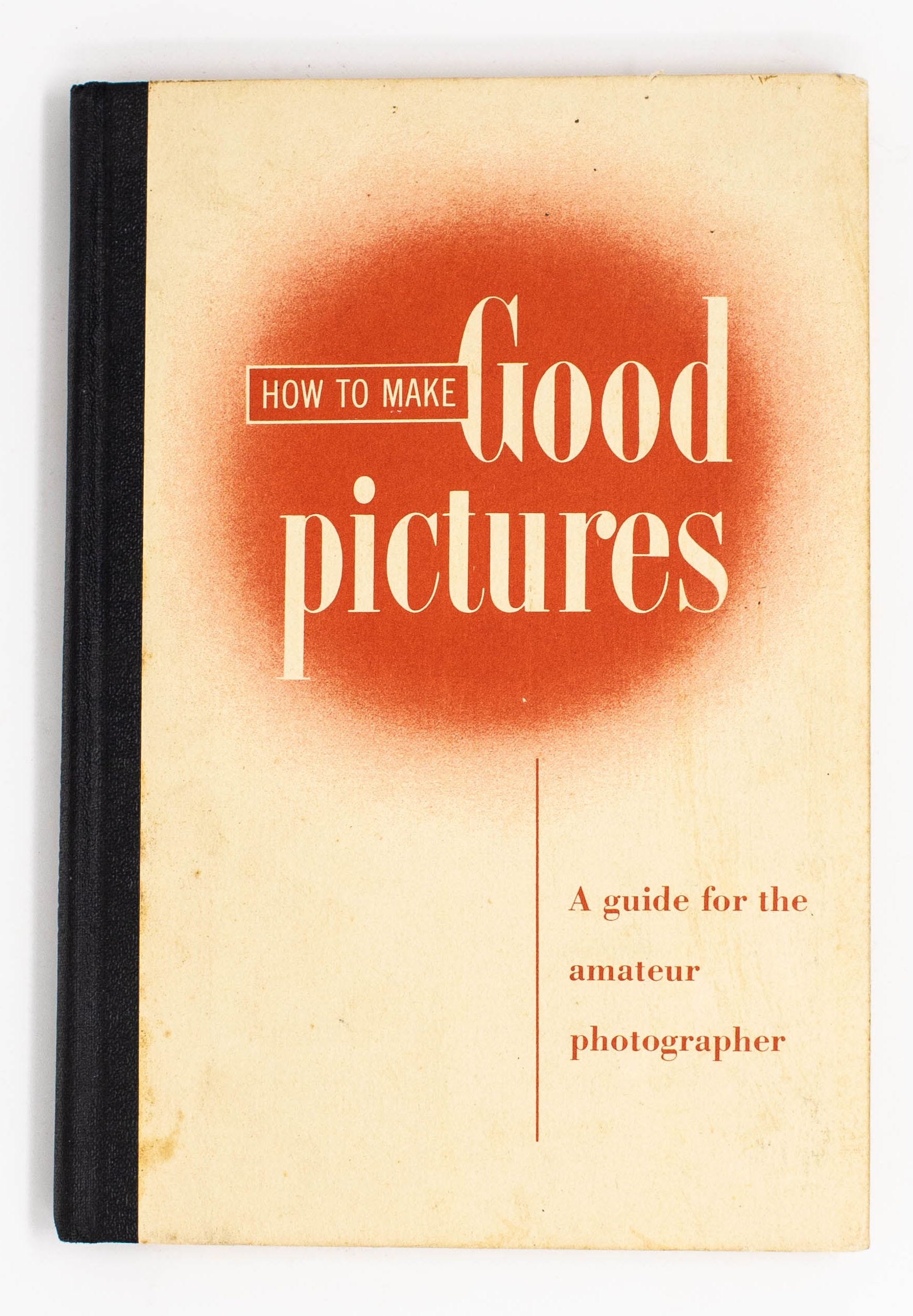
HOWEVER, I do have a particular affinity for mid-twentieth century book design. Perhaps due to techniques available, perhaps due to prevailing tastes, in many covers from this time period,1 there is an economic simplicity I find so damn attractive. I don’t think we should all worship at the feet of Paul Rand, but, I have to admit, I do like modernism.
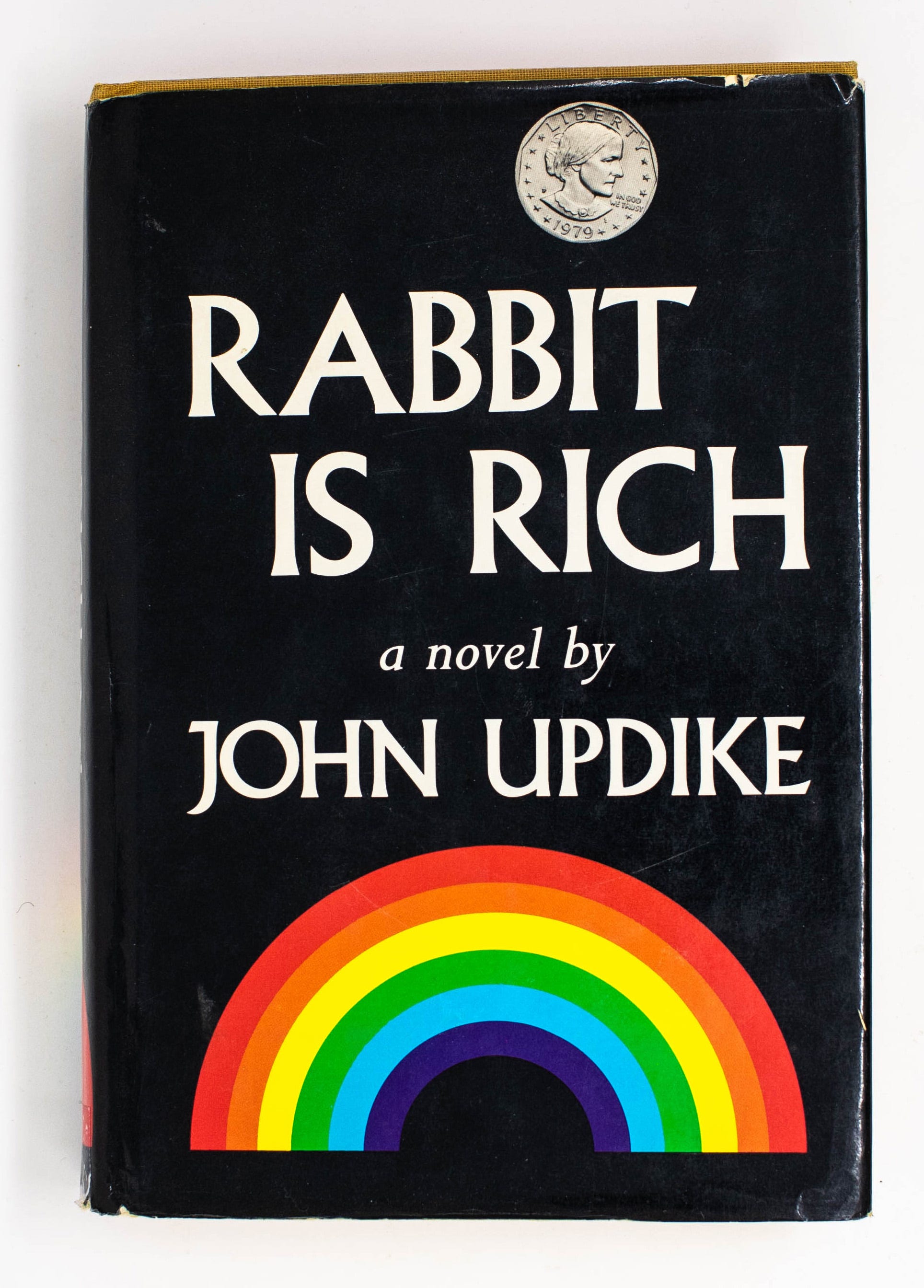
As such, over the years, I have collected a handful of vintage books with handsome covers. I try to be conservative with my purchases, but still, the collection grows. In an attempt to justify this accumulation, I would like to share some images of these covers with you.
Click here to view in your browser. There’s a lot of images, and this will get cut off in your email inbox.
Let me know which cover you like best, and why!


Thanks for Reading!
Thank you for reading looking! I mean it.
If you’d like to keep this newsletter going and help me say no to designing soul-sucking books about corporate events, email marketing, and raising capital, consider becoming a paid subscriber or buying me a coffee.
Until next time,
Nathaniel
Of which I am defining pretty loose, admittedly.
I'd thought in a totally unexamined way that there were currently a lot of book covers that are very focused on large, legible, typography, and that it probably had to do with how we look at a lot of tiny thumbnails of things on phones, but it's good to remember that this is not remotely a new design concept. (personally, I love a very type/lettering-forward cover!)
Your substack is the only one in my inbox that I take the time to stop and read. I completely agree that the mid century stuff is stunning.