

Q&A with a (Film Prop) Book Designer: Adam Medley
A Graphic Designer on the 2023 film 'Dream Scenario' starring Nicolas Cage


This is a companion piece to my newsletter “Real Covers for Fake Books in Real Movies.” You don’t need to read that one first, but I do quote this interview in it.
Click here to read “Real Covers for Fake Books in Real Movies.”
When I conceived of writing a newsletter dedicated to the covers of fictional books in film and television, I knew I wanted to do it right. I didn’t want to write or copy one of the listicles you can find on the internet, solely pointing out these books—I wanted to do some research and provide as much context as I could.
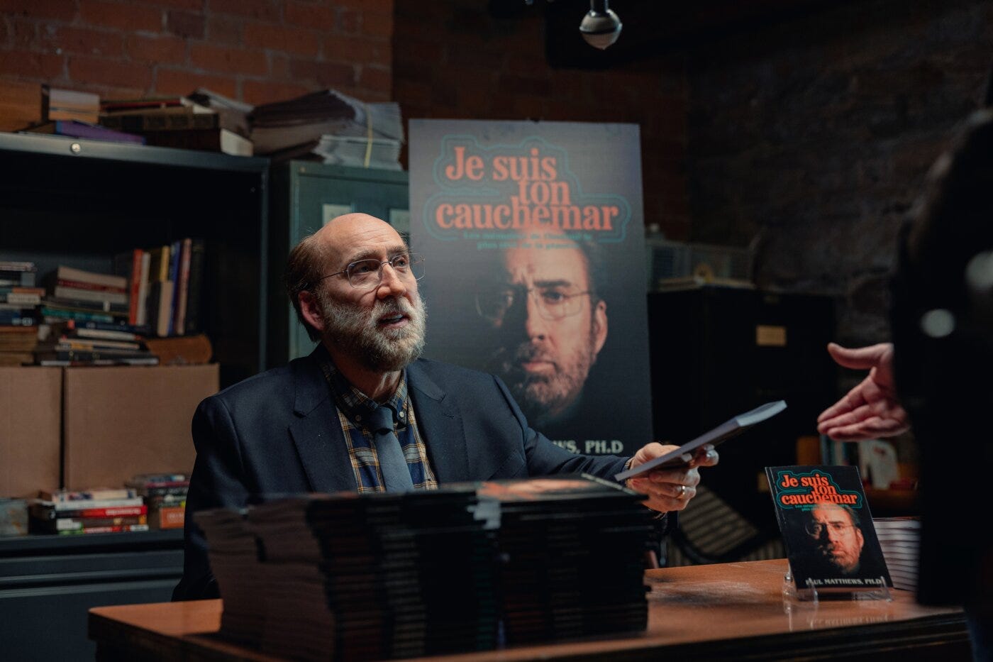
The same week I decided to write this newsletter, I watched a film called Dream Scenario starring Nicolas Cage. At the end of the film, the protagonist Paul Matthews writes a book. Kismet! Naturally, I fell head first down the rabbit hole. I looked up the movie’s credits to see if I could find who designed it—and I did.
Adam Medley is a Hamilton, Ontario graphic designer and the 1st Assistant Art Director on Dream Scenario. He has worked on several film and television productions such as Tribal, Come to Daddy, and Infinity Pool. Adam is super talented and was generous enough to answer several of my questions about both the book design in Dream Scenario and working in film and TV in general.
What did the creative brief for this project look like? Were you executing a specific vision or were you given room to play and try things a bit?
You aren’t given individual creative briefs for graphics in film production—at least I never have been—so the script is, in effect, the brief. Reading the script and taking notes is the first thing I ever do working on a production, as it’s the graphic designer’s job to help tease out all the potential graphics that may be needed scene by scene, and when they’ll be needed in the coming weeks according to the shoot schedule (something that’s not usually fully finalized until soon before everything goes to camera). Another part of this stage of the process is determining how “hero” (i.e. how important or how visible on camera) each graphic will be. There aren’t always a ton of props or set decorations involving graphics written right into a script, but it’s easy to imagine all the things that may need graphics simply from knowing the settings of where the different scenes of the film take place (e.g. a restaurant scene may need menus, artwork on the walls, and signage and a logo if there are shots of its exterior). There’s always more that could be designed than there is time and money to create it, so things in the background and things that are less hero and are as likely as not to never appear on camera anyways aren’t given as much time or priority as the hero graphics, which this book definitely was.
Then there’s the consideration of how long a printer or other vendor will take to print or create the graphic, or if you’re making it in-house how you’re going to print it and put it together. There are a number of print shops in the Toronto area that specialize in serving film productions and they do amazing work turning out all kinds of stuff we wouldn’t be able to figure out on our own and they often work late to do it, but some things need to be sent to other vendors who aren’t used to the film-world pace of things and so it’s important to factor in which graphics will take those extra days or weeks to have made.
I mention these resource and logistical considerations first because they’re as important as anything to how the graphics take shape in the end, though that’s not to say I or anyone in the art department doesn’t care about how things look or how they fit into the visual style and mood of a film. The production designer, who heads the art department, will have put together a design proposal for the director conveying the style they’re going for for the sets with the work of photographers or stills from other films for reference. They’ll also usually have a colour palette they want incorporated into sets and graphics throughout the film as well.
In addition to the production designer’s vision, I’d say the genre of film plays a big role in the style of graphics I’ll design, and of course the time and place that a film is set is crucial too. Everything I’ve worked on has been set in the present-day or fairly recent past, but productions in Canada are often set in the U.S. or other countries, so a lot of the art department’s work will be to make locations such as city streets more American, European, or whatever the case may be. Comedies allow for more freedom to come up with graphics that are funny, but even on something like a drama or thriller there’s usually some opportunity to have fun with the things that are less hero and in the background, but that’s partially just me finding consumer products and branding and so on inherently amusing.
How many options and/or revisions did you make for this cover?
I began with about a half-dozen quick concept designs based on photos of Mr. Cage and book cover reference images I pulled from the internet plus a few book cover references passed on from the director, and from there created a handful of more polished design options once I had received the headshots that were to be used, most of them with the same design but using different photos to see which one worked best. Fortunately the director liked what I had come up with and all that was left after that was a round of revisions to fine-tune the colour and contrast adjustments I had applied to Nic’s face. The last step was expanding the design to include the spine and back cover and fill it with all the necessary details.
In the film, Nicolas Cage’s character didn’t see the book until he was at the bookstore event in Paris. This, among several other indicators, communicates the publication was maybe a little less than legitimate, or at least a very small operation. How did this play into the design direction? How did the book being in French play into the direction?
I can’t quite remember the discussions I had with my art director about this, but I knew from the script that it had to be a thin, unsubstantial book and so should really be just a paperback. The gag is that both the book and the book-signing event both fall well short of how it was hyped up to Paul, so the book had to look cheap, though not necessarily as if no care was put into it. I imagined Paul had a relatively small but devout fanbase in France, and so the book should have a small-press feel to it. And when it comes to the language of the book not being English, the main thing that was lost in translation, so to speak, is the very subject matter of the book, which based on the title had changed from the serious scientific matters Paul cares about to a horror story sensationalizing the phenomenon of him appearing in everyone’s dreams. I didn’t initially know how far in that schlocky horror or true-crime direction the director would want the design to go, but it turned out I got it right right from the start with one of my preliminary design concepts.

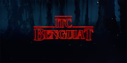
Nathaniel Note: You might recognize the font in which Paul Matthew’s name is set on the cover. It is called ITC Benguiat and it is used on several Stephen King titles and, notably, Stranger Things.
Often in film and TV, you see a hardcover jacket on a book. To my mind, this is cheaper/easier because you can just slip the jacket over an existing book. This book is a paperback. This also communicates the lack of resources from the character’s publisher, but it leaves me wondering—were the inside pages blank?
You’re right that putting a dust jacket on an existing hardcover book is perhaps the easiest way for an art department to create a book; another is wrapping an existing book with an adhesive vinyl front and back cover, which works on paperbacks or anything that wouldn’t have a dust jacket. Both of those methods are cheap and do the trick for background and less hero books—which there are often many of—but for this one we knew it would likely be featured closely and slapping a cover on a preexisting book wouldn’t hold up. We also knew there would be piles of these books in the book signing scene, so they would need to be identical and not just a bunch of random books from a thrift store (the usual go-to source for books to be wrapped).
All this meant we’d need to have some actual books professionally printed, and fortunately I found a shop in the area that specializes in small-run book printing that was economical enough to not put too big a dent in our department’s budget. They sent us some samples of various books they printed and I made sure to get them the print files several weeks ahead of the shoot date to ensure they’d have them printed for us in time. Since we knew this book would be handled by the actors it was important that the inside pages not be blank, as one thing you really don’t want as an art department is for your work to in any way limit what and actor can or cannot do in a given scene—say, open a book in such a way that the inside pages may be caught on camera—whether or not such actions are in the script. To fill these pages someone had the idea, as kind of an inside joke, of taking a particular old French novel1 that was in the public domain, and so I copied the text and formatted it all just well enough that it would look okay if shown on screen.
What did the approval process look like? In publishing, book covers can get picked apart by several different departments at a publishing house.
Generally, as a graphic designer I send my work to our art director and production designer, and they’ll decide whether or not they should send it to the director for approval or feedback. Some directors are more interested in the graphics side of things than others and all super busy overseeing all the other aspects of the filmmaking process, so not every concept design or minor revision will be sent their way, unless it’s for a very important graphic such as this book. Directors generally don’t communicate directly with the graphic designer but I’ll get notes and comments from them through the art director and production designer, who will give me feedback too. Everyone in the art department knows how much of a scramble it is simply to get everything done on time, so the criticism is generally constructive and helpful towards getting the job done. I don’t recall getting any negative feedback or finicky revision requests for this cover design at all.
Are you at liberty to share what text went on the back cover?
The back cover text is a blurb followed by a couple short review quotes and a bio for Mr. Matthews, all of which I wrote. Often when working on a graphic you realize, hopefully well ahead of time, that you need some text or a bit of information (e.g. a character’s middle name on a piece of ID) that you can’t simply make up yourself, and so the art director or production designer will put in a request to the writer or director to come up with what’s needed to complete the graphic. In this case the director (who wrote the script) must have been, understandably, too busy at the time to write anything and since I can speak and write somewhat passably in French I took a shot at it and passed it on for everyone’s approval. I’m happy to note that if you’re able to read French and pause the movie at the right moment you’ll find that most of the text is fairly intelligible, especially the bio at the end, which is the part I’m most proud of.

Did you get to keep a copy?
Honestly, I can’t remember! Typically graphics and props leave the art department and are taken to set, never to be seen again by those who designed them. If I have a copy of the book I put it somewhere safe, I’m sure!
Have you designed any other books for film and TV? If so, which ones?
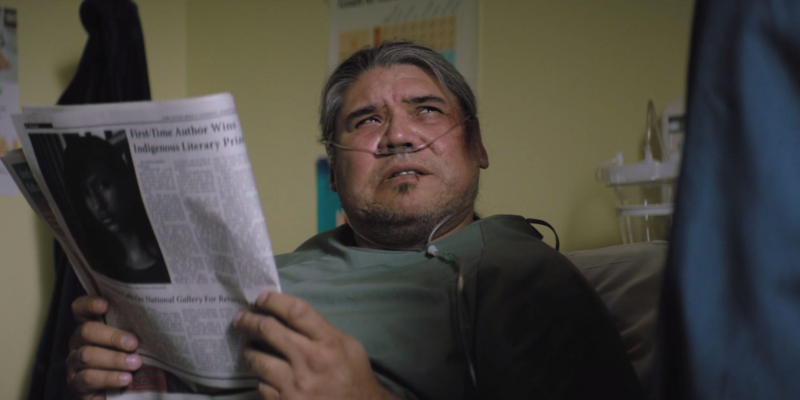
I’ve done a bunch of cover wraps for books for set backgrounds, to give to set dec to place on shelves and coffee tables and so on, but nothing else as heavily featured or important to the plot at this one. This film is the most book-centric I’ve worked on: in the latter diner scene, you can see Paul reading a Robert Sapolsky paperback I designed a cover wrap for, and earlier in the movie there’s the fake issue of Nature magazine that I created (magazines being close cousins of books). There were a couple more covers I designed for books that were supposedly somewhat hero but ended up not making it on camera, or at least not enough for viewers to make out their designs. Maybe they’ll make more of an appearance in the Director’s Cut!
I could ask you a million things about designing for the screen. It sounds like so much fun, though I'm certain it has many challenges. What's the weirdest thing you've ever had to design? Or the last thing you ever thought you'd be asked to design?
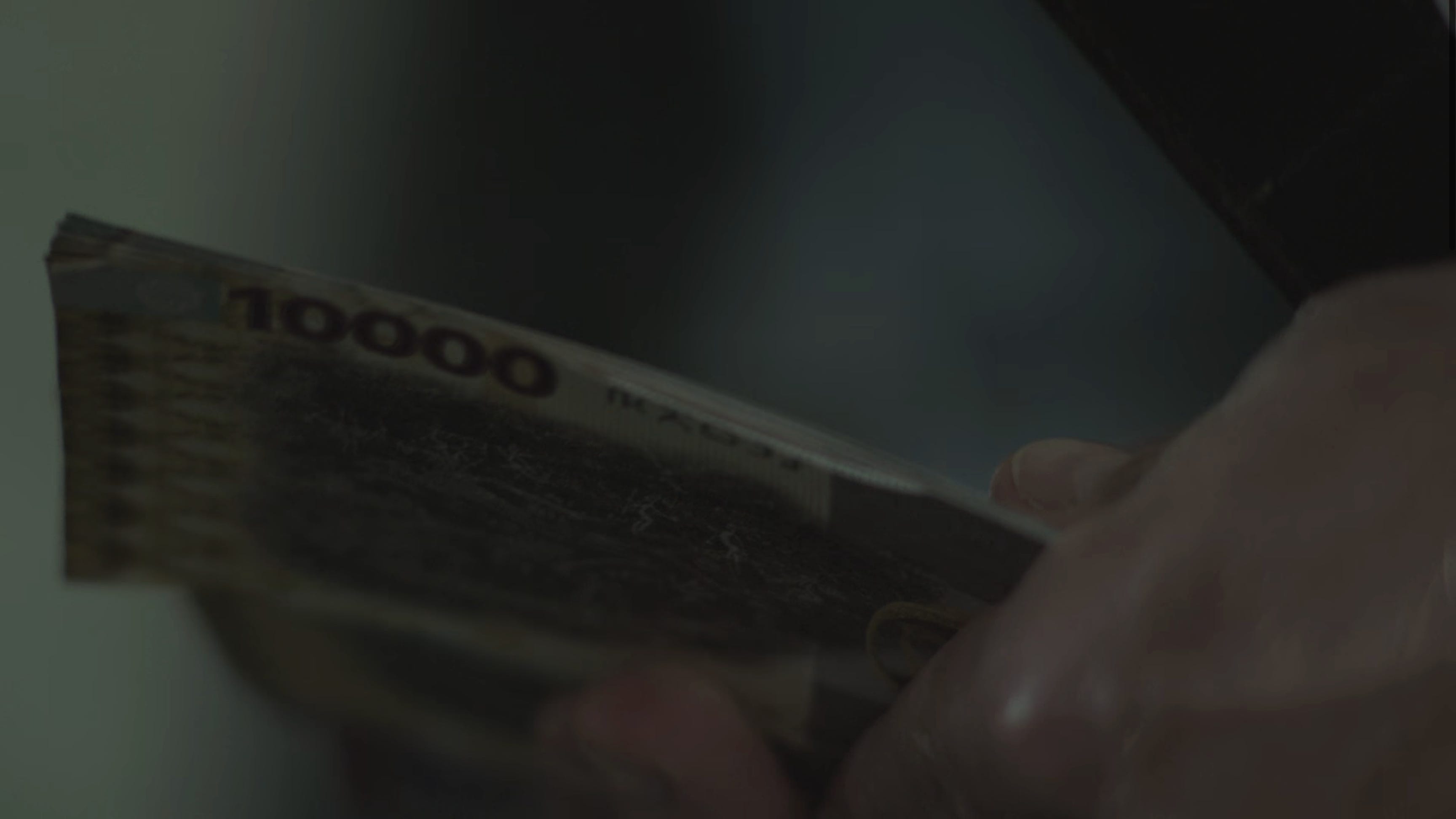
Nothing I’ve had to design has ever been particularly weird, so I’d have to go with the stack of banknotes I designed for Infinity Pool, which was a different kind of challenge. That film takes place in a fictional country with its own invented language and alphabet (one I got to help design the glyphs and typography for), and so we didn’t want them to look like ordinary American or (somewhat less ordinary) Canadian dollar bills. I spent a fair bit of time online finding some really crazy banknotes from around the world to pass on to the Director as references, and came up with designs for three denominations in bright colours that I thought would make them stand out as foreign to North American audiences. Working on other films had given me practice in counterfeiting driver’s licenses and passports so getting to try my hand at (entirely fictional) money and seeing the result on screen was very cool.
What makes your experience in the industry atypical?
NN: Adam mentioned this earlier in our correspondence.
I never had any plans to work in film, and the first film I did graphics for I worked on remotely as I was living in a different province. I worked on several more productions the same way, always far from the rest of the art department and all the action on set and in the production office. Working remotely is something that’s become more common for graphic designers in film production beginning with COVID, as a lot of folks were working from home and you don’t as a graphic designer need to be on set anyways, but working remotely wasn’t an ideal start for someone new to the industry like myself. When I moved back to the Toronto area I was finally able to work more in person, and I found working in the production office along with the rest of the art department to go much, much, better than from my desk at home. It’s nice to be able to see sets being built or sometimes going to locations, and working alongside the rest of the art department and what’s going on in other departments helps you have a much better sense of how the production is going as a whole and allows you to better keep up with the frantic pace of everything.
Thanks for Reading!
Thanks for reading! And thank you to Adam for taking the time to answer a cold email and several questions. I loved learning more about his work and hope you did too. If you missed it, be sure to read my newsletter about fictional books and their covers.
If you love this newsletter and want to support it, you can do so by buying me a coffee or becoming a paid subscriber.

Paid subscribers get access to How to Design a Book Cover, a bonus bi-weekly series in which I break down my book cover designs from creative brief to final cover. You can read the first post in the series for free here:

Until next time,
Nathaniel
Because I am a nerd, I wish Adam mentioned the novel, but thought asking him might have been annoying!