

Indie vs. Mainstream


A few months ago, someone shared an early newsletter of mine, about my ability to tell your book was self-published, with this comment:
Trying to make your book appear more mainstream is one choice
I’m looking to make mine appear more indie not less
My initial response to this comment was one of annoyance—“OK buddy, good luck with that”—but the more I sat with it, the more curious and thoughtful I became.
The advice in that earlier newsletter can be distilled into two categories:
Quality Design Choices
Adhering to Publishing Conventions
The latter, I assume, is what this “more indie not less” commenter was referring to, despite this category’s relatively smaller presence compared to the former. I will be generous and assume this person was not advocating for poor typographic hierarchy and excessive drop shadows in an effort to look more “indie.”
Whatever their intention, the comment raised some questions in my mind:
What exactly does “indie” mean?
Where is the line between indie and mainstream?
What does indie, yet professional, look like?
What, if anything, constitutes a book that appears too indie?
What role does design play in this discussion?

What Does “Indie” Mean?
While I don’t think this comment means nothing, I do think it means less than what its author thinks it means. “Indie,” of course, here means independent. But independent publishing is a broad umbrella that can and does mean many different things. The great Anne Trubek may correct me if I am wrong, but “independent” really just means any publishing operation that is not conglomerate owned.1 W. W. Norton, a publishing company with tens, if not hundreds, of millions of dollars in revenue,2 is technically independent. So is Hub City Press, a small, non-profit press in Spartanburg, South Carolina, helmed by Meg Reid. So are writers like Brandon Sanderson and Elle Griffin crowdfunding the financial support for their latest books, CEOs hiring hybrid publishers to help them publish books, or your weird uncle selling copies of the memoir he produced at Kinko’s out of the trunk of his wood-paneled hatchback.

Lately, I have noticed a push to specifically label self-publishing as “indie” publishing. This is not necessarily wrong, but this both interesting and, in context of our friend’s comment, somewhat ironic. It seems to me that this push to label self-published books as indie comes from a desire to do away with the stigma or cultural baggage of the term “self-published.” One writer on Substack even admitted as much in an interview they re-published to their newsletter last year (emphasis mine):
Let’s call it mainstream vs indie. I know I’m being pedantic, but a) I’m a writer, and b) it matters. The publishing industry is way behind the curve of every other creative sphere when it comes to valuing independent artists. The word indie is revered in music, food, beauty, hotels, festivals; you name it. Stick the word independent on the front, you can charge double and everyone thinks it’s cool.
But publishing? It works for indie bookstores, it even works for indie publishers, but for indie authors, which is exactly what a self-published author is, forget it. It’s slapped with the denigration vanity publishing. Look too closely and you’ll see embedded into the title self-published is the notion that the contents will be a step down from anything published by a mainstream publishing house, that the production values will be a bit rubbish, that it just won’t be as good.
The point being made here is solid, and I don’t even really disagree, but this use of the term “indie” to refer to self-published books is, ironically, using language to make your book appear more mainstream. The indiest thing you can do is call your book self-published. And, I think, the most impressive thing someone can do is create a terrific looking book that they are unafraid to call self-published.
I know, I know, I am getting caught in the semantic weeds here and another writer is getting dragged into this before I even begin to talk about the role of book design in all of this. But we’re writers—if we cannot talk semantics, who will?
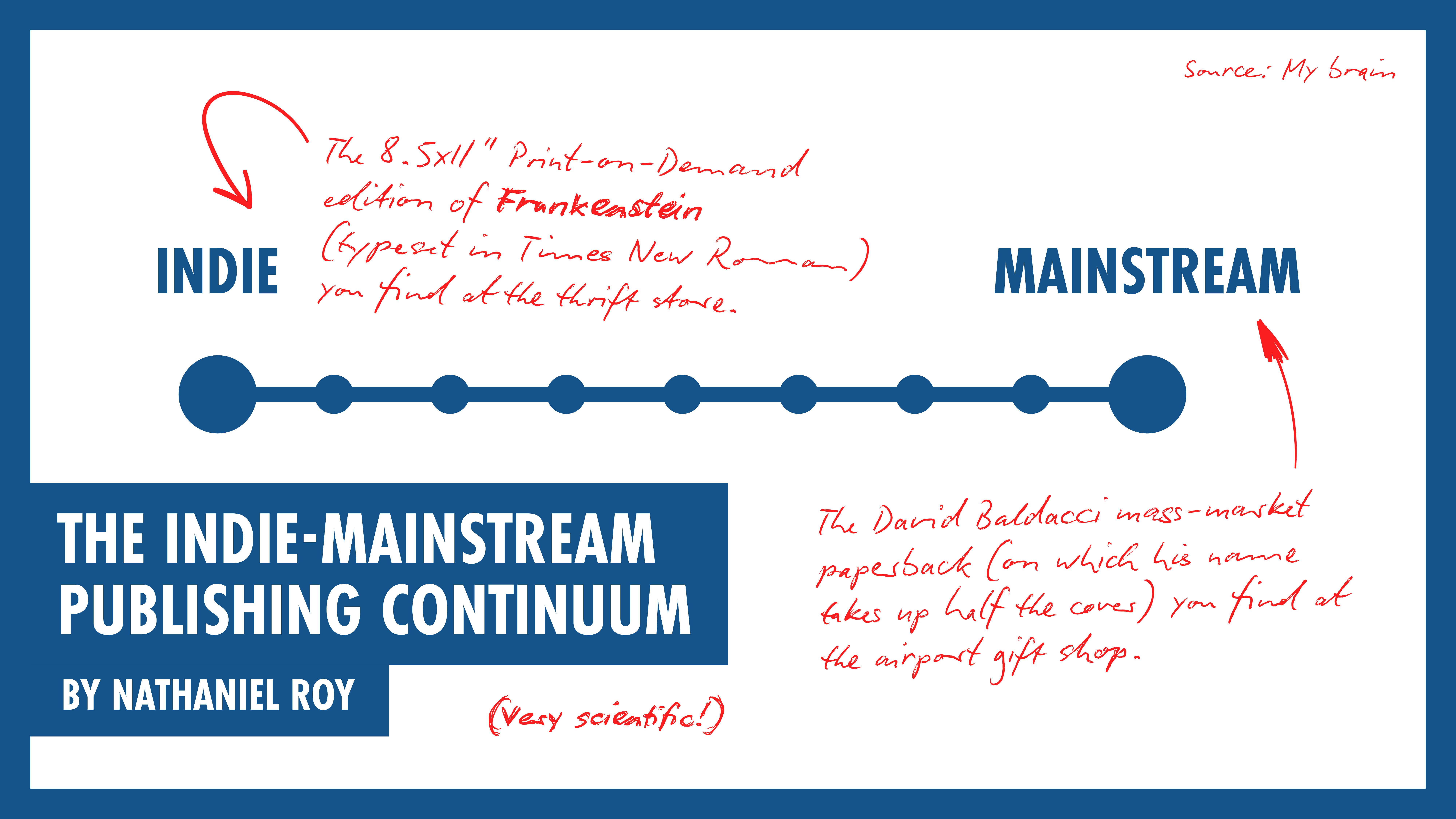
My point is that this “indie” of which we want more of does not mean just one thing. Indie and mainstream publishing exists upon a continuum on which the way your book looks is just a single factor.
Why Look Indie?
Now that we’ve established “indie” is more than one thing, and that “appearing more indie” might mean different things to different books and people, why might anyone want to look more indie in the first place?
The Impact of Book Design on the Indie-Mainstream Continuum
Whether a book is mainstream or indie, attention to design is integral to establishing the credibility of both the work and its author. A well-designed book signals the author or publishing house invested time, attention, and resources into a book. “Good” design, to a degree, is subject to individual tastes, but unless you are targeting the least discerning audience imaginable—hey, I’m not here to judge—you do not want your book to be typeset in 12 point Times New Roman. This choice is certainly “more indie,” yet in this instance I don’t know anyone who would call “indie” a desirable trait.
So then where is the line? How do you make your book look more indie without also looking like shit?
Ways to Look More Indie
One way might be to abandon some of the industry conventions not necessarily in and of themselves necessary for good design. For example, you might decide to do away with blurbs on the back of your book. Here are some creative ideas from Cassie Mannes Murray for what you might do instead. You might decide not to care about whether or not there is a spine logo (AKA colophon). These can be fun, but in self-publishing, these are largely virtue signaling or camouflage.

Another approach might be to hire a designer who, while professional, is not necessarily a publishing industry veteran. I offer this with a grain—or several—of salt, because your designer(s) need(s) to be up to the technical task of typesetting and/or designing a cover mechanical, but hiring a professional outside of the industry might be a way to insert a fresh take on the medium. One of the best self-published books I have ever seen in the wild was designed by the head of a branding agency. Shane Bzdok, my internet friend and co-founder of a multi-disciplinary studio, designed both The Midnight Vault anthology and J. Curtis’s latest output Tiny Worlds. Every time I read a book written by a graphic designer who also designed it, the book often diverts from tradition in a way that is both compelling and beautiful.3 My point is this: A pro is a pro.

A tactic I think works well, but is difficult to achieve and depends on the subject and style of the book, is merging strong design principles with a DIY or handmade aesthetic.
Small and University Presses
If it is in your interest for your book to not look “mainstream,” i.e. as if it were from The Big Five, yet you still would like a competent, professionally-designed book, I recommend looking to small and university presses for examples.
These publishers would still like to sell books, of course, but the numbers are not to the scale of the big boys, and in the case of university presses, the mission is often more about the work existing than selling. Small houses are often able and willing to take some risks with design—to produce something professional, but distinctly non-mainstream.
Speaking of Anne Trubek again, I think Belt Publishing is a good example of this approach. If you look at their covers, they are clearly professional. But they don’t look like a Penguin bestseller. There’s a cohesion to Belt’s titles, thanks in large part to the majority of covers being designed by one designer: David Wilson. I’d love to do a cover for Belt, but I don’t think my work would fit.
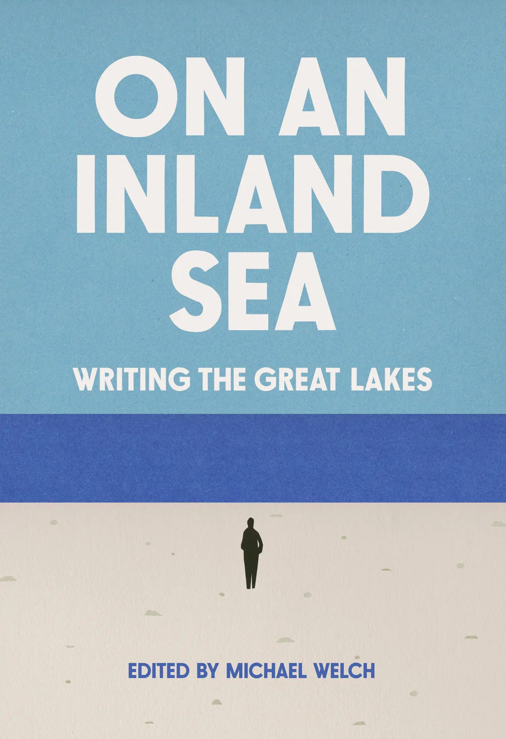
Here’s another example off my shelf: Abbott Awaits by Chris Bacheldor from Louisiana State University Press. This one is from 2011.
I think this cover is fine. Not amazing, but not bad. It captures the mundanity that is a major through line in the novel. I think it looks fairly “indie.” But it is still professionally typeset on both the back cover and interior. Care is taken with margins, hierarchy, and type choice. There are blurbs and a spine colophon. I think this book sits comfortably in the middle of that indie-mainstream continuum.
: Bachelder, Chris: 9780807137222: Amazon.com: Books")
I do a lot of work for university presses, so I may be biased. But I think they generally do a good job of straddling that line.
Subjectivity and Irony
I think this comment has been stuck in my craw because of how goddamn subjective the indie-mainstream framework is. The author of this original comment just released a premium, slipcase hardcover version of one of their books with custom illustrations priced at $95. There’s no dust jacket with marketing copy, sure, but I would hardly call that looking “indie.” They’re marketing this premium object via via interviews with well-known YouTubers. Absolutely nothing wrong with that—PR and marketing are essential to selling books—I just find it ironic based on their comment at the beginning of this newsletter.
Maybe this whole newsletter could have been one line: “Looking ‘indie’ is subjective.” Maybe I’m bothered by a comment whose writer probably doesn’t even remember writing it. Maybe this discussion doesn’t even really matter—but, like with so many things, I needed to write about it to be able to approach that conclusion.
I’m spinning my wheels a bit on this, so I’d like to turn this over to you. What does looking “indie” mean to you? “Mainstream”? Where’s the line between the two, and what do you want your book to look like?

Thanks for Reading!
Thank you for reading! I mean it.
If you’d like to keep this newsletter going and help me say no to designing soul-sucking books about corporate events, email marketing, and raising capital, consider buying me a coffee.
Until next time,
Nathaniel
For example: Penguin Random House, itself a conglomerate of Penguin and Random House (and nearly Simon & Schuster), is owned by German multinational conglomerate Bertelsmann.
Online sources are all varied estimates.
Granted, these books are usually about graphic design, which helps. But I think the point stands.
It used to be a thing for an indie author to try to look trad pub. That meant buying ISBN numbers, coming up with an imprint name and a logo etc. And, of course, a great cover. But I don't think many people bother anymore. Nor do they deliberately try to stand out as indie. They just ensure every aspect of the product page is professional and make sure their book is good. After that, it's up to the readers. On Amazon there are some readers who will only buy trad pub. There are some who mostly just buy indie. Both groups are massive. Both know if the author is trad pub or indie, and they buy according to their tastes.
There is an Andy Griffith episode where the owner of Foster’s Polish rolls into Mayberry and laments that the pretty girl spokesmodel was getting a lot of attention but selling very little furniture polish. So he gets convinced that Aunt Bea — a regular “housewife” without acting polish* — could do a better job selling. He was wrong, but ended up hiring a professional actor who acted like a goofy normie who couldn’t sing the jingle.
It takes a good actor to act drunk on screen. It takes a good musician to play off key well. It takes a good designer to create an indie-published looking book cover.
*pun intended, like way over the top intended.