

How to Make a Book Cover Out of Sawdust
The design process for 'Sawdusted' by Raymond Goodwin


This post may be truncated by your email client. Click here to read it on the web.
I tried something new on a recent book cover project: sawdust lettering. The book, appropriately enough, is called Sawdusted: A Millhand’s Chronicle of Hell-Raising and Hard Work.1
I’ve wanted to include more analog work in my covers for a while now, but until I moved my studio to my basement this year, my circumstances made that difficult (besides the occasional handwritten “essays” or “poems”). I’m really inspired by the work of David Drummond, who is one clever motherfucker. So much of his work is tangible and photographed. One time, he shared a photo of a toy car frozen in a block of ice for one of his covers. I didn’t know it at the time, but I would spend a lot of time thinking about that image. It opened my mind to what a cover could be—I should thank him.2
And so I made my sawdust letters, but not without much trial and error.
First, I made the sawdust. I alternated between a small handsaw and a drill on thin pieces of wood my dad left behind from his work building the studio.


For my first attempt at making these letters, I printed the letter “S” in my desired font, placed a transparency sheet over it, and gathered the sawdust on top of the letter with an x-acto knife. This was incredibly tedious. A day later, my dad suggested using a stencil and I said “oh, duh.” I printed that letter S at something like 500pt and cut it out of the paper with my blade. I gathered the saw dust on top of my stencil, lifted the paper, and there was an “S” made of sawdust.
After I did my first few photo tests, I struggled mightily to isolate the sawdust from the background. Photoshop’s selection tools have gotten really good since I began using the software, but no matter what I tried, there was always some residue of the white paper included in my selection. This was particularly highlighted when I put the letter on a green background. I didn’t want a white background for this cover, so I thought my idea might be cooked.
Then my brilliant and beautiful wife suggested I photograph the letters on a green background. This is why I always have and will share my work in progress with non-designers. I took her advice and took it even a step further by scanning the green paper I would use to photograph the letters so that the green background in my document would match the background in the photograph as closely as possible.


I had a preliminary cover!
I was happy, but I had a sneaking suspicion it wasn’t yet good enough. Notes from some colleagues confirmed my thoughts. The lighting was inconsistent, because I shot each letter on my desk using my work lamp. I liked the warmth it gave, but the shadows were wrong and tone inconsistent between letters. The shape of the individual characters weren’t as defined as they could be. So I made them again.
This time, I printed my stencils on 65 lb cardstock instead of copy paper. The latter was a rookie mistake in hindsight, but I was, in fact, a rookie in this process! Every good process involves iteration. The thicker paper kept far more of the “cuts” and detail from the stylized typeface I chose. I also chose to photograph the letters in my portable photo studio box this time. Again, probably something I should have done from the start, but I was initially put off by how pale and flat it made the sawdust look. But, as every photographer knows, a flat image with lots of data gives you the most flexibility possible when editing the images. I shot the letters, applied some edits, cut them out, and assembled my cover in Photoshop. I also photographed a light sprinkling of sawdust (four times to get the amount right) in order to tie the composition together.


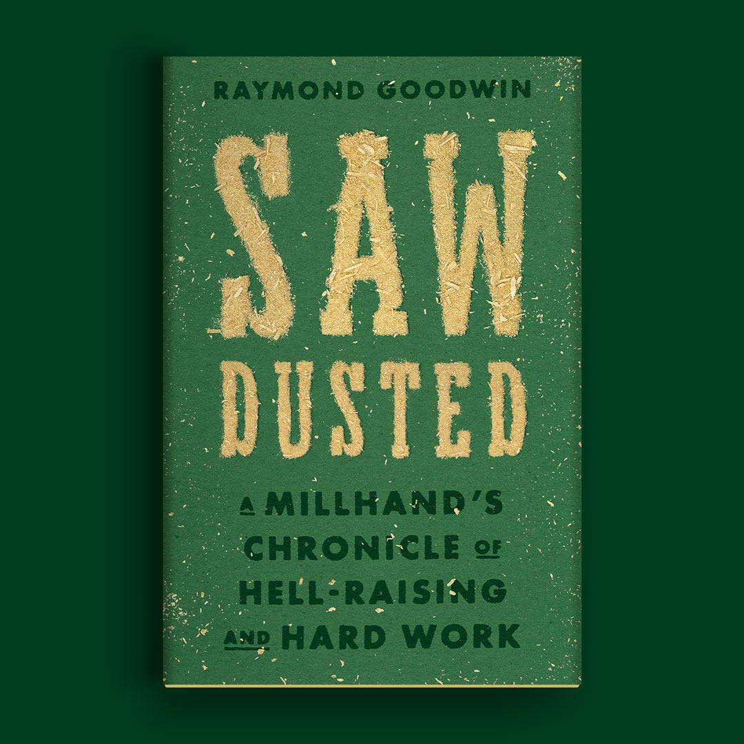
In the end, this cover wasn’t chosen by the publisher. I am okay with that. I also love the one they did choose! This cover can still live in the “cover graveyard” section of my website, and I genuinely feel that the process of making the thing was its own reward. Maybe more than I have for any other cover, used or unused.
For those interested, below is the final cover followed some more unused options.
Leave a comment with your favorite cover and why ⬇️



In Case You Missed It
My last newsletter was about how feelings play a role in my design process:

What I’m Reading (books)
The links below are affiliate links with bookshop.org. Buying a book via those links is a great way to support the newsletter! You can also buy something else and still choose to benefit Nathaniel Roy Design.
Make Your Art No Matter What by Beth Pickens
100 Essays I Don’t Have Time to Write by Sara Ruhl
A Manual for Cleaning Women by Lucia Berlin
What I’m Reading (links)
Someone free Colleen Hoover’s movies from the shackles of that narrow sans serif font on all of her books by Katrina Romulo
The Publishing Process for Creatives: What I Wish I Knew Before I Started by Mr. Tom Froese
What I’m Working On
A query letter and book proposal! Ya boy is trying to get published.
Bouncing between digital and analog processes to make this little guy:


Thanks for Reading!
Thank you for reading! I mean it.
If you’d like to keep this newsletter going and help me say no to designing soul-sucking books about corporate events, email marketing, and raising capital, consider becoming a paid subscriber or buying me a coffee.
Until next time,
—Nathaniel
If you preorder the book from this link, I get a small kickback. Thanks!
I’d share this particular image with you, but I can’t find it anymore.
Nice! What a great article, I hope more people write these creative experiments up. I prefer the green of your card stock to the green of the chosen final cover (which is really a good cover), but that's just me.
Also, in the future you could consider screen printing glue or acrylic paint through a screen and shaking the dust on, which would leave a residue of colour beneath the sawdust. Glue would work over a printed base image, and a deep red/brown paint mix would be a nice contrast to that green. Maybe both?