

Dancing with Pixels and Ink
Or, What I'm Doing About the Rise of AI-Generated Imagery and Templated Design Software


I might have two left feet, but I like to dance—to shuffle, to bounce—between the analog and the digital. Looking back at some of my early work, I have enjoyed doing so for some time, but I wouldn’t have told you that. Not then. It was not until recently that I noticed the throughline.
I am not a digital native, but I am, for all intents and purposes, a digital native designer. I made tens or hundreds of digital images before I ever heard the term “paste-up” or meaningfully touched an X-Acto knife. My design life began by making basketball graphics on the family’s kitchen desktop using my accountant father’s copy of Photoshop Elements. I didn’t take “Intro to Art” until my senior year of high school, and when I took a three-hour drawing studio class my freshman year of college, I had panic attacks. Making creative work without a mouse in my hand did not come naturally to me. But it would, eventually, come, and for this I am grateful to my Bachelor of Fine Arts degree, even if little of the work I made for it was any good. At the time, drawing, sculpture, ceramics, and the like felt like things I had to do in order to get my graphic design degree. And they were, of course, but now I see these classes for what they were named and designed to be: foundational. I still wouldn’t call myself a technically proficient artist, but I am a willing one, and I think that often makes all the difference. I am not as afraid of being “bad.”
Printmaking, with its close relationship to graphic design, was my favorite of these studio art classes by a wide margin. But I don’t think I viewed what I made there as “graphic design,” so to speak, despite just about every project that semester containing some combination of type and image. I saw graphic design as “What I Do” and the work I made in other classes as scary, then fun, artmaking experiments separate from my main thing. I was younger and too interested in what Austin Kleon calls “the noun” instead of “the verb.” Now, I’d just call those non-graphic design projects part of my creative practice—a soup in which graphic design may be the broth, but far from the only ingredient. As if proving this to myself, I still keep a poster I made in that printmaking class in my studio.
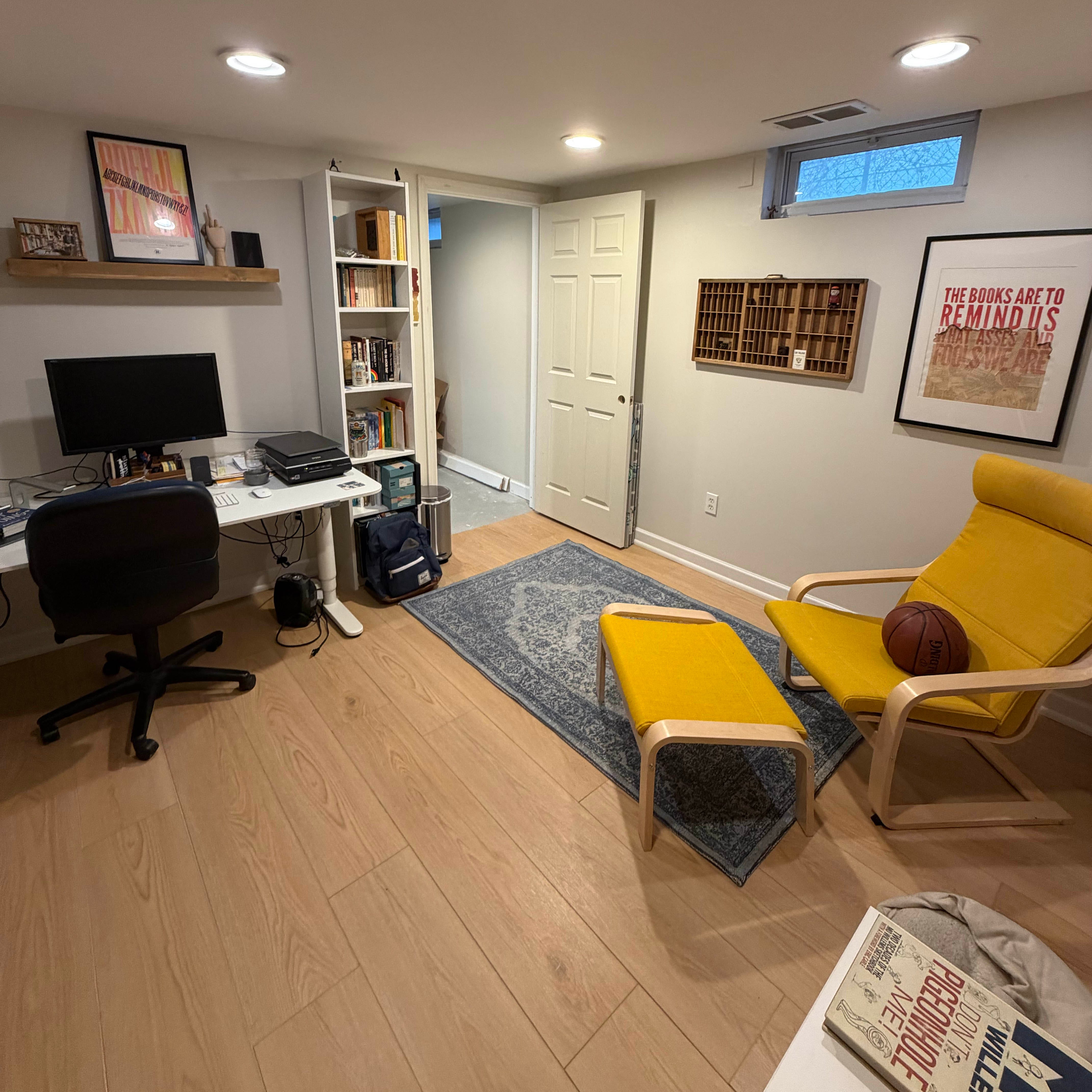
Throughout my time in school, there were other indicators of an interest in moving between analog and digital techniques for the same project. In the screenprinting unit, I made my design in Photoshop before burning my screen. In Typography II, I made the word “life” out of crushed lemon slices and photographed it.1 In my capstone project, I wrote words on my body, buzzed my hair, photographed myself (shirtless, in the snow), and produced a poster on which I asked gallery viewers to write what they wished people knew about mental illness. The degree to which this work was successful varies, but with the benefit of hindsight, it is telling that these projects remain my favorite from this time and, to my current sensibilities, hold up the best.
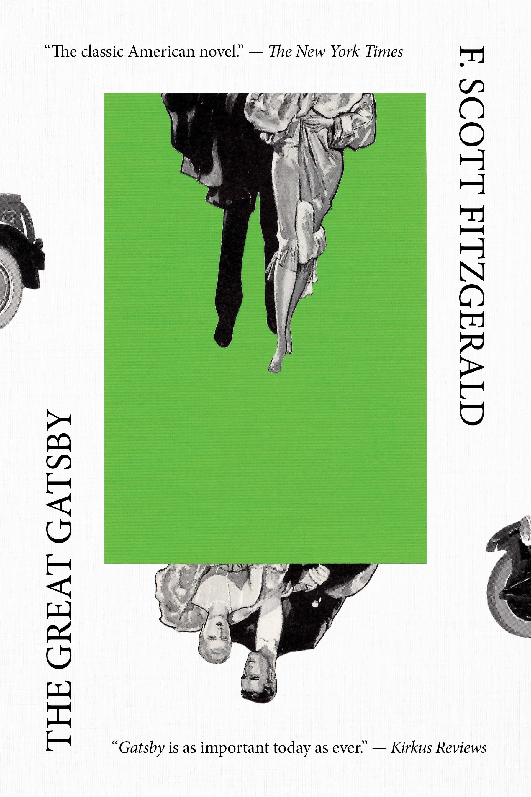
After university, there were fewer readily available opportunities for this sort of process experimentation, and what opportunities there were I did not seek out. I was working second shift at a newspaper, dating my now-wife long distance, and had not yet realized how important this “dancing” would become to me. A year or so after leaving the paper and moving to Ann Arbor, I started making collages out of the pages of the local newspaper there. I can’t remember why I did so in the first place—isn’t that funny? Collage is so important to me now—but I called this series “In the News.” I leaned on my newspaper design experience to make compositions that looked as if they were themselves weird, wacky, and satirical newspaper stories.2 Around the same time, I started creating other collages out of magazines, books, and other paper, including a series of simple, color-block collages that became a staple in my sketchbook. One collage, featuring illustrations from a 1920s National Geographic on a solid green background, immediately reminded me of The Great Gatsby and the book’s symbolic green light. So I scanned this collage, added pieces of a car digitally, and added the title and some fake blurbs. Sharing this particular cover to Instagram played an instrumental role in the development of my book design career.
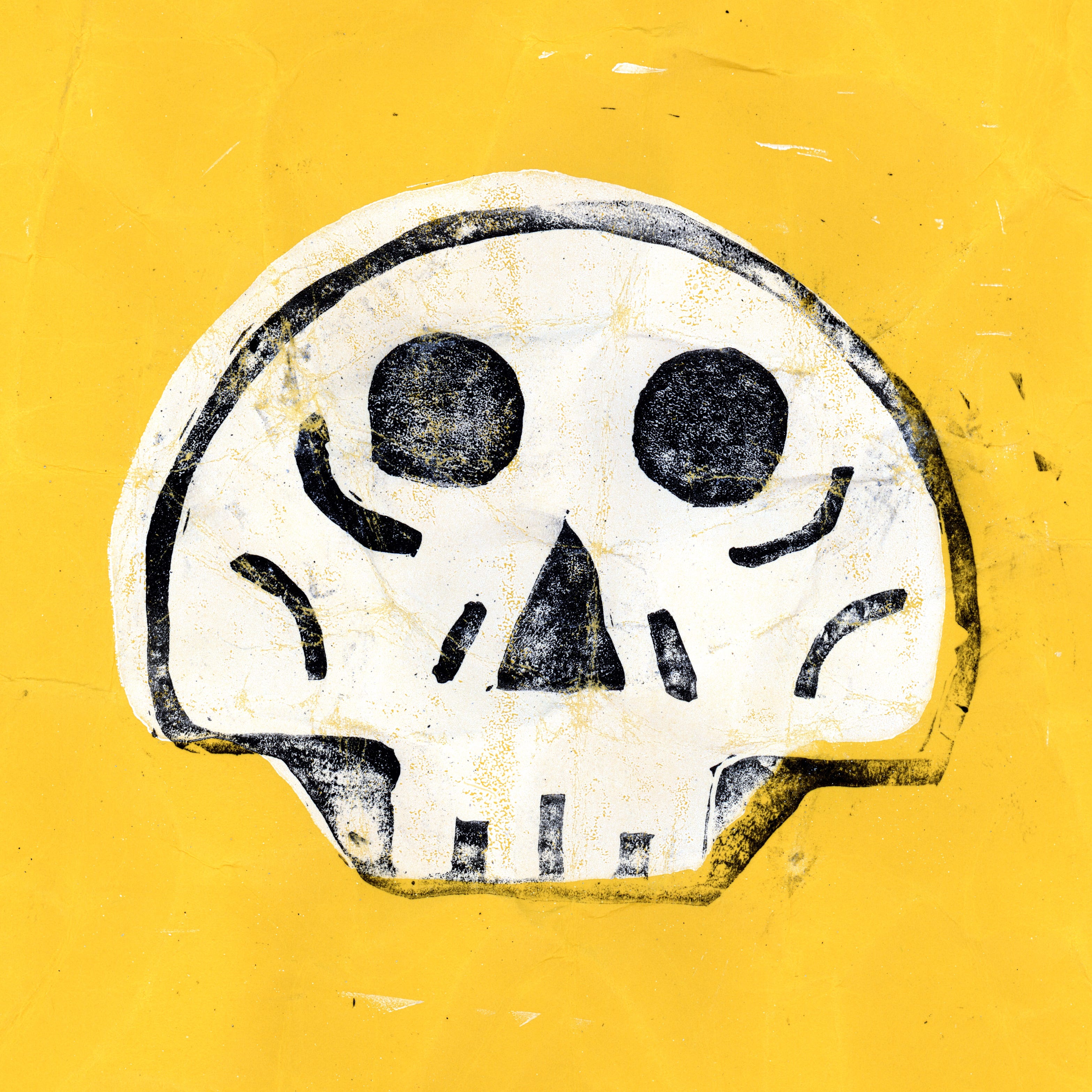
Despite this, in my so-called “professional” practice, I have spent a lot of time making digital-only work. Many, if not most, projects in my early freelance career only called for digital technique. And even if they did not explicitly, a digital-first approach was usually faster and more comfortable for my calcifying professional habits. But alongside this digital paid work, my personal work increasingly leaned analog or some combination of digital and analog. Manipulating analog collages on the scanner bed. Sketching people I took digital photos of. Photographing a book I ruined with mayonnaise and messing with it in Photoshop just for the sake of a newsletter thumbnail. Most recently, I created a skull illustration by sketching it, vectorizing it, printing it with my shitty Epson, tracing it, transferring it to a linoleum block, carving it, inking it, printing it, crumpling it, and then scanning it. Phew—did you follow those steps? They weren’t perfect, but the rhythm is there.3
In the last two years, I have started to bounce between digital and analog in new ways for paid work. Revisiting my past as we have, this feels long overdue. On the other hand, it feels like the perfect time for this growth. For one thing, I now have a home studio in which to make this work. I rented a studio for a few years before, but I underestimated the extent to which a dedicated room in my house might facilitate those projects that dance between pixels and ink.4 I can leave materials out and let them linger, returning to them when the kids are asleep or my time otherwise allows for it. This room—and the materials I have amassed over the years—help me see through ideas that were previously difficult to explore without either dedicated space or unfettered access to it.
How to Make a Book Cover Out of Sawdust

I tried something new on a recent book cover project: sawdust lettering. The book, appropriately enough, is called Sawdusted: A Millhand’s Chronicle of Hell-Raising and Hard Work.
Beyond my new studio, now feels like the time to become a more consistent practitioner of this dance thanks to the rise of both generative AI and templated design software. Whether you are pro- or anti-AI, I think these technologies have and continue to usher in a new era of both access and aesthetic uniformity. Whether they fire up ChatGPT or Canva, just about anyone can create a halfway-decent flyer for their business or event. But while the average aesthetic quality of this output has improved since the early days of desktop design software, I cannot help but think that what we are seeing mirrors what happened when Comic Sans was originally disseminated to the public via the Microsoft operating system: the font ended up everywhere, irrespective of taste or craft.
There is interesting, creative usage. But the floodgates are open.
In response to the rise of AI, there is a growing counter-trend toward handmade and what some are calling “ugly” work. “Ugliness is proof of life,” says Kyle Raymond Fitzpatrick in The Creative Review. I am likely never going to become a craftsman, artisan, or work exclusively with my hands. I love what digital technology has afforded me and my work, but I also want to feel at home with either a mouse or paintbrush in my hand. Whether my design work is ugly or beautiful—and book covers may call for both—I want my work to breathe with this life. I want to make things that feel like they were made by me, whether that be from a technique I use or conceptual choice that I make.
Maybe someone can perform a similar dance with the use of AI. I have my doubts, but I am slowly putting down my proverbial pitchfork. It’s too exhausting. However, in the gradual dissipation of this antipathy, there remains complete and utter disinterest. It is simply not for me.
It is my belief—my fervent hope—that being a practitioner of this analog-digital tango is what sets me apart from the maddening crowd of would-be artists and designers who don’t care about process, about the making in and of itself. Design is for clients and “solving problems,” sure, but in order to be allowed to keep solving these problems, the work must find a way to stand out. It is my hope that by continuing to practice this dance, I may find joy, meaning, and value in my work for as long as I have the privilege of making it.

July 20, 2026
Feedback on the [redacted] cover today from N. The press is pleased! They asked for a small handful of revisions, all perfectly reasonable. It looks like S will have to wait to get her handwriting on one of my covers, though—they asked for another subtitle treatment on the collage option. N said it was “feeling maybe too ‘rockstar memoir.’”
Emails from C at [publisher] and M at [publisher] today, too. The Boyd book doesn’t have a final page count yet, but it does have an estimate, so C would like to proceed with the mech and update the spine later if needed. M sent an updated subtitle. While the first book was only the addition of a comma, this has happened on all four books I’ve done with them to date.
Book Covers of Substack
Dancing with Pixels and Light: Shane Bzdok talks about exploring cyanotype for one of his book covers:
What I’m Reading (books)
The links below are affiliate links with bookshop.org. Buying a book via those links is a great way to support the newsletter! You can also buy something else and still choose to benefit Nathaniel Roy Design.
Good Movies as Old Books by Matt Stevens
Making Art and Making A Living by Mason Currey
100 Essays I Don’t Have Time to Write by Sara Ruhl
A Manual for Cleaning Women by Lucia Berlin
What I’m Working On
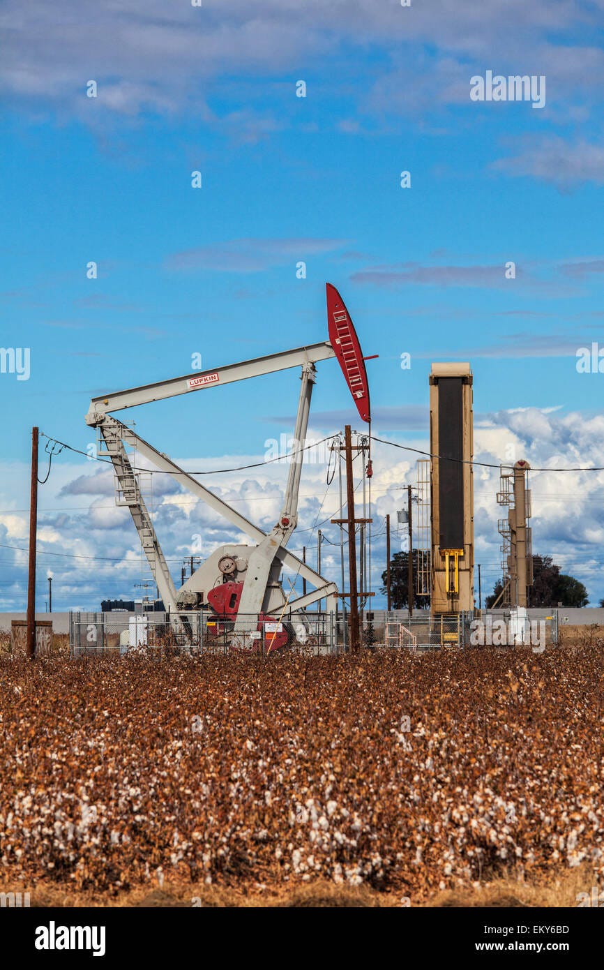
I am doing some image research on oil derricks for a book cover project about a former boom town in California.

Thanks for Reading!
Thank you for reading! I mean it.
If you’d like to keep this newsletter going and help me say no to designing soul-sucking books about corporate events, email marketing, and raising capital, consider becoming a paid subscriber or buying me a coffee.
Until next time,
—Nathaniel
This typography assignment was to make a word out of a material that communicated some kind of message or visual pun. The example my professor shared, created by a former student, was the word “fields” made out of strawberries—a reference to “Strawberry Fields Forever” by the Beatles. My initial idea in this vein was to make the word “leaves” out of grass, as a nod to Walt Whitman of course, but my professor thought that might be too obscure for my fellow young students. I wish I had pushed back and made it anyway.
A few years later, I would digitally scan these collages, lay them out in InDesign, and print them as a zine.
My daughter actually danced with me here—she slightly crumpled one of the prints and I liked how it looked, so I crumpled it more (to my wife’s look of horror).
"I want my work to breathe with this life. I want to make things that feel like they were made by me, whether that be from a technique I use or conceptual choice that I make."
.
However one feels about AI, this is where we're going now. The sweet spot. The dance.
Thanks for your work, Nathaniel, I think you're going in an interesting direction, using the technology like clay, working and reshaping it--transforming it--with your own human hands and imagination.