

Cover Design from Hardcover to Paperback (with an Italian Twist)
Q&A with author Jessica Berger Gross about the covers for 'Hazel Says No'


If and when a book transitions from hardcover to paperback, its cover is subject to change. Sometimes the change is slight—The Nickel Boys by Colson Whitehead comes to mind—and other times the change is more complete.
There are a variety of reasons a book’s cover might change. In a rare treat, I was recently offered the opportunity for some insight into one particular cover evolution: that of Hazel Says No by Jessica Berger Gross.
Hazel Says No is Gross’s debut novel. It comes out in paperback on June 2. Please enjoy the following Q&A with author Jessica Berger Gross.
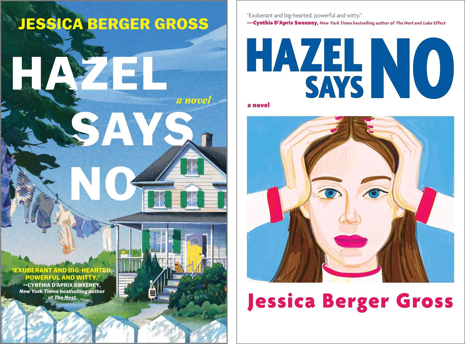
How long after Hazel Says No came out in hardcover was the paperback edition released?
A year, minus two weeks. Hazel Says No is out in paperback on June 2.
The big one: do you have a favorite? Why or why not?
That feels like choosing between my two best friends; I love them both for such different reasons. The original hardcover’s design is inspired by my house in Maine: a white 1870’s farmhouse with green shutters and a yellow door on the porch. If you look closely, you can see that each of my main characters has a sort of totem object. Claire, the clothing designer mother, has her laundry on the line. Hazel has a canvas Brooklyn tote, her brother Wolf his school backpack, and Gus, the American Studies professor dad, a stack of papers to grade. On top of repping our Brooklyn transplants, the Greenberg Blum family, and their new home in small town Maine, the hardcover has a wraparound jacket evoking the Maine town beyond, blurbs I adore and generally feels very Brooklyn family moves to small town Maine. For the paperback cover, we wanted to represent Hazel and the novel’s sharper edges. The cover design has a singular focus on the titular character Hazel, and the feminist and collective NO of the book. There’s something crystalline and oh so cool (I think!) about the paperback.
One cover features a house, the other a person. Does one cover represent the book better than the other? How does that aspect influence how you feel about them?
The challenge with the cover design, and talking Hazel Says No, is also what I hope readers love about the book. Hazel Says No is both a family novel where bad things happen and life is far from perfect, and a story of feminist resistance, resilience, and finding your voice and community. And it’s (hopefully!) smart, sharp and funny. And set in Maine. That’s a lot to cover in, haha, a cover.
I’m sure it happens, but this is the first time I’ve heard about an American publisher licensing a foreign edition’s artwork for the American paperback. What was the rationale behind the cover change to your book? Was it a creative or sales decision? Was it a publisher decision, or something you pushed for?
Yes, from what I understand this is very unusual. My Italian publisher is Heloola, a super special indie start-up that began with a quite popular book club and subscription service, and then launched their own imprint. The first book they published was Angie Kim’s Happiness Falls. Hazel Says No was their second. Alice and Giada Cancellario found HAZEL and me quite early on and have championed my novel in Italy. We’ll meet for the first time in Rome at the end of May!
Rethinking the US paperback cover was a very collaborative and mutual-feeling editorial, creative, and sales team decision. My agent Henry Dunow and I had fallen in love with the Italian cover and wanted to bring that sharpness to the paperback. That was our dream — but we had no idea what Hanover Square/HarperCollins would think. My editor John Glynn, Editorial Director at Hanover Square Press, loved the idea of licensing the Italian cover. So did sales, marketing, and the rest of the team. It was remarkably easy once we made that suggestion. I’m forever grateful to John and his colleagues for being so open and excited about giving HAZEL a whole new look.
If there’s more to the story of how the cover evolved, I’d love to hear it. Were there any other scrapped ideas for the paperback adaptation?
With the hardcover jacket, we went through many iterations, but for the paperback, once we decided on the Italian version and asked to license, the process felt (at least to me) super simple.
How much input did you have for the original cover? How does that level of input compare to your input on the paperback?
Unlike my earlier books, where it was more about picking among a few options presented to me, and having some but not loads of input, I was lucky to be very involved early on with both of my Hanover Square/HarperCollins Hazel Says No covers. When we began brainstorming, I sent my editor John Glynn everything from covers I love to photos of my house to images of Alex Katz’s Maine paintings.
With the paperback, all credit goes to Alice and Giada Cancellario, who worked with the Dublin-based, Italian artist Mario Sughi to find this perfect Hazel. Mario’s work is also used for the cover of Cynthia D’Aprix Sweeney’s latest novel Lake Effect. Cynthia and I are both represented by Henry Dunow, and Cynthia’s blurb is on the front of both of my covers. But the art/artist crossover is a happy coincidence.
Both editions feature paintings, or at least painterly illustrations. Were these artworks created specifically for their respective covers, or were they existing pieces that were licensed? If the former, how was the subject matter chosen? Why do you think the painting medium made sense for your book?
Andrea Cheung created the hardcover image for the cover. (And so beautifully, I think.) The Mario Sughi image already existed, though his Hazel feels bespoke, or at least, meant to be. Alice told me she and Giada were searching for the perfect image while looking at Mario Sughi’s recent work. Alice said over email, “We saw her and thought: oh, that’s Hazel.”
As for the medium, I wonder if that has to do with the Hazel Says No being a book set in Maine. Or maybe that HAZEL has a freshness best captured by the painting medium? I’m curious to hear what you and your readers think. Especially once you read.
Is there anything else you want to share about the book or its covers?
For the German edition Hazel Sagt Nein my publisher Bastei Lubbe went with the American hardcover version for their jacket. In promoting the German-language Hazel, they sent promo boxes of book-related goodies containing Hazel’s first day of school tote bag mentioned in chapter one—including everything from tampons to a journal they made with NEIN in big letters—and included a key chain with the family’s yellow front door. This summer, after eleven years in our Central Maine town, my (real) family and I are moving to a new (dreamy) part of Maine. My new set of house keys is on the German key chain, reminding me of my beloved old house’s yellow door, our time together in “Riverburg” (the fictional town), and writing a book about a Brooklyn family who move to a small town in the middle of Maine — and find themselves along the way.

Thanks for Reading!
Thank you for reading! I mean it.
If you’d like to keep this newsletter going and help me say no to designing soul-sucking books about corporate events, email marketing, and raising capital, consider becoming a paid subscriber or buying me a coffee.
Until next time,
—Nathaniel
I love hearing the background of this! I think both covers work super well (having read the book) but they appeal to two different markets. The hardcover has that definite Catherine Newman vibe: what I think of as the literary mom market. The paperback appeals more to the Gen Z lit girl aesthetic, very Coco Mellors.
I’d probably buy both 😬🥹🤗 The first one speaks to me the most though. I’m looking forward to reading your book.