

A Ten Minute Typography Lesson
From Butterick's Practical Typography

Hi there,
I wanted to let you know up top that I made something for you: A book design resources page.
If I were smarter and a savvier businessperson, I would put this behind a paywall. There’s a lot here. But right now I’m more interested in being kind than smart. You can click the hyperlink above, any of the ones below, or find this page pinned in the navigation bar on the A Book Designer’s Notebook homepage.
On this page you’ll find:
Software, images, fonts
As I learn about new resources and remember old ones, I will update this page as I remember to do so. But even so, this list may not be comprehensive, but it is pretty damn thorough. I hope it’s useful; I hope it helps you design better-looking books.


While the internet may eventually be the downfall of humankind, there are, at least for the time being, a few wonderful things that live on it.
One of these things is Butterick’s Practical Typography, a typography book hosted entirely—and only—on the world wide web.
The book is an incredible resource. If you have the time and interest, I recommend reading it cov—er, page to page. But for our purposes today, I wanted to share with you Butterick’s concise and handy section called Typography in ten minutes.

Here’s Butterick (underlined text is hyperlinked):
Typography in Ten Minutes
This is a bold claim, but I stand behind it: if you learn and follow these five typography rules, you will be a better typographer than nearly every writer—and even most graphic designers.
All it takes is ten minutes: five minutes to read these rules once. Then five minutes to read them again.
Ready? Go.
The typographic quality of your document is determined largely by how the body text looks. Why? Because there’s more body text than anything else. So start every project by making the body text look good. Then worry about the rest.
In turn, the appearance of the body text is determined primarily by these four typographic choices:
Point size is how big the font is. In print, the most comfortable range for body text is 10–12 point. On the web, 15–25 pixels. Not every font appears equally large at a given point size, so be prepared to adjust as needed.
Line spacing is the vertical distance between lines. It should be 120–145% of the point size. In word processors, use the “Exact” line-spacing option to achieve this. The default single-line option is too tight; the 1½-line option is too loose. In CSS, use the line-height property (preferably with a unitless value, so 130% would become 1.3).
Line length is the horizontal width of the text block. Line length should be an average of 45–90 characters per line (use your word-count function) or 2–3 lowercase alphabets, like so:
abcdefghijklmnopqrstuvwxyzabcdefghijklmnopqrstuvwxyzabcd
In a printed document, this usually means page margins larger than one inch (a typewriter habit). On a web page, it usually means preventing the text from flowing to the edges of the browser window.
And finally, font choice. The fastest, easiest, and most visible improvement you can make to your typography is to ignore the fonts already loaded on your computer (known as system fonts) and the free fonts that inundate the internet. Instead, buy a professional font (like those found in font recommendations). A professional font gives you the benefit of a professional designer’s skills without having to hire one.
If that’s impossible, you can still make good typography with system fonts. But choose wisely. And never choose Times New Roman or Arial, as those fonts are favored only by the apathetic and sloppy. Not by typographers. Not by you.
That’s it. As you put these five rules to work, you’ll notice your documents starting to look more like professionally published material.
If you’re ready for a little more, try the summary of key rules.
If you’re ready for a lot more, start at the foreword and keep reading.
If you have a few more minutes, head over to Practical Typography. I was going to link to a few more sections—but I quickly realized I was on my way to linking the whole book. Do yourself a favor and check it out. As Matthew Butterick points out, if you are a writer, you are by default a typographer. And typographers care about the way their words look—not just for aesthetics, but to support the text.
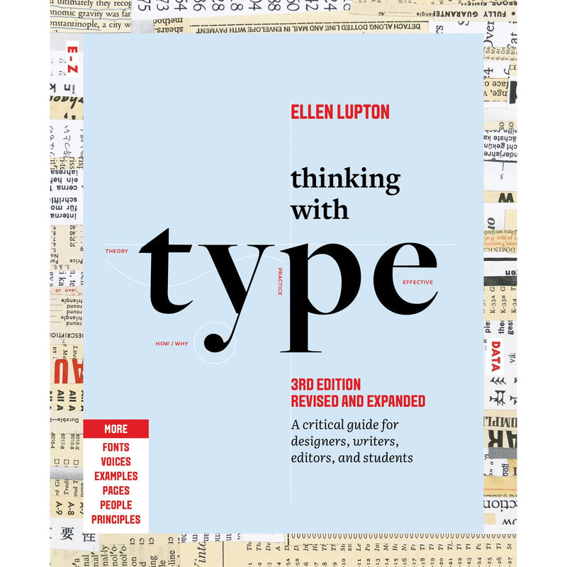
Now, there’s a lot more to typography than what’s above, but it’s a good start for the uninitiated. If you’re looking for a great, physical book on typography, I cannot recommend enough Thinking with Type by Ellen Lupton.1 If you’ve been reading this newsletter for a while you know I recommend this book often, but it’s for good reason. With these two books under your belt, you’ll have a typographic leg up on almost everyone.
📓 Nathaniel’s Notebook 📓
ICYMI: ‘A Cover People Might Love to Hate’ by yours truly
Reading (books): The Memory Palace by Nate Dimeo
Reading (links): “We should be grateful for all those bad books” by Jared Henderson, “I did not check my phone before 10am all week” by Francis Chouquet, “4 Steps to Channel the Past” by Jesse Nunez, “Please don’t see the film Eraserhead” by Shaun Usher, “Goodnight Moon” by Mac Barnett and Jon Klassen
Watching: David Lynch: The Art Life (Streaming free on the Criterion channel until the end of January)
Writing: A critique of my very first book design, ten years later.
Work: Catching up on some freelance work I’ve been procrastinating on. Sorry if you’re waiting on an email from me!
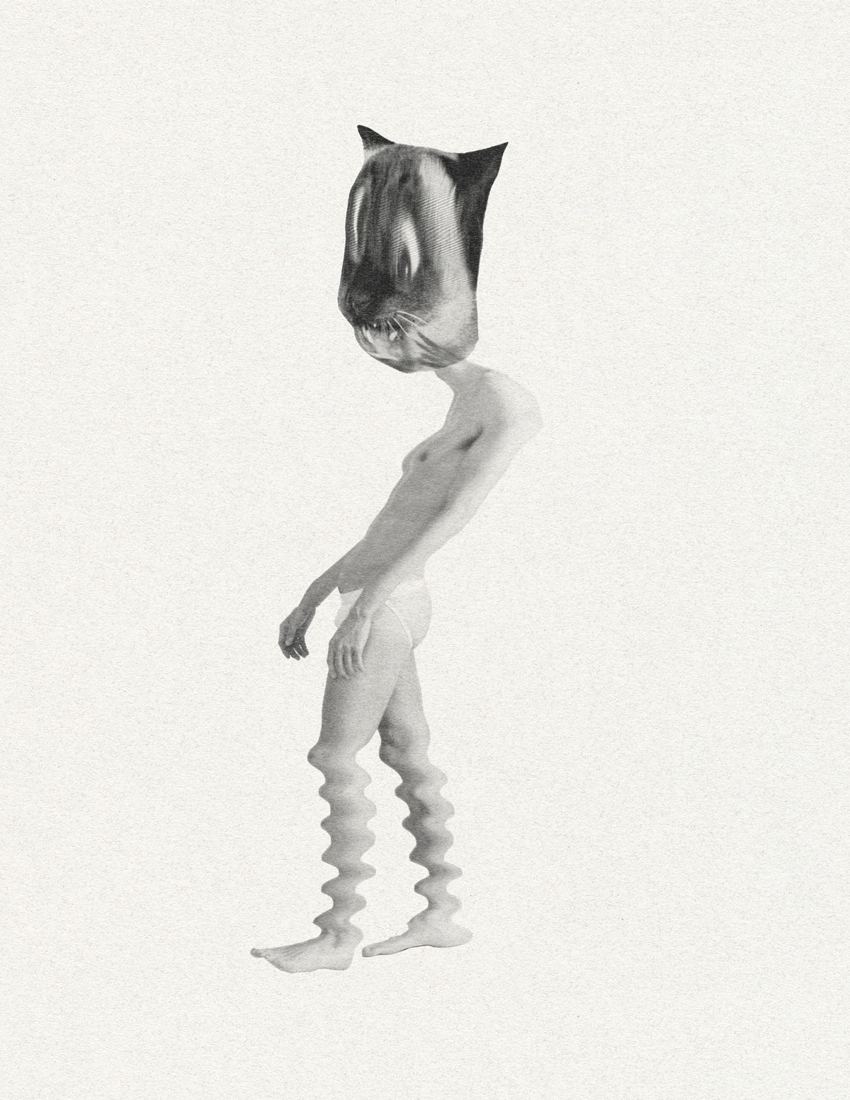
Play: “Cathead II”, analog and digital collage.
Thanks for Reading!
Thanks for reading! If you value this newsletter and want to support it, you can do so by buying me a coffee or becoming a paid subscriber.
Paid subscribers get access to How to Design a Book Cover, a bonus bi-weekly series in which I break down my book cover process from creative brief to final cover. You can read the first post in the series for free here:

and the latest post here:

Until next time,
Nathaniel
MORE LIKE THIS
This is a bookshop.org affiliate link that earns me a small commission.
Such practical and easy to follow advice.
Giving away gems here. Great post! (Also, thanks for the mention : )