

I Don't Hate You, Comic Sans
And Nobody Should


I don’t hate you, Comic Sans.
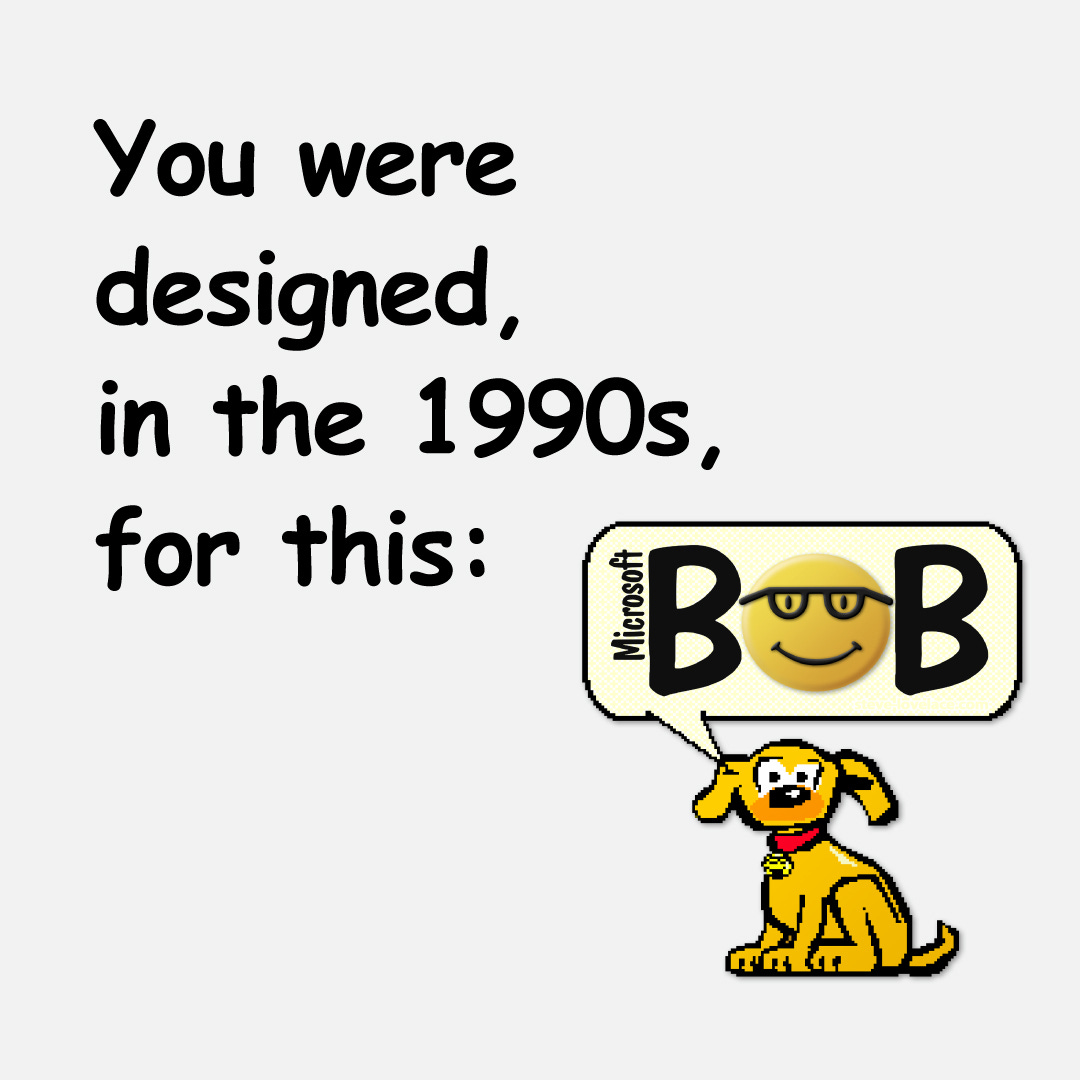
You were designed in the 1990s for a program called Microsoft Bob.
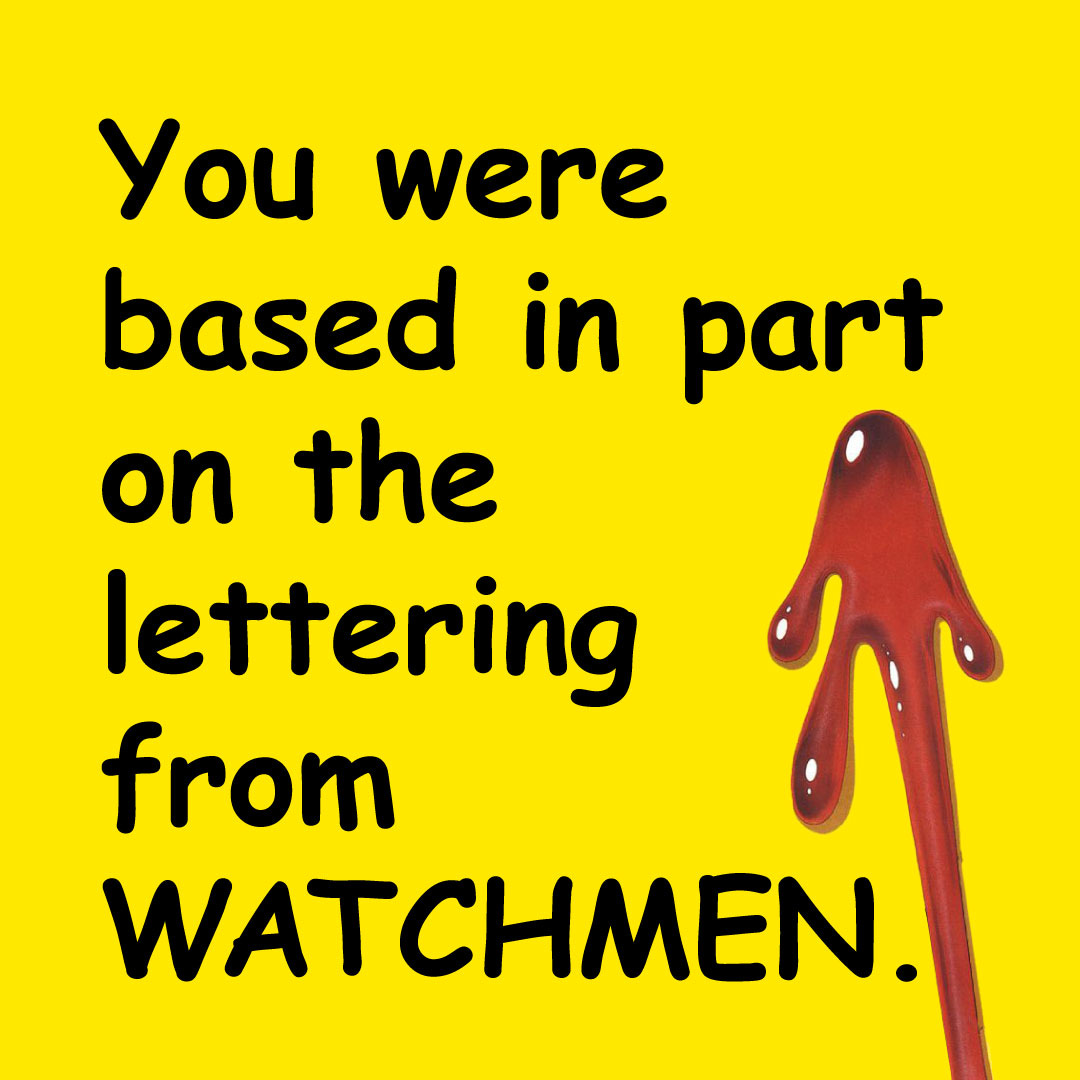
You were based, in part, on the lettering from Watchmen.
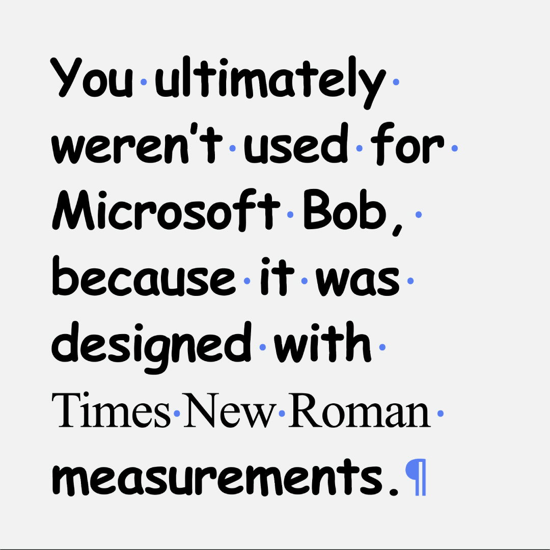
You ultimately weren’t used for Microsoft Bob, because it was designed with Times New Roman measurements.
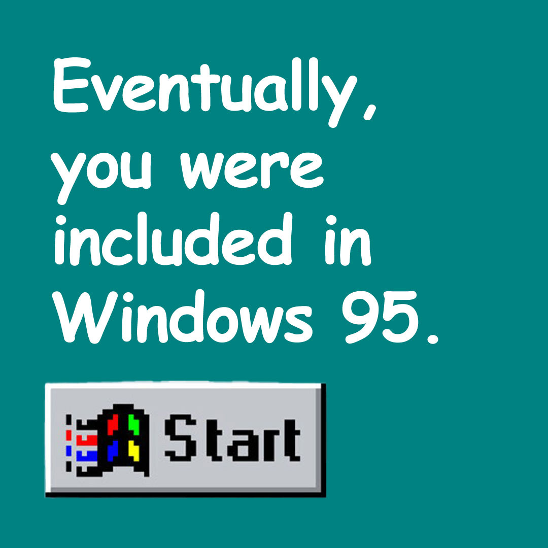
Eventually, you were included in Windows 95.
Designed for a single purpose, you were put into the hands of the world to do whatever it would with you. And the world ... made some choices.
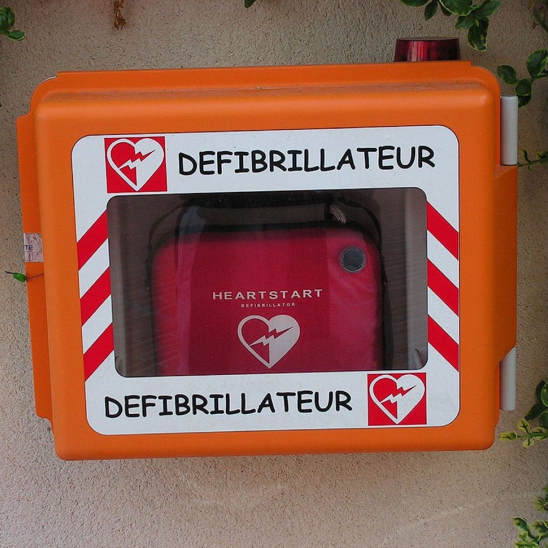
Now, you’re hated by designers and non-designers alike. But it’s not your fault, you were just being who you were. I don’t look good in orange, either.
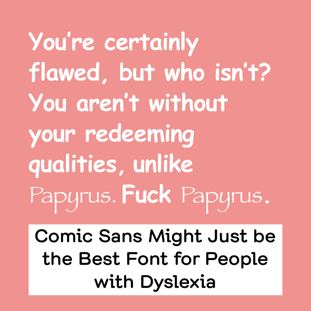
You’re certainly flawed, but who isn’t? You aren’t without your redeeming qualities, unlike Papyrus. Fuck Papyrus.
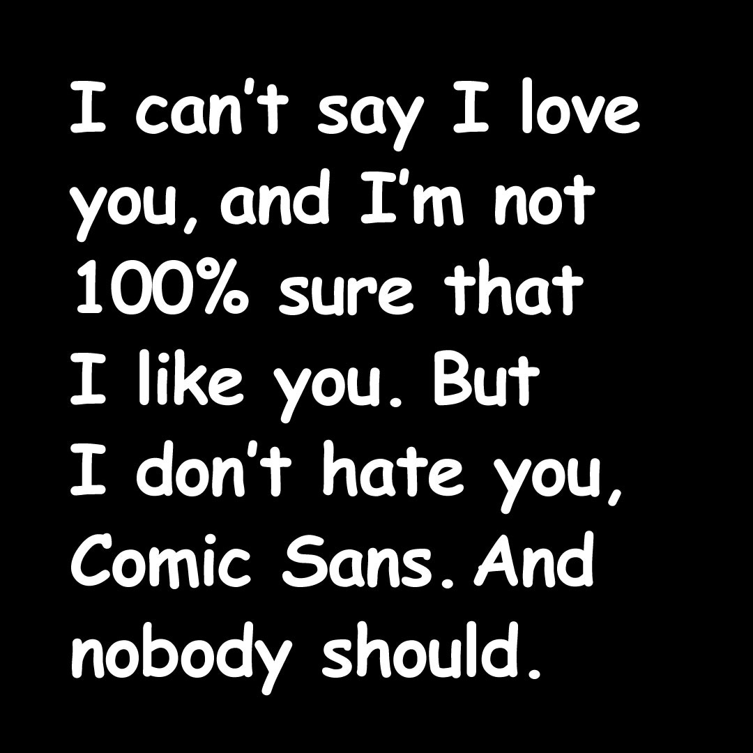
I can’t say I love you, and I’m not 100% sure that I like you. But I don’t hate you, Comic Sans. And nobody should.
I learned about the history of Comic Sans from a book called Just My Type by Simon Garfield. I heartily recommend it.
After I read it, I became a little obsessed. I was the design editor at my university newspaper at the time, and I wrote an earlier version of this as a column in the paper. I think people mostly liked it. They also said “why the hell is this in the newspaper?”
Garfield also has a new entire book about the font as part of a trilogy of books about the typefaces Albertus, Baskerville, and Comic Sans. I haven’t read them yet, but I would like to.
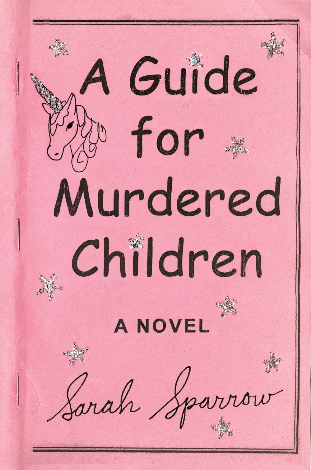
Like I wrote in “Cover Your Book with Beautiful Garbage,” one of my favorite book covers of all-time, designed by Ben Denzer, uses Comic Sans.
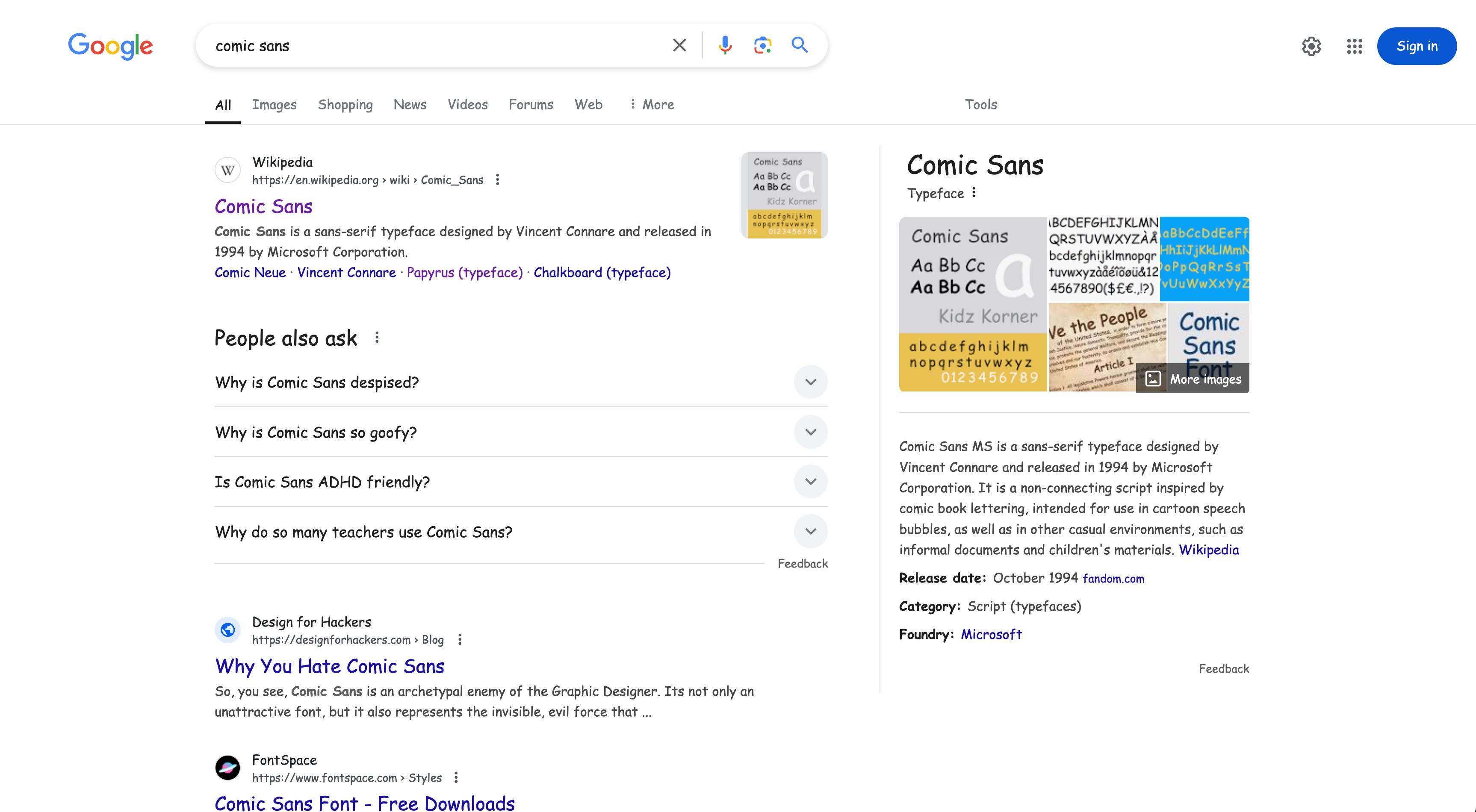
Fun fact: Did you know that if you Google “Comic Sans,” your search results are returned in Comic Sans?
So tell me. What are your thoughts on Comic Sans?

Thanks for Reading!
Thank you for reading! I mean it.
If you’d like to keep this newsletter going and help me say no to designing soul-sucking books about corporate events, email marketing, and raising capital, consider becoming a paid subscriber or buying me a coffee.
Until next time,
Nathaniel
A friend advised that while writing academic essays it is best to use Comic Sans because it prevents your writing from seeming stiff and stifled. You, of course, convert the font prior to submission of the document. It works!
I like Comic Sans because it reminds me of my mom. She always used Comic Sans on things she printed out, so every time I see it, it's like a little note from my mom.
Of course, it's funny when it's used in incongruous places, but that makes it all the better.