

How I Add Handwriting to a Book Cover


I love handwriting on a book cover. Whether it be the whole composition, or just the phrase “a novel,” it adds a human touch to the design that is rarely, if ever, replicated by a digital font.1
For a long time, I didn’t know how to add it to my own covers effectively. I had a few problems:
My handwriting is not great.
Even if a cover called for sloppy, handwritten type, I found it difficult to compose said type. If a designer is worth their salt, even a “sloppy” cover is considered.
When I tried to add handwriting to a cover, I struggled to make it look like it was written on the cover instead of just added to the cover digitally. That difference might sound insignificant, but in my opinion, it’s the difference between professional and amateur work (as it pertains to handwritten type, at least).
All of my favorite designers have handwritten type in their bag of tricks, so I was determined to figure out how to add it to mine.
After much time, trial, and error, here is what I do now.
Style & Composition
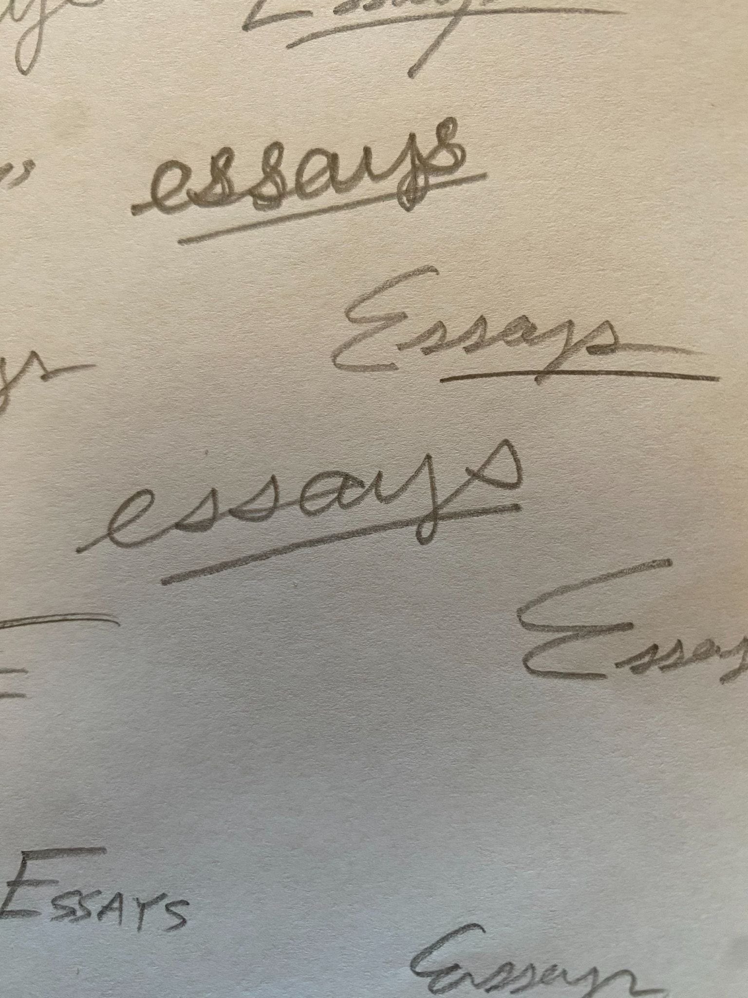
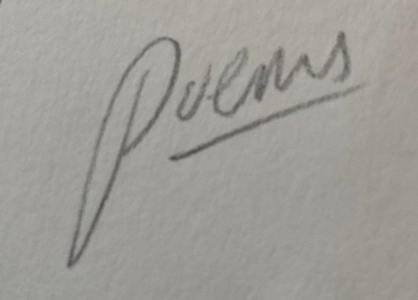
When a cover calls for just one handwritten word, like “poems,” I typically just write it over and over and over again in my sketchbook. This can take a while, but if I am patient, I can typically come up with something usable. Sometimes I have my wife take a crack at it. Throughout this process, I attempt to make subtle adjustments to how I write the word for different visual flavors. This isn’t natural for me, so I have to pay close attention to the way I make the letters.
This is what I did for my covers for We Interrupt This Broadcast by Gregory Orr and Our Fragile Freedoms by Eric Foner.


If I want to make the title, subtitle, and/or author name handwritten, I need to think more about how the type will be arranged in addition to how each individual letter looks. And I would say that nine times out of ten, I am unsuccessful with the above approach for single words. So I figured out a way to “cheat.”
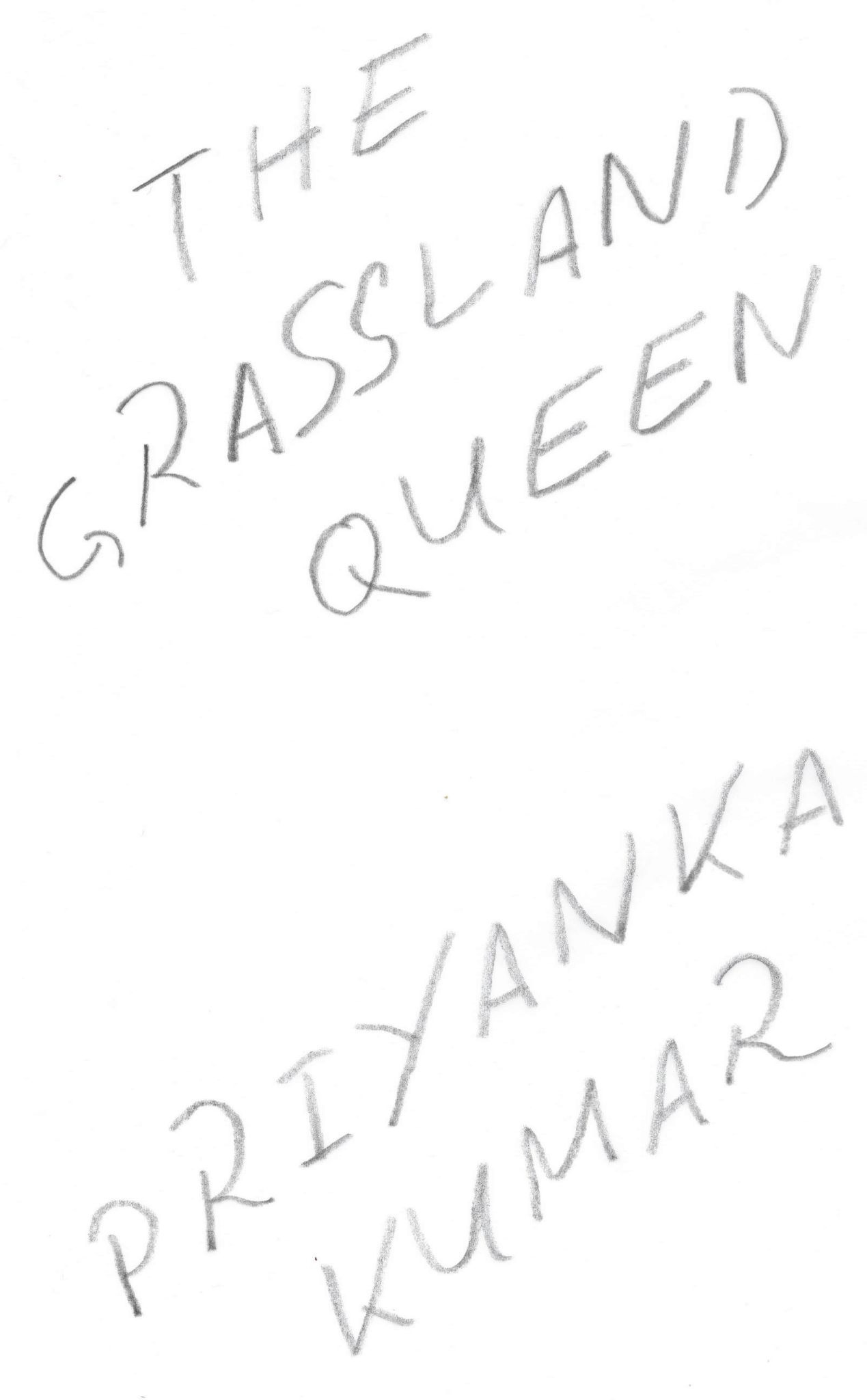
Now, when I want to use a lot of handwriting on a cover, I set the type in Photoshop first, as if I were designing a cover with my standard digital process. Sometimes it’s a serif/sans serif, sometimes it’s a handwriting font.
Then I:
Isolate the type so it’s the only thing showing in the document.
Print the type-only composition.
Using tracing paper, I trace the type-only composition with a pencil, pen, paint marker, paintbrush, or whatever else the project calls for.
Scan the handwriting and bring it back in to Photoshop.
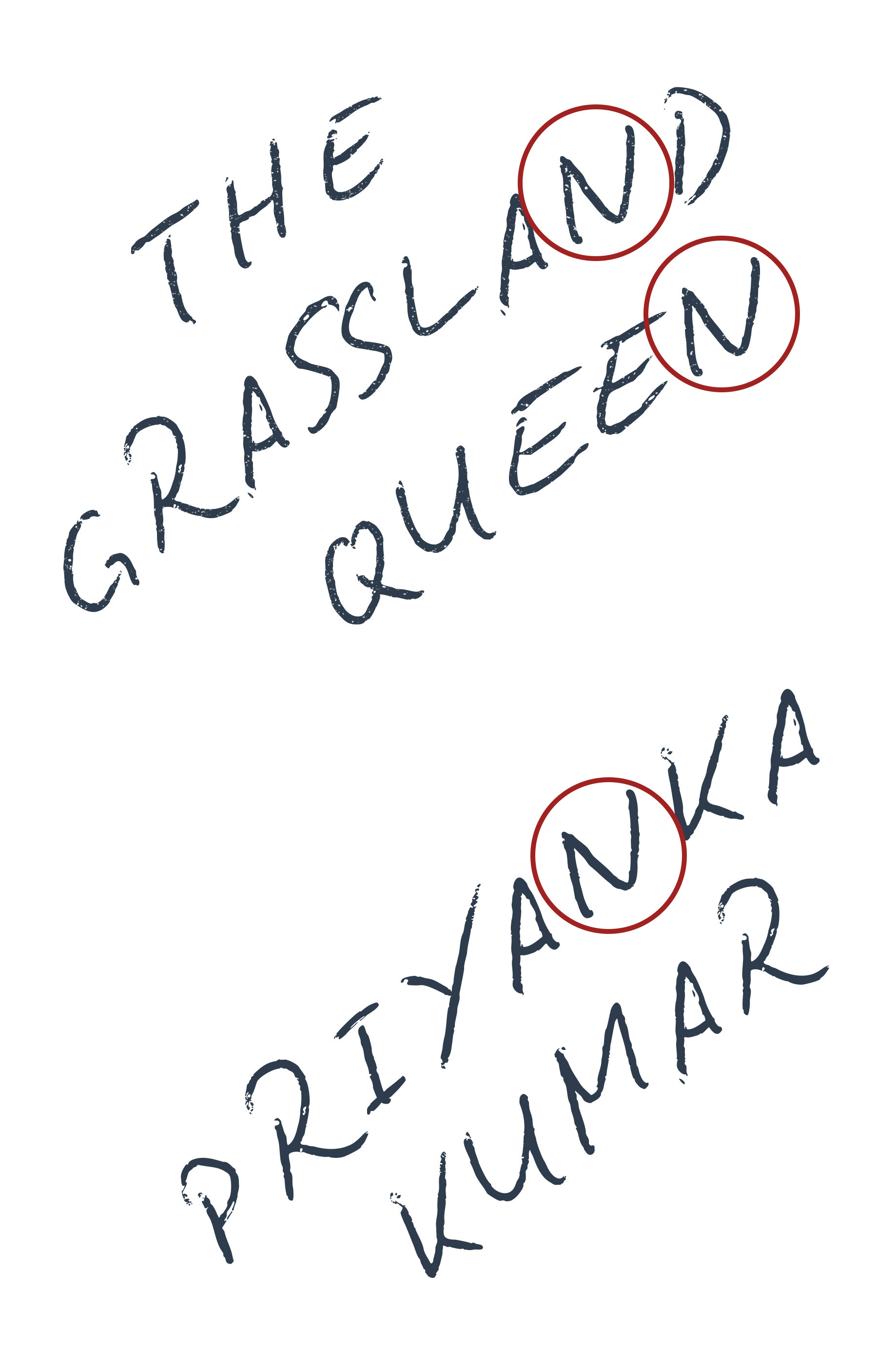
Why not just use a handwriting font, you might ask? Most of the time—and especially at larger sizes—they just aren’t realistic looking enough. There are two problems:
At larger sizes, the vectorness of the type becomes apparent, even if it is distressed.
Great handwriting fonts have ligatures and alternate glyphs built in, but they will often still repeat glyphs.
Look at the “N”s here—they are exactly the same. Some might not notice, but this gives it away as a font and not real handwriting. When you trace letters, they cannot help but be imperfect and slightly different. This is a good thing!
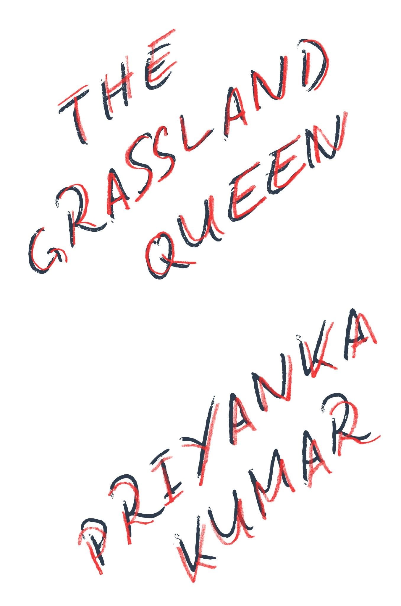
Isolating the Handwriting
The next step is isolating the handwritten type. This can be a little tricky to do right. You want to select it so that you’re not just grabbing the shape of the letters, but making sure you get all of the texture that gets “bites” into the letters. I do this by selecting using Photoshop’s Select>Color Range menu.
This gets a little technical, and is difficult to write about clearly. So for those interested, here’s a little video demo I made:
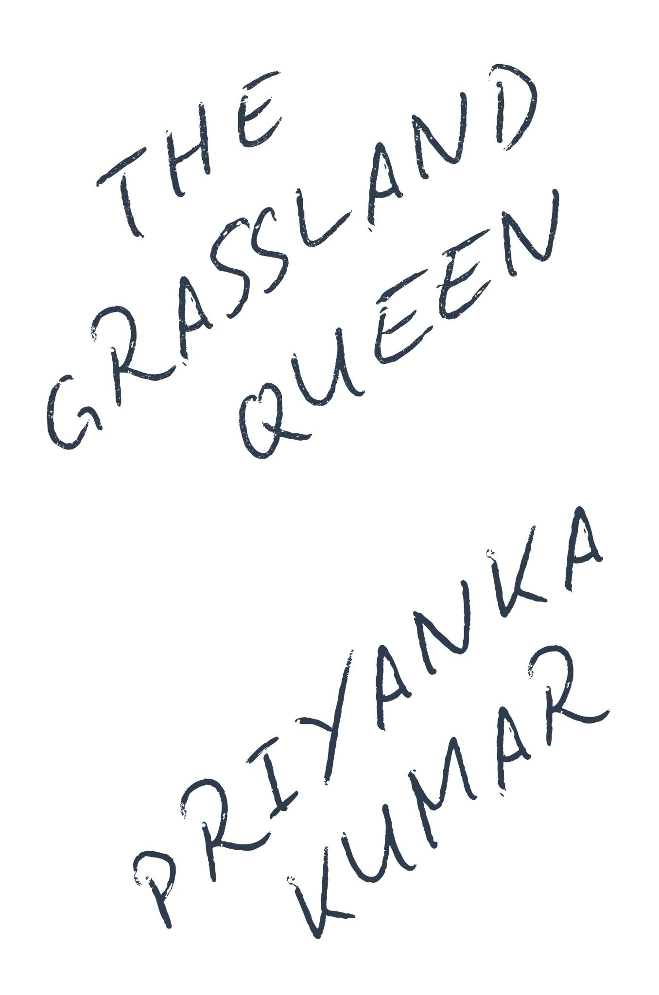
After all that, here’s what the final cover looks like:
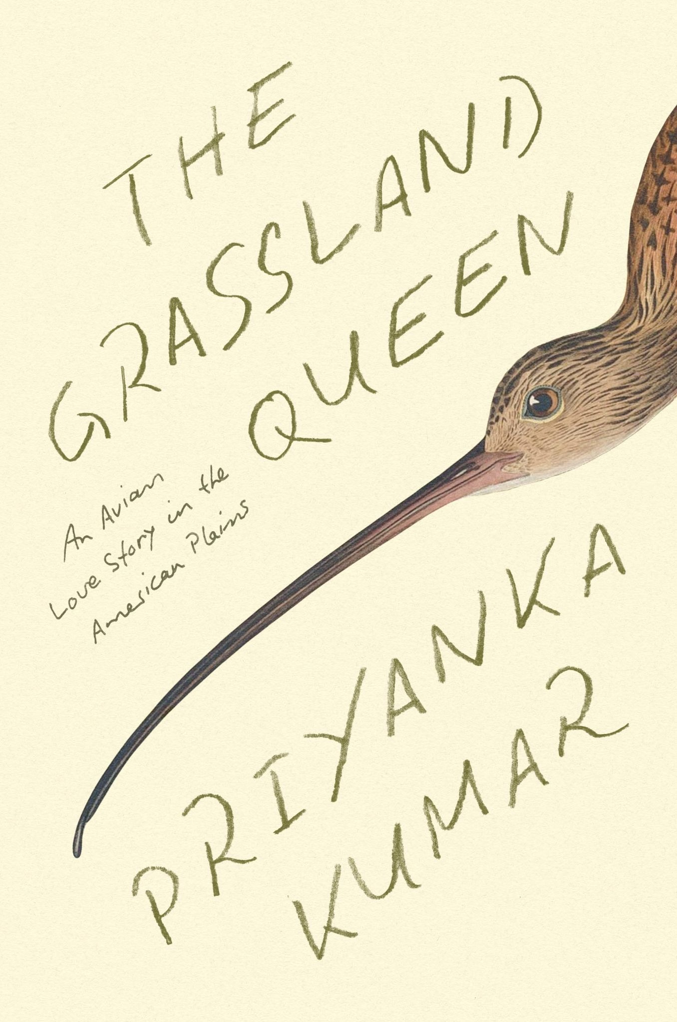
I felt it was important to use real handwriting on this cover, not just a font, because of the personal aspects of this book blended with its science. If you’re interested, you can preorder The Grassland Queen here. I get a little kickback.
I hope you enjoyed this exploration of handwriting on book covers!

What I’m Reading (links)
Galley Brag #25 by Ezra Kupor. A great interview with book cover designers Joanne O’Neill and Olivia McGiff.
On Collecting Reference & Inspiration by Daniel ➽ Letterpress Designer
A Pocket Notebook Can Change Your Life by Mark Ragland
Why My Simple Book Cover Wasn’t Simple by David Pogue
The Camera as a Social Shield: Robert Rauschenberg on Why We Photograph by Wesley Verhoeve

Thanks for Reading!
Thank you for reading! I mean it.
If you’d like to keep this newsletter going and help me say no to designing soul-sucking books about corporate events, email marketing, and raising capital, consider becoming a paid subscriber or buying me a coffee.
Until next time,
Nathaniel
Or “essays,” “poems,” etc.
doing the perfect imperfect handwriting is so hard, i think its harder as a designer because we are really thinking about it. This is so cool!!!
This is great! I hadn’t tried this specific technique. I’m also going to ask my husband on occasion because his handwriting is terrible and may actually be perfect for certain quirky projects…